The network for creativity
Join 1.25M professional creatives like you
Connect with clients, get discovered, and run your business 100% commission-free
Creatives on Contra have earned over $150M and we are just getting started
Back to feedPost

A sophisticated brand identity concept blending timeless typography, elegant composition, and refined visual storytelling. Designed to represent luxury, exclusivity, and a strong brand presence through a minimal yet impactful logo."

The network for creativity
Join 1.25M professional creatives like you
Connect with clients, get discovered, and run your business 100% commission-free
Creatives on Contra have earned over $150M and we are just getting started




Related posts

Which Virtual Reality Vector Logo You Guys Like Most?
These 100% Handmade Vector Logos Are Also Available For Purchase With Exclusive Copyrights Transfer Ownership, Feel Free To Contact Us.

7 voted
70%
3 voted
30%
10 votes
Closed

Logo Suite designed for Annie Bakery — a local bread bakery.
©2026
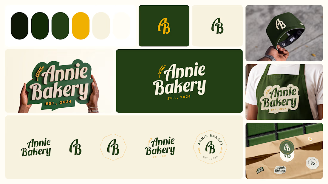

The suite holds together because the script wordmark, the AB monogram, and the round badge all carry the same wheat detail, so it reads as Annie Bakery whether on a storefront or shrunk onto a cap. The dark green with mustard is also a warm artisan pairing that dodges the usual beige bakery cliche.
Which Valkyrie Vector Logo You Guys Like Most?
These 100% Handmade Vector Logos Are Also Available For Purchase With Exclusive Copyrights Transfer Ownership, Feel Free To Contact Us.
4 voted
44%
5 voted
56%
9 votes
Closed