The network for creativity
Join 1.25M professional creatives like you
Connect with clients, get discovered, and run your business 100% commission-free
Creatives on Contra have earned over $150M and we are just getting started
Back to feedPost

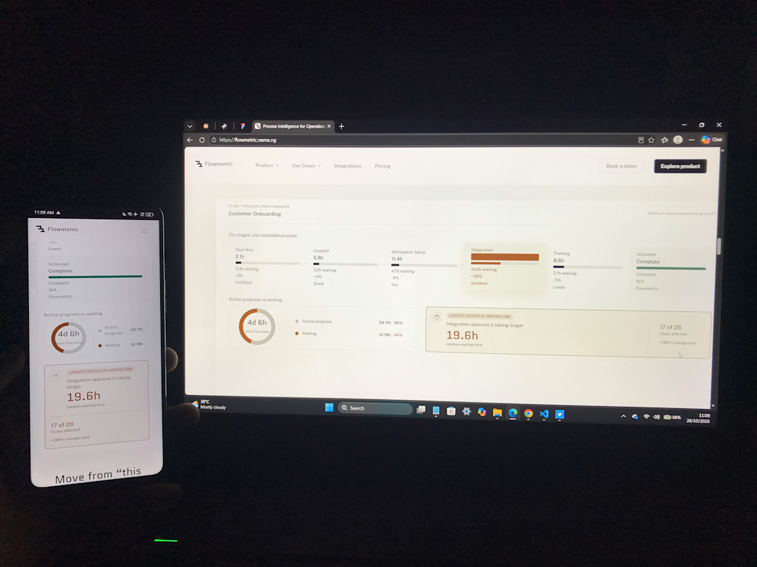
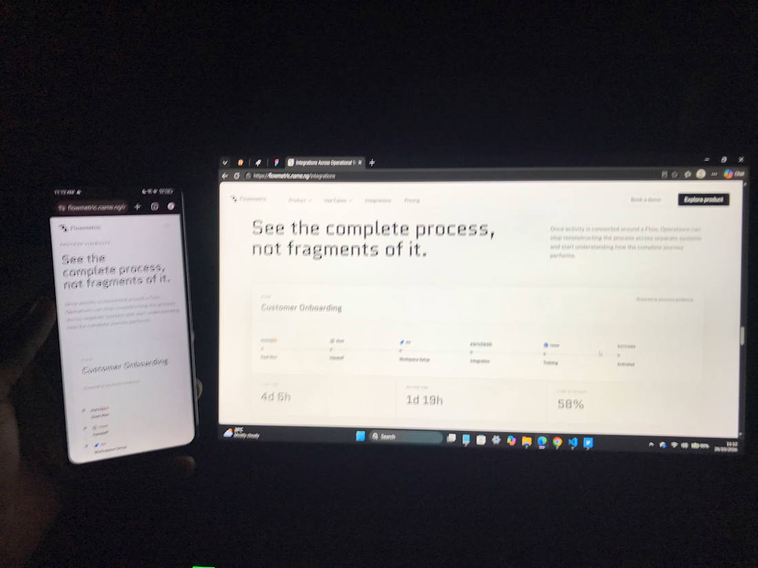
I didn’t want the product interface on Flowmetric’s website to exist just to make the page look more like a SaaS website... It needed to help explain the product
Customer onboarding became the recurring example
Instead of only saying that Flowmetric helps operations teams understand processes, the website can show a process moving from Deal Won through Handoff, Workspace Setup, Integration and Training until the customer is Activated
From there, the interface can show where work is active, where it waits and where friction appears
That made the product UI part of the website’s communication rather than decoration
For complex SaaS products, showing the right part of the product can sometimes explain more than adding another paragraph.
The network for creativity
Join 1.25M professional creatives like you
Connect with clients, get discovered, and run your business 100% commission-free
Creatives on Contra have earned over $150M and we are just getting started



Related posts

Webiste redesign for Saas company


2 voted
4%
44 voted
96%
46 votes
Closed


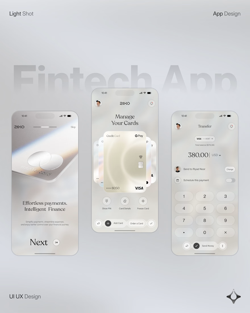
People don’t just want a banking app. They want to feel in control of their money.
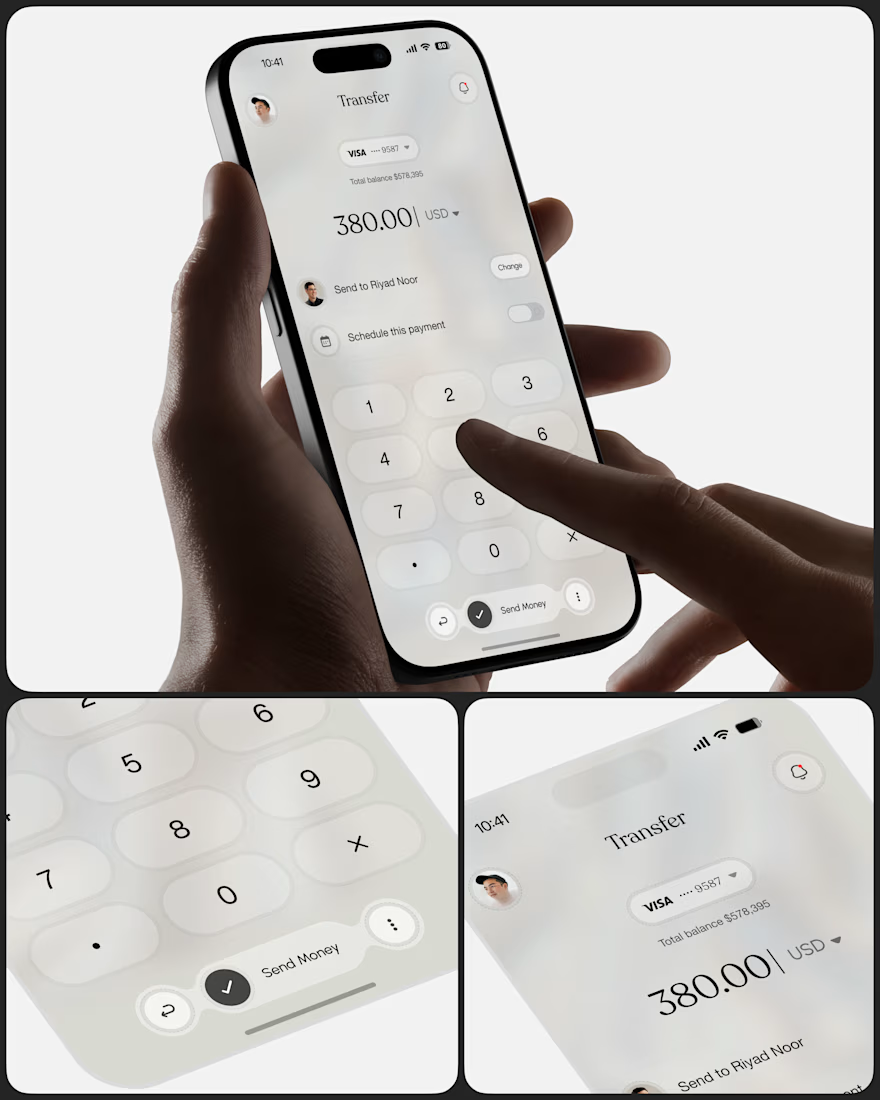
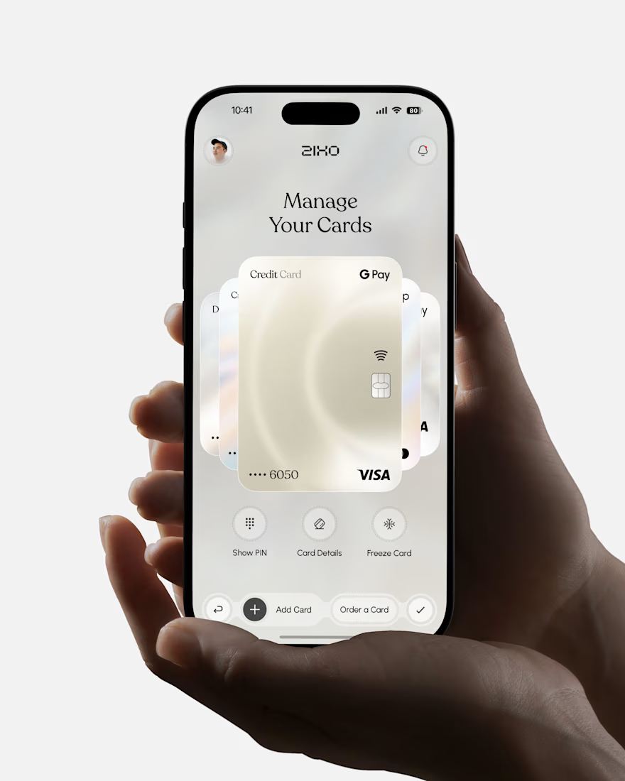
Great fintech design doesn’t just look premium. It makes money feel simpler, safer, and easier to control.
Meet Ziko, a mobile banking concept where every interaction is designed to reduce friction and build trust.
What wins your trust first: 🔒 Security, ✨ Simplicity, or ⚡ Speed?


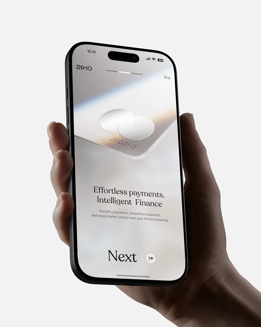

Absolutely love this Fintech App design! The minimal soft 3D elements with the clean UI is such a premium combo — feels very Apple-like and trustworthy. The interaction "designed to reduce" cognitive load really shows in the execution. Super polished work, that "Effortless payments. Intelligent Finance." screen is my fav!

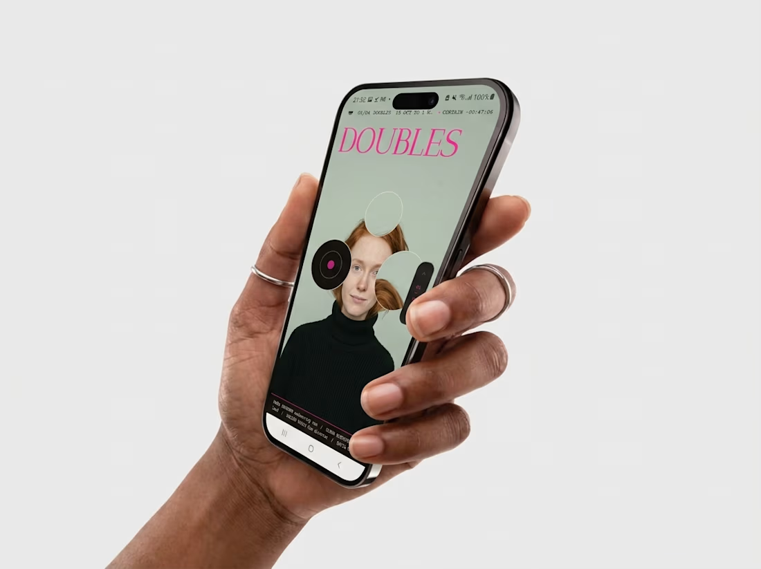
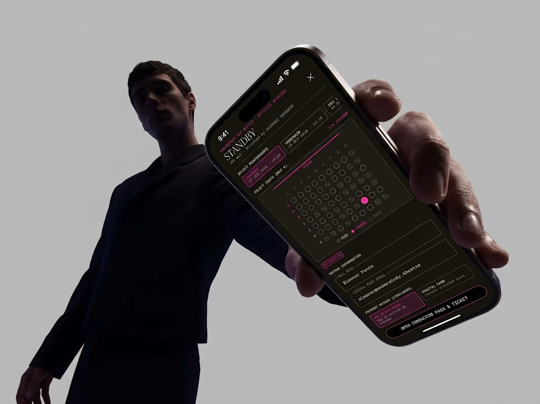
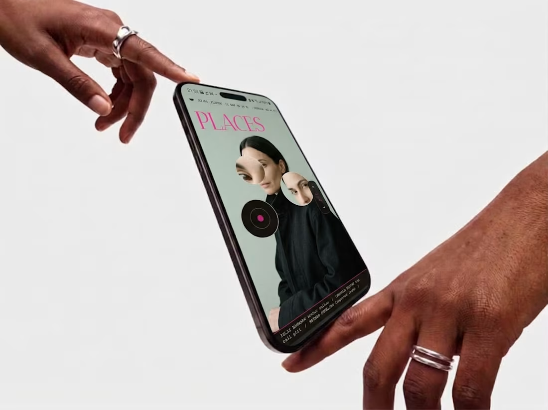
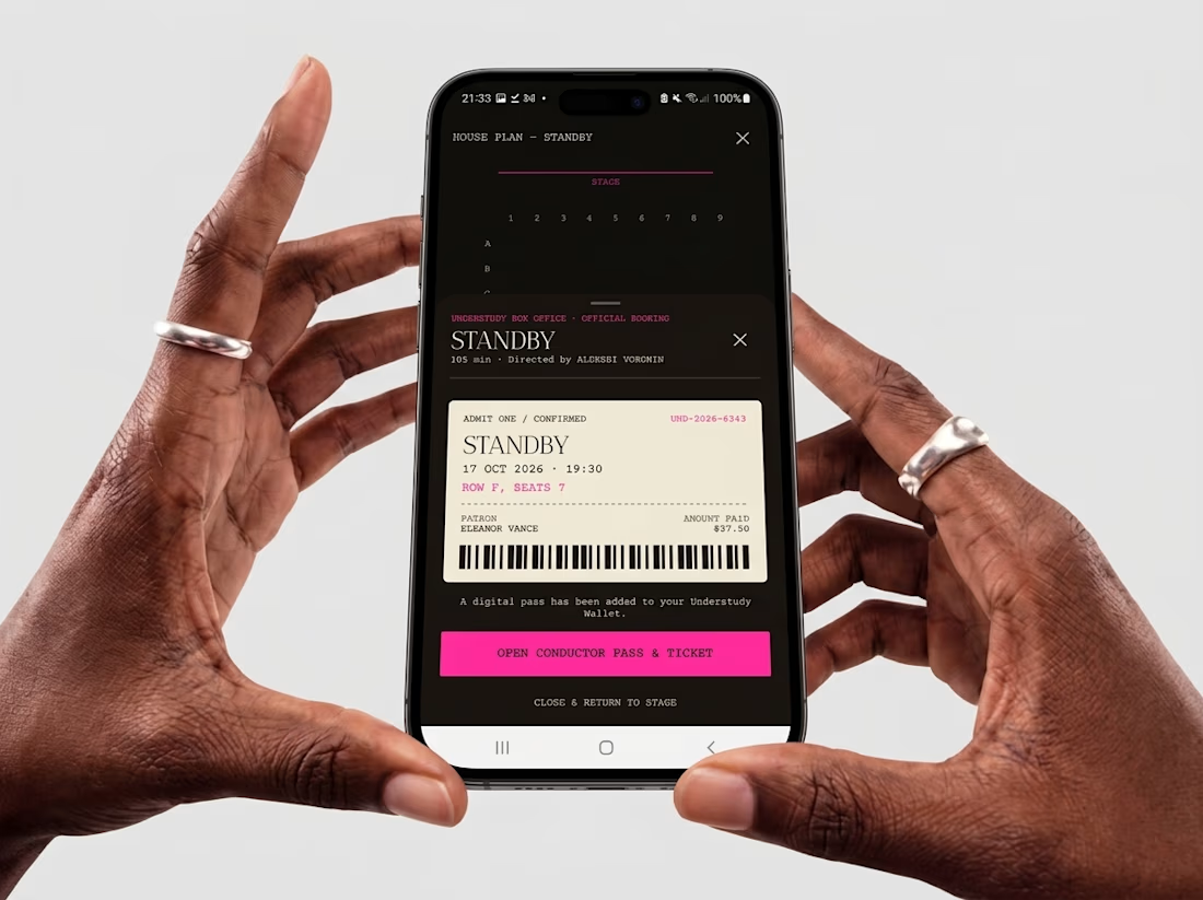
Friday app: Understudy
What if an app’s menu was a hole in a face?
UNDERSTUDY turns one circle into the interface: eyes open shows, voids open seat plans, and a typewriter clock counts down to curtain.