The network for creativity
Join 1.25M professional creatives like you
Connect with clients, get discovered, and run your business 100% commission-free
Creatives on Contra have earned over $150M and we are just getting started
Back to feedPost

HR Employee Attrition Analysis — Power BI Dashboard
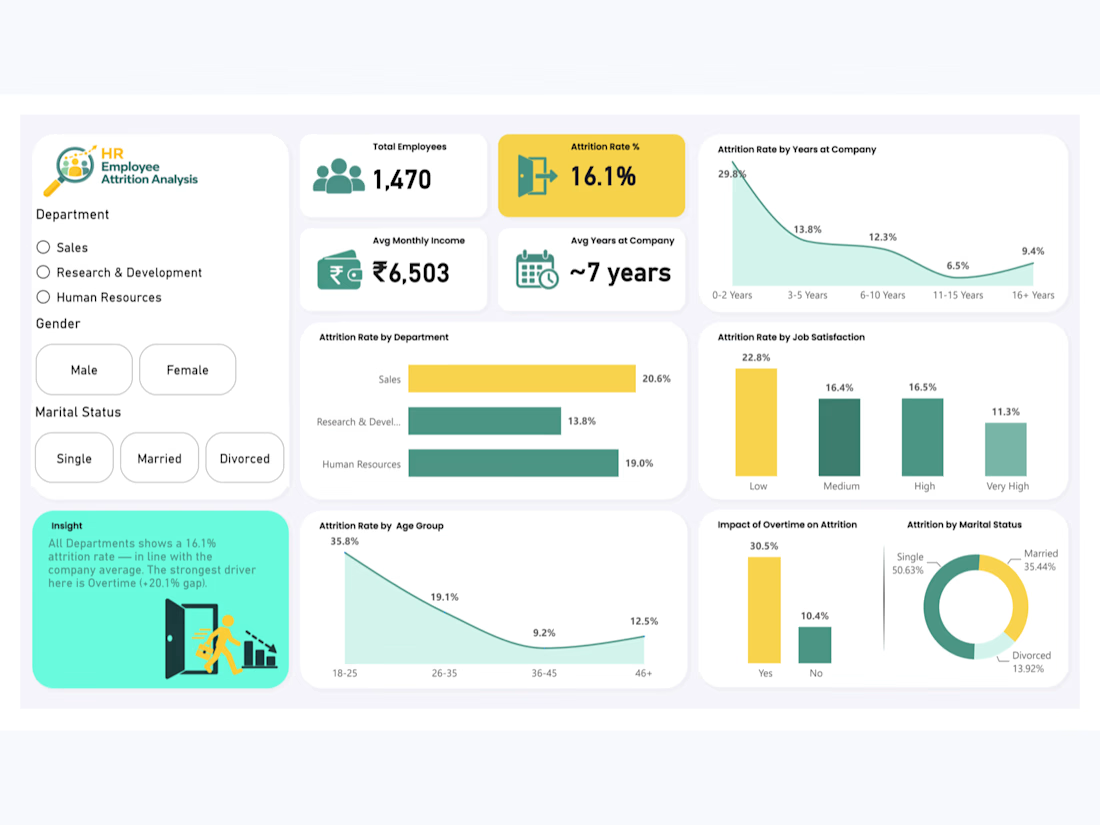
Built an interactive HR Employee Attrition Analysis Dashboard in Power BI using the publicly available IBM HR Analytics dataset from Kaggle (1,470 employees, 35 attributes).
This is a personal portfolio project. Dataset analysis, data cleaning, dashboard development, DAX measures, and visualizations were completed independently.
Key highlights:
Cleaned and transformed HR data using Power Query, including ordinal HR scales and custom Age and Tenure grouping logic
Developed DAX-driven KPIs for Total Employees, Attrition Rate, Average Monthly Income, and Average Years at Company
Analyzed employee attrition patterns across departments, age groups, years at company, job satisfaction, marital status, and overtime
Built a dynamic insight card that updates its message and risk color based on Department, Gender, and Marital Status filters using DAX and conditional formatting
Created two dedicated tooltip pages, Employee Segment Overview and Workplace Experience, providing contextual employee insights on hover
Developed interactive visuals to compare attrition rates by department, tenure, age group, job satisfaction, and overtime status
Identified key attrition patterns, including higher attrition among employees working overtime and differences across tenure and department segments
Designed a clean, recruiter-ready dashboard with a consistent teal, yellow, and white color palette
Tools used: Microsoft Power BI, Power Query, DAX, Data Modeling, Conditional Formatting, Interactive Dashboard Design, Report Tooltips
Data source: Public Kaggle dataset — IBM HR Analytics Employee Attrition & Performance


The network for creativity
Join 1.25M professional creatives like you
Connect with clients, get discovered, and run your business 100% commission-free
Creatives on Contra have earned over $150M and we are just getting started
Related posts

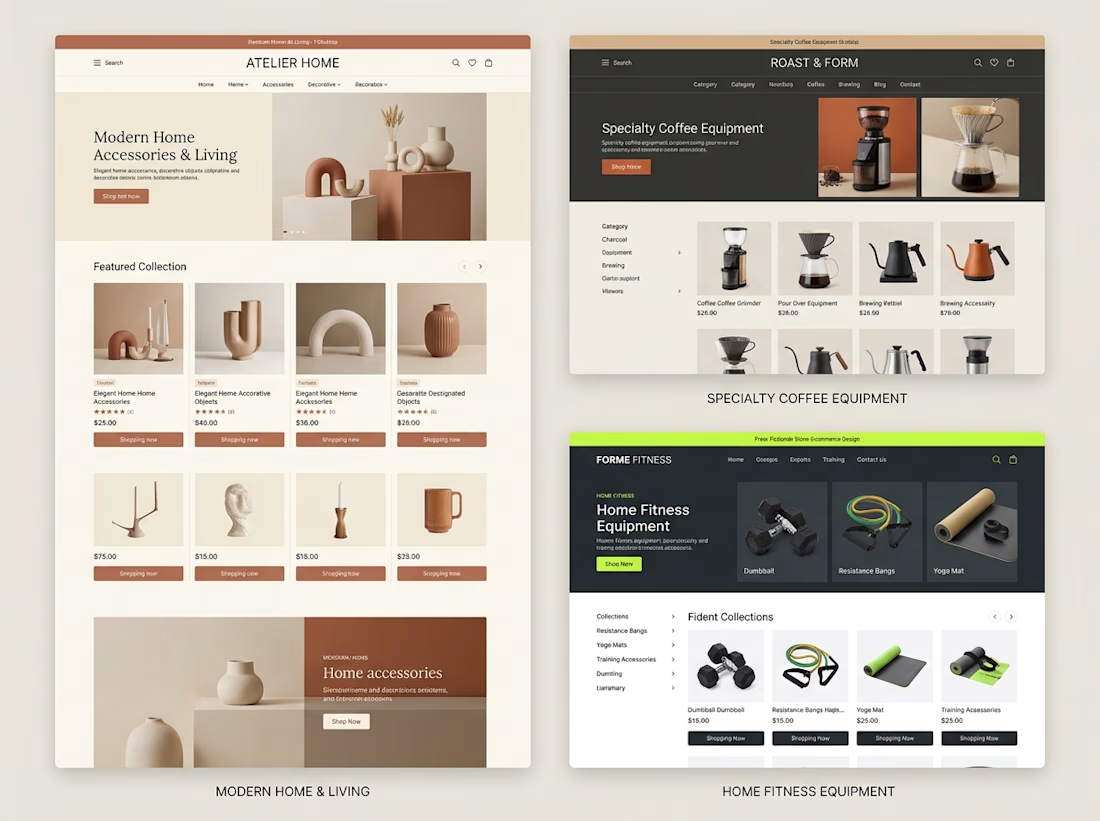
Different products need different shopping experiences.
When exploring Shopify store design, I like thinking about how the brand, product category, and customer journey should influence the final layout.
For example:
→ A home decor store needs strong visual presentation and an editorial feel.
→ A coffee equipment store needs clear categories and product information that helps customers compare options.
→ A fitness store needs organized collections and a straightforward path to the right equipment.
The goal isn't to use the same design for every business.
It's to understand what each store needs and build an experience around it.
These concepts explore three different directions, but they share one principle:
Good e-commerce design should make products easier to understand and easier to shop.
Which of these three store styles would you be most interested in exploring?



Great point. I’d pick the home decor one, editorial layouts really sell the vibe. 🔥

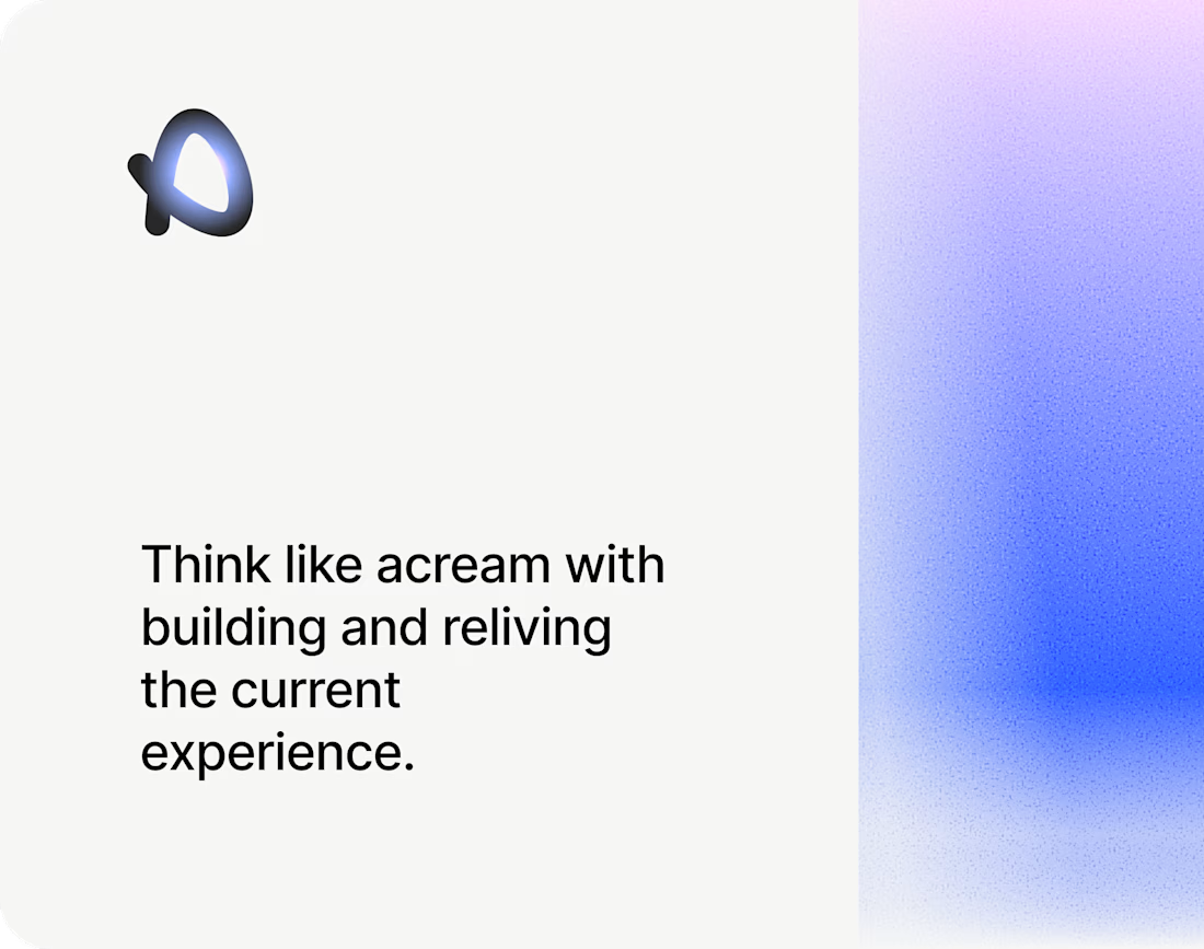

The soft blue and lilac gradient against the plain black type feels calm and a bit techy. Nice pacing in the motion too.

From static footer to motion.
It's crazy how adding motion can take something from OK to premium in an instant.


Good choice putting the motion in the footer. By the time someone scrolls that far they're already interested, so it rewards them without slowing down the first impression. For a health records app it also helps that the motion stays calm and doesn't feel flashy.