The network for creativity
Join 1.25M professional creatives like you
Connect with clients, get discovered, and run your business 100% commission-free
Creatives on Contra have earned over $150M and we are just getting started
Back to feedPost

Cousins is an interactive food card that shows how dishes from different cultures are related. Pick a dish you love, then spin it to discover its cousins around the world. Saimin spins into ramen, then pho, laksa, and Taiwanese beef noodle, one bowl transforming into the next. Tap "Next family" and the same idea plays out with dumplings, tracing a single parcel of dough west along the Silk Road from jiaozi in China to pierogi in Poland. Flip any card to read where the dish came from and how to make it. The whole thing is built on one idea: these dishes are not strangers, they are family.
How I used Stitch
I started by generating the watercolor illustrations in Stitch from a single reference image, which gave me a consistent painted style across all ten dishes. I built one card front in Stitch, then layered the motion in as in-place edits: a spin transition with motion blur that swaps one dish for the next at the blurred midpoint, a recipe flip on the card's depth axis, and a horizontal slide to move between families. Each gesture does a different job, so spinning means "same family, transformed," flipping means "go deeper," and sliding means "travel to a new family." I used the in-place edit prompts to wire the interactions and the recipe content, and built the second family by duplicating the working card and swapping its images and text.
I did not like the first iteration of the design it came up with. It was too slick and SaaS looking for a food exploration app, and the look and feel clashed with the watercolor illustrations. Creating a rough design in Figma with the same prompts first, then bringing that into Stitch, gave me much better results. It steered the tool away from its default app look and toward the editorial feel I wanted.
I was also impressed with Stitch's ability to generate consistent watercolor illustrations from one reference image. I did have to correct the registration of the images and remove the backgrounds in Photoshop for this project, since the spin transition needs every bowl in the exact same position, but otherwise it was a strong result. The biggest wins were the in-place edits for motion and the speed of iterating on a single card before extending it to a second family.
Prototype


Really like how each interaction has a purpose. Spin, flip, and slide all tell a different part of the story instead of being animation for the sake of animation.
Here's my submission:
https://on.contra.com/pnfJBQ
Curious what you think about it.

on.contra.com
Introducing Voya: Revolutionize Your Travel Planning Experience
Connect with next-gen talent and tools to get work underway. Hire more independents. Start more projects. Get more creative.


I love apps that help me learn new fun facts. Especially when it's about food! Nice work
The network for creativity
Join 1.25M professional creatives like you
Connect with clients, get discovered, and run your business 100% commission-free
Creatives on Contra have earned over $150M and we are just getting started

Challenges
View all


Related posts


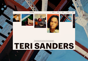
Hey! I got brave enough to submit one of our recent website projects to a contest 🥹
Would really appreciate your vote!
csswinner.com
Artist Portfolio - CSS Winner
Portfolio website for Teri Sanders, a New York-based artist. Design and Webflow development by Heed Collective.

Good on you for putting it out there. The portfolio site looks clean, the type-forward hero with her name is a strong choice for an artist site. Hope the vote goes your way.

An experiment exploring how to visually communicate design impact through a draggable before/after slider. Built to test the interaction and motion feel of scrubbing between two states of a design, it uses a small format to show transformation at a glance 😊


The compact format is doing a lot of work—the draggable reveal makes the improvement immediately legible, while the consistent card rhythm keeps the comparison easy to scan.

I just like making things like this.
I made this one as an experiment without opening a single design app. Basically, I just kept telling Codex what I wanted it to do.
It’s not a magic button. It took around 100 prompts and quite a few hours. But the fact that you can make something like this just by talking, without touching a keyboard or mouse, is still pretty wild.
And the whole thing runs and renders right in the browser.