The network for creativity
Join 1.25M professional creatives like you
Connect with clients, get discovered, and run your business 100% commission-free
Creatives on Contra have earned over $150M and we are just getting started
Back to feedPost

Do you ever find the perfect clothes online, only to discover your size is sold out?
I face this problem often, and I'm exploring a simple idea to make finding available sizes easier.
I'm testing a small service where you can share a product link and your size, and I'll look for available alternatives across stores.
I'm still at the idea-validation stage, so I'd really appreciate hearing about your experience.
If you'd like to try submitting a request, here's the page: https://sizescout.odoo.com/
What sizes or clothing categories are hardest for you to find?
sizescout.odoo.com
Home | SizeScout
This is the homepage of the website
The network for creativity
Join 1.25M professional creatives like you
Connect with clients, get discovered, and run your business 100% commission-free
Creatives on Contra have earned over $150M and we are just getting started











Related posts

🎨 What makes an e-commerce website stand out: the design, the products, or the shopping experience?
Here’s a look at my e-commerce website design concept for a retro-inspired fashion store.
From product collections and featured items to community-inspired sections, the goal was to create a storefront that brings the brand’s personality to life while making product discovery feel effortless.
But I want to hear your honest thoughts 👇
💬 If you were improving this website, what would you focus on first?
🎨 The visual design and branding
🛍️ The product browsing experience
📱 The user experience and navigation
💰 The layout and conversion potential
Feel free to share your suggestions, even if you would do something differently. I’m always interested in hearing how other designers, founders, and e-commerce professionals think.
#EcommerceDesign #WebDesign #UIDesign #Shopify #UXDesign


this is amazing

Title: Why 80% of your new email subscribers never buy or donate
Most brands work so hard on top of funnel traffic. You run ads, post on social media, and get people to sign up for your newsletter.
Then you send them a generic welcome email with a discount code and complete silence for two weeks.
Here is what happens when you do that:
Your subscribers forget who you are within 48 hours
Your open rates drop on every future broadcast
Readers feel like just another metric on your list instead of an insider
A generic confirmation email does not build trust. A strategic 3-part sequence tells your core origin story, sets clear expectations, and guides new subscribers toward their first purchase or donation while their interest is at its peak.
If your welcome flow feels dry or non-existent, I write 3-part custom on boarding sequences that turn cold signups into warm, loyal community members.
Drop a comment or check out my fixed-scope service link on my profile to get your welcome sequence updated this week.

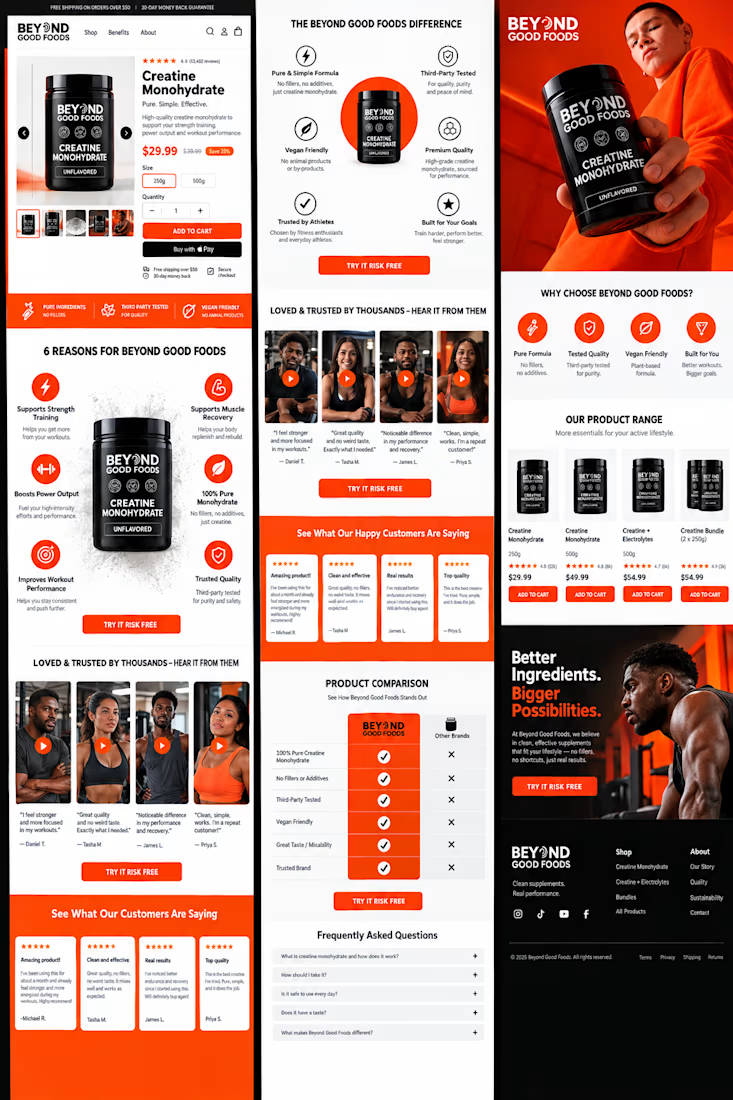
Turn visitors into buyers with a high-converting e-commerce landing page! More trust, better user experience, and more sales opportunities. Ready to grow your business? DM ME TO START!