The network for creativity
Join 1.25M professional creatives like you
Connect with clients, get discovered, and run your business 100% commission-free
Creatives on Contra have earned over $150M and we are just getting started

The network for creativity
Join 1.25M professional creatives like you
Connect with clients, get discovered, and run your business 100% commission-free
Creatives on Contra have earned over $150M and we are just getting started







Related posts

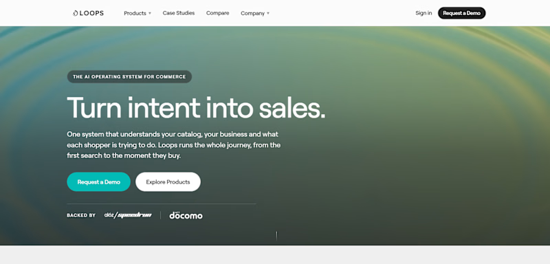
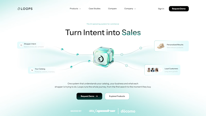
LoopsAI hero redesign
Same headline. Now the product is visible and the CTA stands out.
Independent concept, not affiliated with LoopsAI.

5 votes
Ends in 15h


seeing the actual product up top makes a big difference

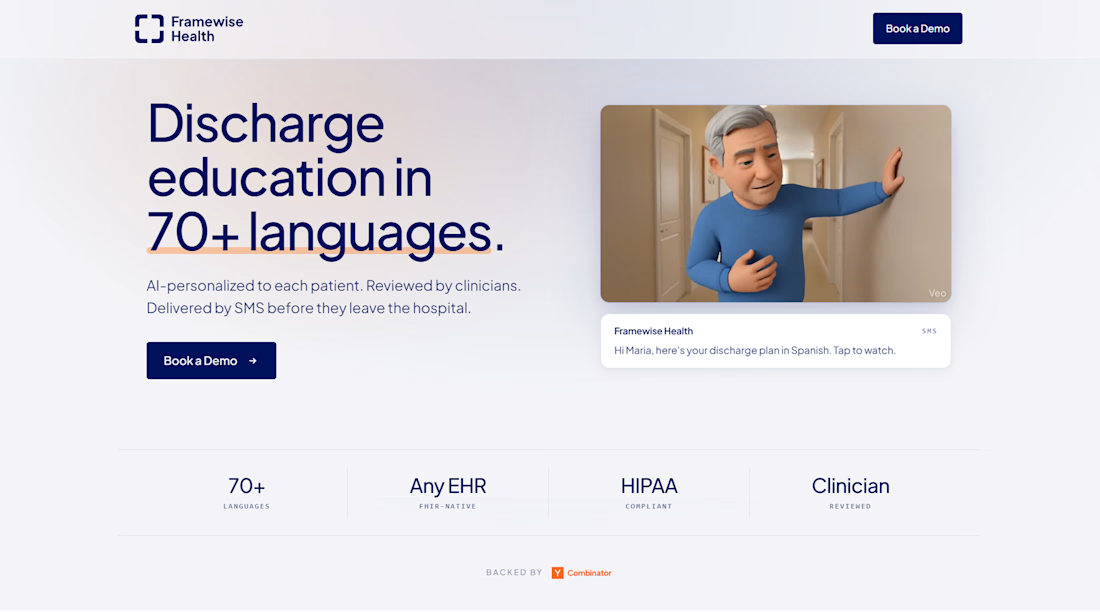
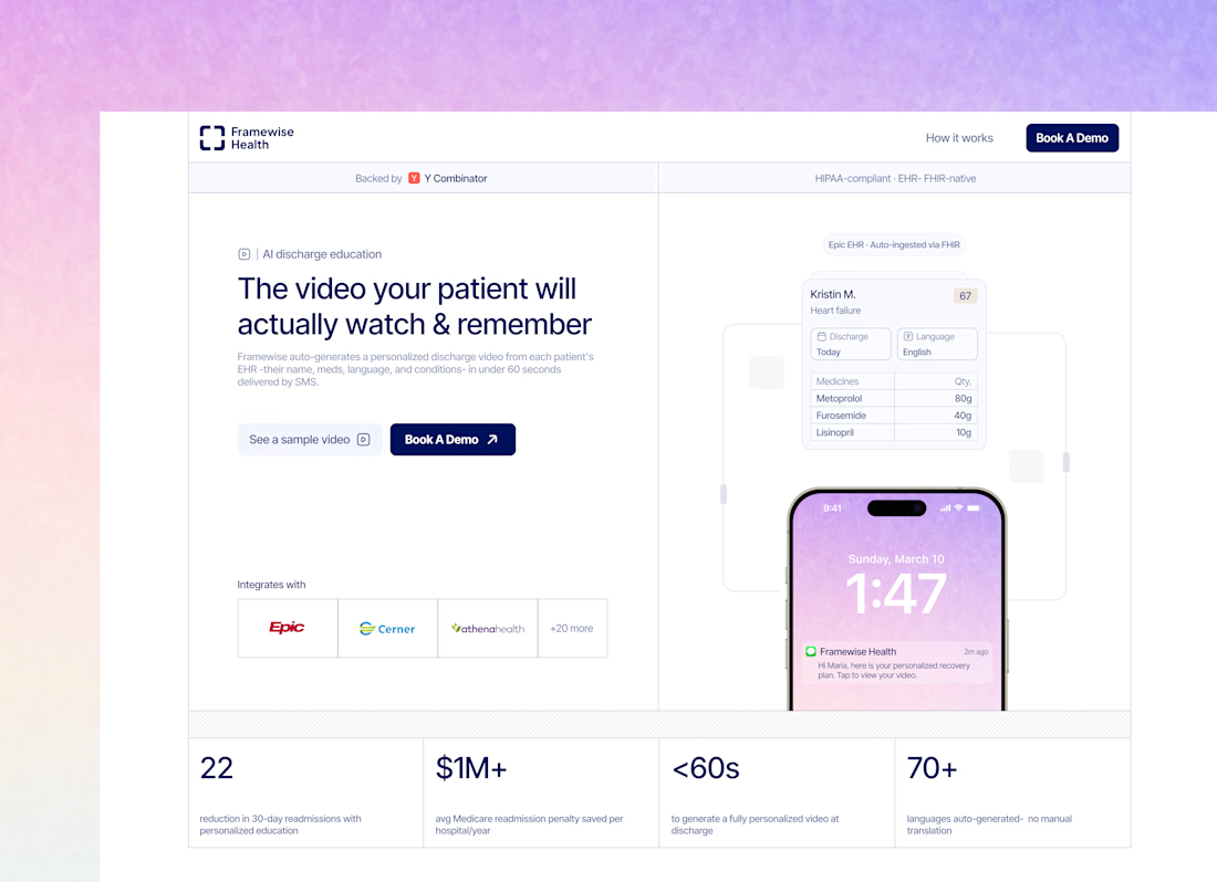
Health Website Design For Traffic and Client Generation


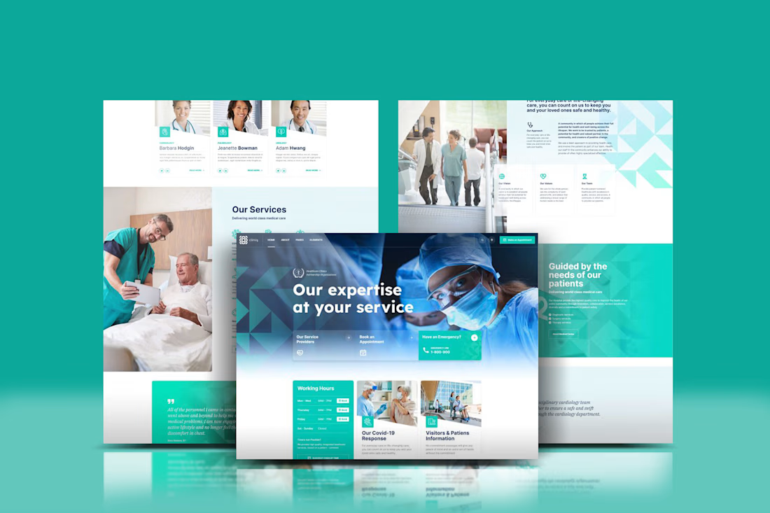

I designed this website template using @Framer 😊
How well will you rate this Template?