The network for creativity
Join 1.25M professional creatives like you
Connect with clients, get discovered, and run your business 100% commission-free
Creatives on Contra have earned over $150M and we are just getting started
Back to feedPost

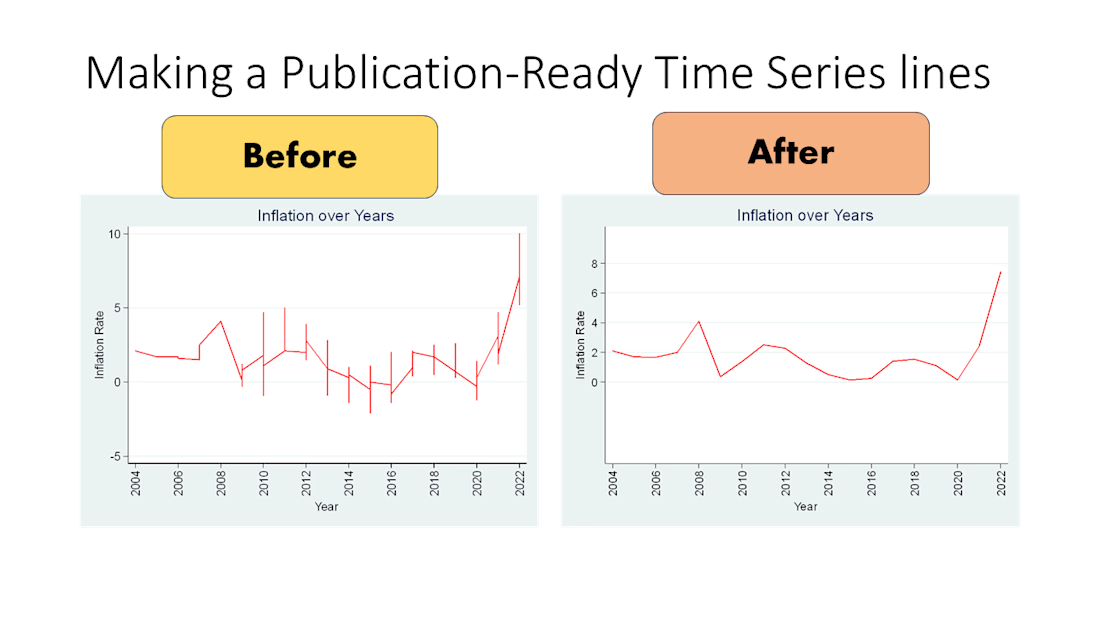
Turning messy time-series plots into publication-ready figures.
Before: cluttered line and distracting spikes that hide the story.
After: cleaned, consistent formatting, and a smoother trend line that makes the pattern readable.
If you have a dataset that needs a journal-ready figure (and export at high resolution), message me.

The network for creativity
Join 1.25M professional creatives like you
Connect with clients, get discovered, and run your business 100% commission-free
Creatives on Contra have earned over $150M and we are just getting started











Related posts

I tested the Prepare App with 10 people. The thing I was proudest of didn’t work.
Prepare turns the forecast into “here’s what to wear and pack.” For V0.1 I designed illustrated backgrounds to convey conditions at a glance. In 10 user interviews, they told people almost nothing. I removed them completely 😮💨 .
What people actually told me:
1️⃣ They want the "why" - A recommendation alone wasn’t enough. They wanted the underlying forecast data (feels-like, wind, precipitation timing) to trust what to wear.
2️⃣ They want a reference - People wanted to see what the right clothes look like, not just read a list.
3️⃣ They don't plan one day at a time - Most look at the week or weekend, especially with an event coming up. One participant told me they plan their weekend on Tuesday, and any shopping has to fit into an already busy week.
That last one changed my roadmap. Planning for tomorrow is a small problem. Planning ahead, with time to shop, is the bigger one.
So what’s coming next:
🟦 Deeper forecast detail behind every recommendation
🟦 Day and Week views
🟦 Custom packs, including items that appear only when conditions call for them.
🟦 Clothing references and suggestions
🟦 Event and trip prep tied to your calendar
Here is a One-minute walkthrough of whats to come. Small sample, so I’m treating this as direction, not proof. Next step is testing these changes with the same group.


Title / Headline:
Atlas of Cities — Editorial Web Design & Brand Identity System
Description
Overview:
Atlas of Cities is an editorial-driven web experience designed to translate complex urban analytics, housing statistics, and green space data into compelling, human-readable visual stories.
Design Highlights:
Modular Grid System: Engineered a high-density, structured layout balancing editorial typography with high-impact data visualization.
Editorial Typography: Paired clean display serif typography with ultra-legible body fonts to deliver a premium publishing aesthetics.
Brand Identity & Color Palette: Minimalist high-contrast palette (Signal Red, Neutral Gray, Off-White) optimized for maximum legibility and brand authority.
Cross-Platform Responsive Design: Fully adapted desktop and mobile interfaces, ensuring a seamless reading experience across all devices.
Tools & Stack:
Figma, Design Systems, Typography Scale, Data Visualization Design, UI/UX Responsive Layouts.


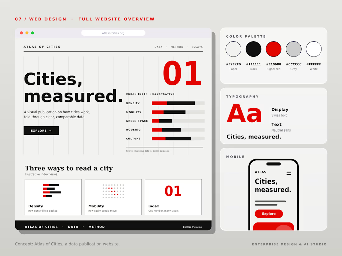

Turning urban analytics and housing stats into human-readable visual stories is a noble brief. The Signal Red accent cutting through the off-white gives it that premium editorial punch, and the modular grid keeps the density under control.

How I Built an End-to-End Sales Analytics Dashboard in Excel for an E-commerce Company
I recently completed an end-to-end sales analytics project using Microsoft Excel, transforming raw e-commerce sales data into an interactive dashboard that provides meaningful business insights.
In this project, I explored the data, performed analysis, identified key sales trends, and built an interactive dashboard to help businesses make data-driven decisions.
I documented the entire process, including the approach, tools, analysis, and dashboard development.
Read the full project walkthrough on Medium: https://medium.com/@Refino/how-i-built-an-end-to-end-sales-analytics-dashboard-in-excel-for-an-e-commerce-company-e8692d81f354


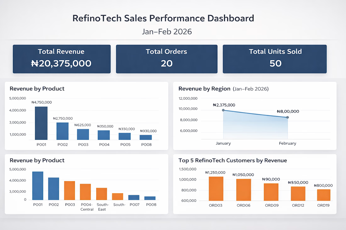

Excellent work! Turning raw data into actionable business insights is a valuable skill.