The network for creativity
Join 1.25M professional creatives like you
Connect with clients, get discovered, and run your business 100% commission-free
Creatives on Contra have earned over $150M and we are just getting started
Back to feedPost

DJ LUVABLE 🪩
What does a good booking flow look like for both sides?
For the Contra × Lovable challenge, I became DJ Luvable, a wedding and art-venue DJ from a parallel universe, and built his site with Lovable to find out.
FOR THE CLIENT
✦ Every package, inclusion and deposit shown upfront
✦ Reels and playlists to check the style before booking
✦ Lulu, a voice assistant built with VAPI, for anyone who'd rather talk than type
FOR THE DJ
✦ Availability synced with Google Calendar, so no double bookings
✦ Fewer "quick question" emails
✦ Enquiries that arrive with everything already filled in
Also made with AI: two moody reels, two music sets and 3D character illustrations.
The (very real) testimonial of the week: “I’m giving him five out of five disco balls! 🪩🪩🪩🪩🪩”
The behind-the-scenes footage starts at around 2:00 in the demo video.


Congrats @Lubos Belak for winning the Lovable challenge.
Thank you, Raja! 🙌
The network for creativity
Join 1.25M professional creatives like you
Connect with clients, get discovered, and run your business 100% commission-free
Creatives on Contra have earned over $150M and we are just getting started










Related posts


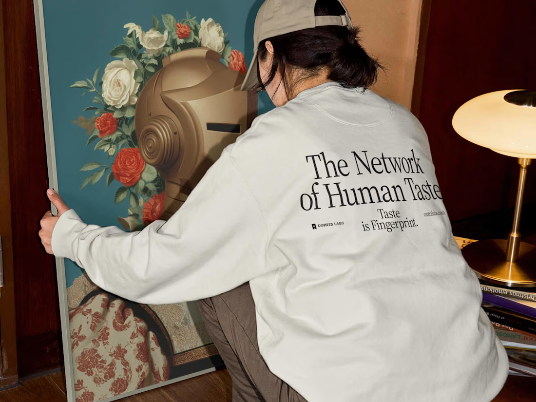
A very special one for us at Heed Collective ✨
We had the opportunity to shape the visual identity and digital experience for Contra Labs, and I'm incredibly proud of what we created together 💚


I used Lovable to transform ideas into modern websites and interactive web applications with clean UI/UX, responsive layouts, and engaging user experiences.
From startup landing pages to SaaS platforms and MVPs, my focus is on creating digital products that look professional and support real business goals.
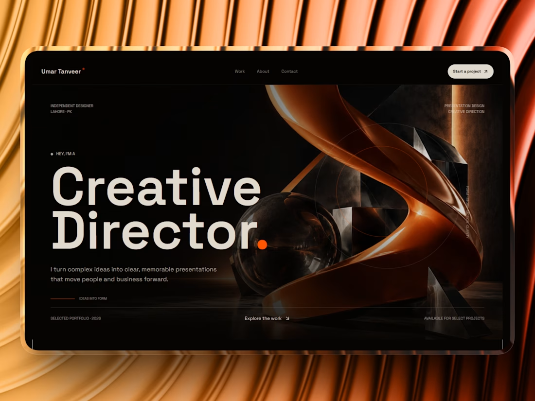

Thats lovely design!

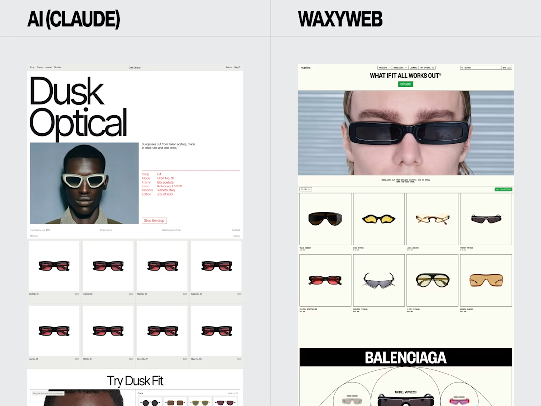
Eyewear Ecommerce Website Redesign — AI vs. WaxyWeb
A side-by-side design comparison exploring two approaches to an online eyewear store.
The WaxyWeb redesign focuses on the relationship between product presentation, collection browsing, editorial imagery, and the store’s visual identity.
Design considerations:
Eyewear product presentation
Ecommerce layout and hierarchy
Collection and product discovery
Fashion-focused visual direction
Consistent online shopping experience
For fashion, eyewear, and lifestyle brands, the goal is to create a store that presents products clearly while giving the brand a recognisable visual presence.
Website design and development: www.waxyweb.com


WaxyWeb