The network for creativity
Join 1.25M professional creatives like you
Connect with clients, get discovered, and run your business 100% commission-free
Creatives on Contra have earned over $150M and we are just getting started
Back to feedPost

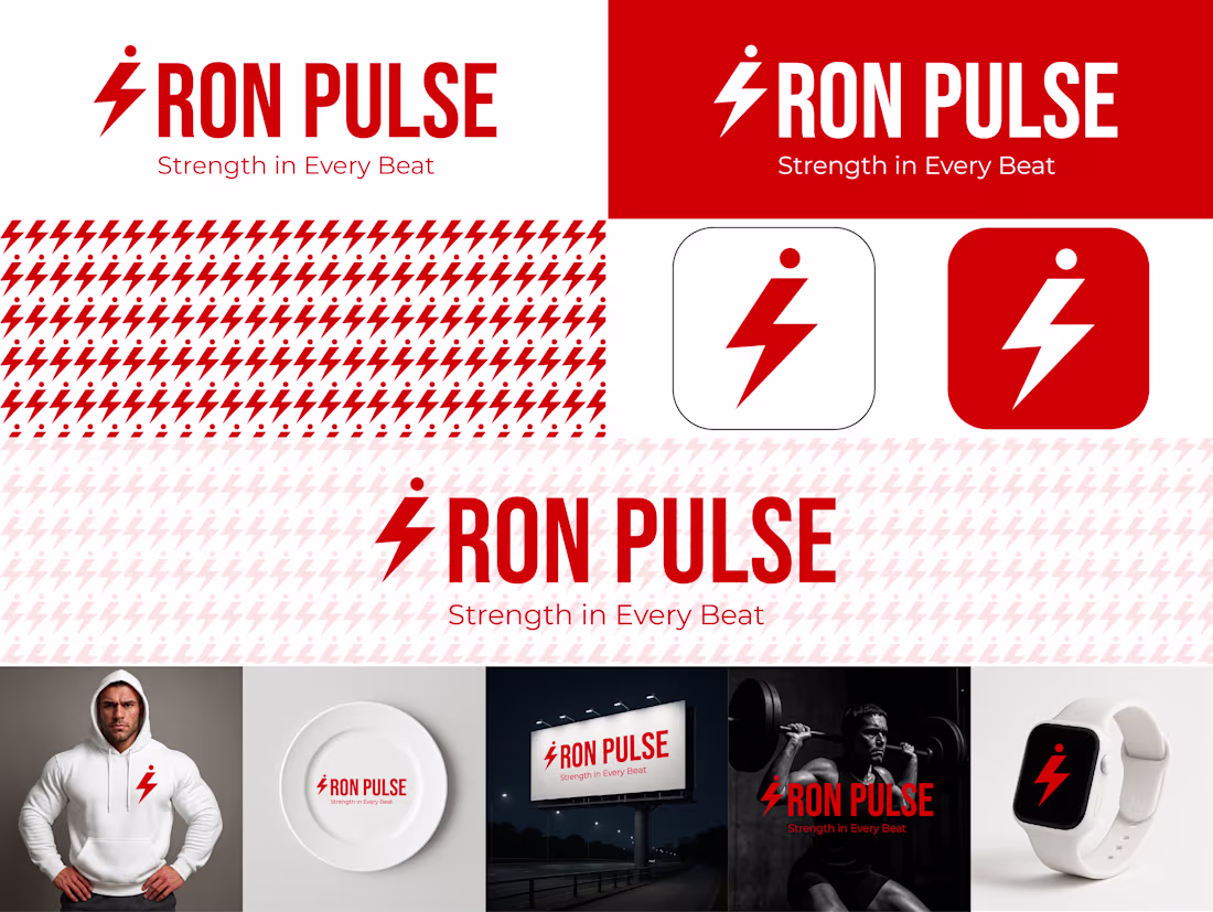
Presenting the IRON PULSE Brand Identity.
Excited to share a recent portfolio project: IRON PULSE, a premium, no-excuses brand for strength training and performance.
The vision was simple: Discipline over Cliche. We designed a system that fuses the raw power of Iron Black with the intensity of Pulse Red.
Core Strategy:
Impact: The lightning bolt 'I' instantly connects Strength (Iron) with Energy (Pulse).
Aesthetic: Clean, ultra-bold typography and aggressive angles to reflect a strong, zero-clutter mindset.
Application: Consistency across all touchpoints, from App Icons to high-impact Billboards.
This is branding built for peak performance. What are your thoughts on this minimalist, high-impact approach? 👇


The network for creativity
Join 1.25M professional creatives like you
Connect with clients, get discovered, and run your business 100% commission-free
Creatives on Contra have earned over $150M and we are just getting started


Trending


Figma Make
Go from idea to prototype in minutes. What are you designing?
brandguidelines
Brand guidelines are becoming living systems, not static documents. What are you building for your clients?
aivideo
AI video tools are moving at warp speed. Which ones are you experimenting with?
illustration
Handcrafted illustration is bubbling up across the web. What are you drawing lately?
freelancerlife
Freelancer life is wins, pivots, and everything in between. What’s yours right now?