The network for creativity
Join 1.25M professional creatives like you
Connect with clients, get discovered, and run your business 100% commission-free
Creatives on Contra have earned over $150M and we are just getting started
Back to feedPost

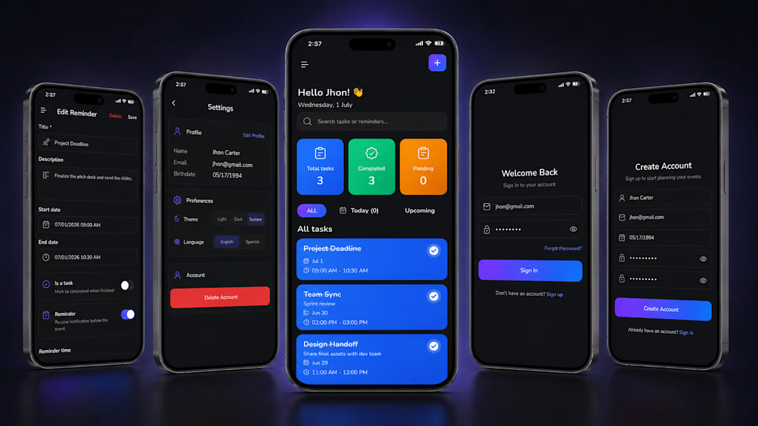
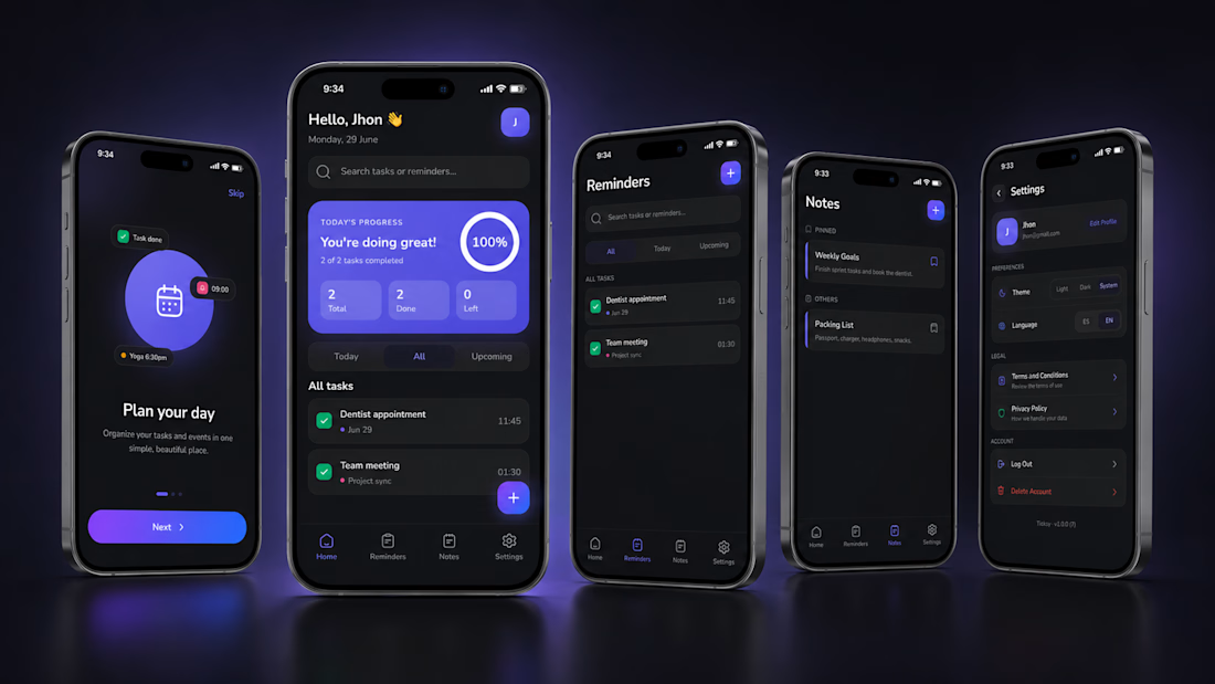
Ticksy was a working app. It just wasn't making money.
Most apps don't fail because the code is bad. They fail because they look generic, do too little, and never convert. That's exactly where Ticksy was: a functional MVP with no brand, limited scope, and zero revenue.
Here's what changed when we treated it as a product, not just a build:
A brand that sells. Full redesign that turns first impressions into retention. Every screen, every interaction, every micro-animation was rebuilt to feel premium.
More reasons to stay. A new Notes feature widened the use case and pushed daily usage. The app went from "task list" to "daily command center."
Revenue from day one. Monetization built into the experience without degrading it. Subscriptions, premium features, and a paywall that feels fair.
Ready for the market. Fully prepared to ship on Google Play and the App Store. Not "almost ready." Actually ready.
We took it from prototype to a polished, revenue-ready product without rewriting what already worked.
Before vs. After: see the difference below.
Thinking about building or fixing a product? Whether it's an idea on paper or an MVP that isn't converting, we take products from idea to market: design, development, backend, publishing, and monetization.

The network for creativity
Join 1.25M professional creatives like you
Connect with clients, get discovered, and run your business 100% commission-free
Creatives on Contra have earned over $150M and we are just getting started







Related posts

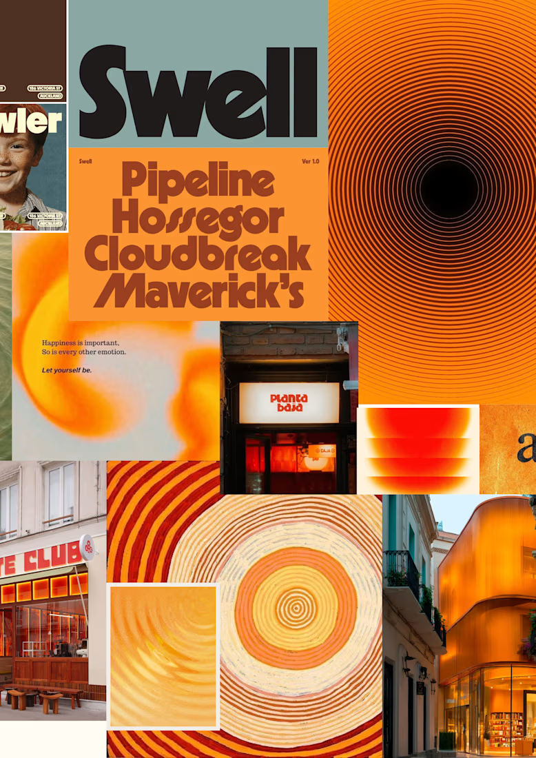
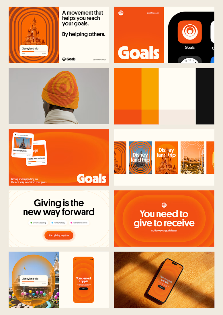
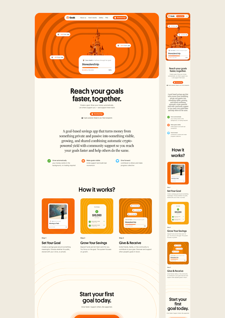
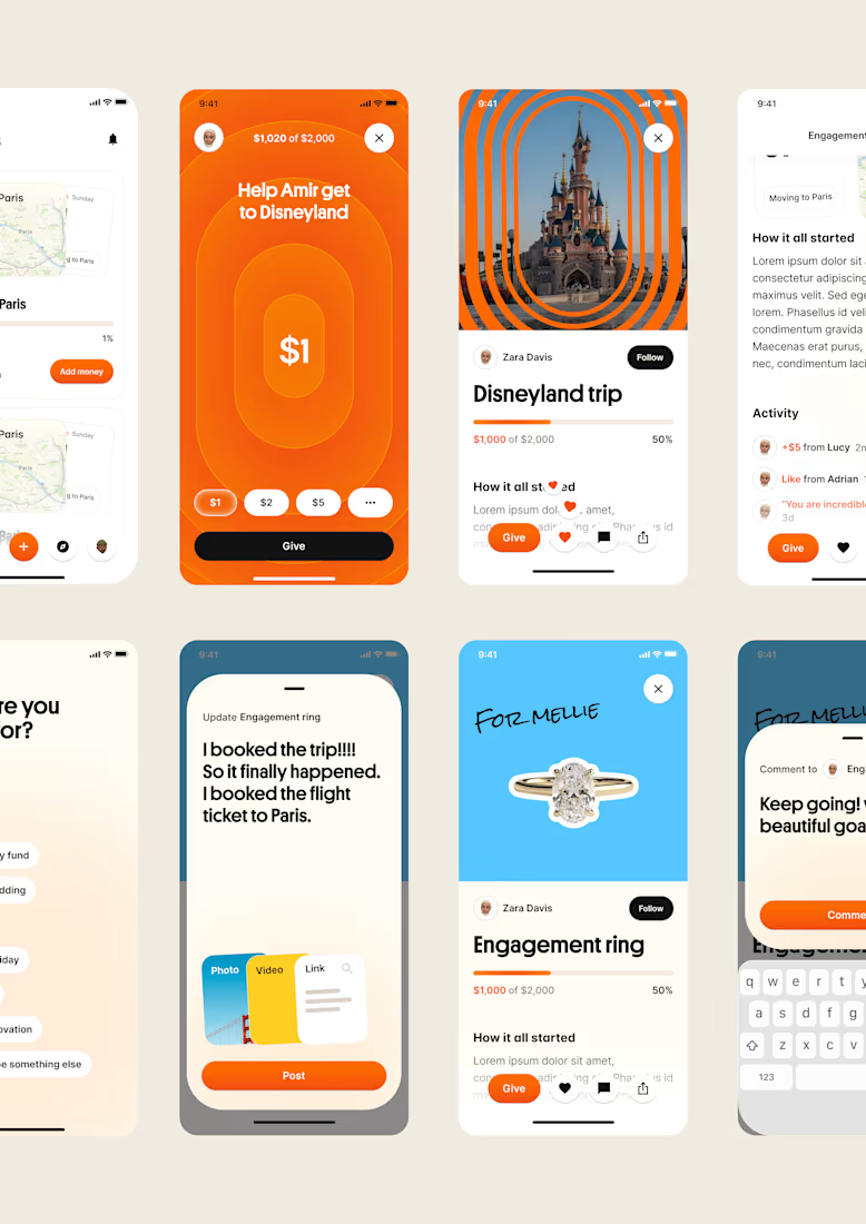
one of my favourite things about running a one-person studio is that nothing gets lost in translation.
the idea behind the brand is the same idea that shapes the website and the product.
no handovers, no starting from scratch, no trying to explain the vision to someone new.
a little look at how that came together for goals, from the first moodboard to the app ↓

Love it!

Real eggs. No apologies 🥚
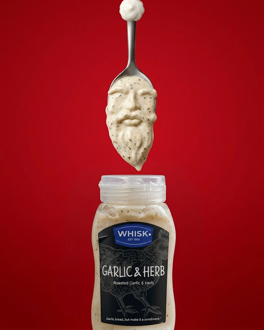
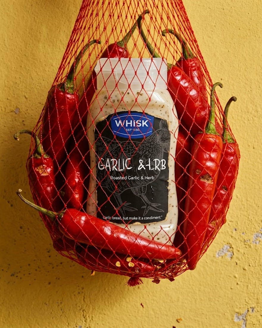
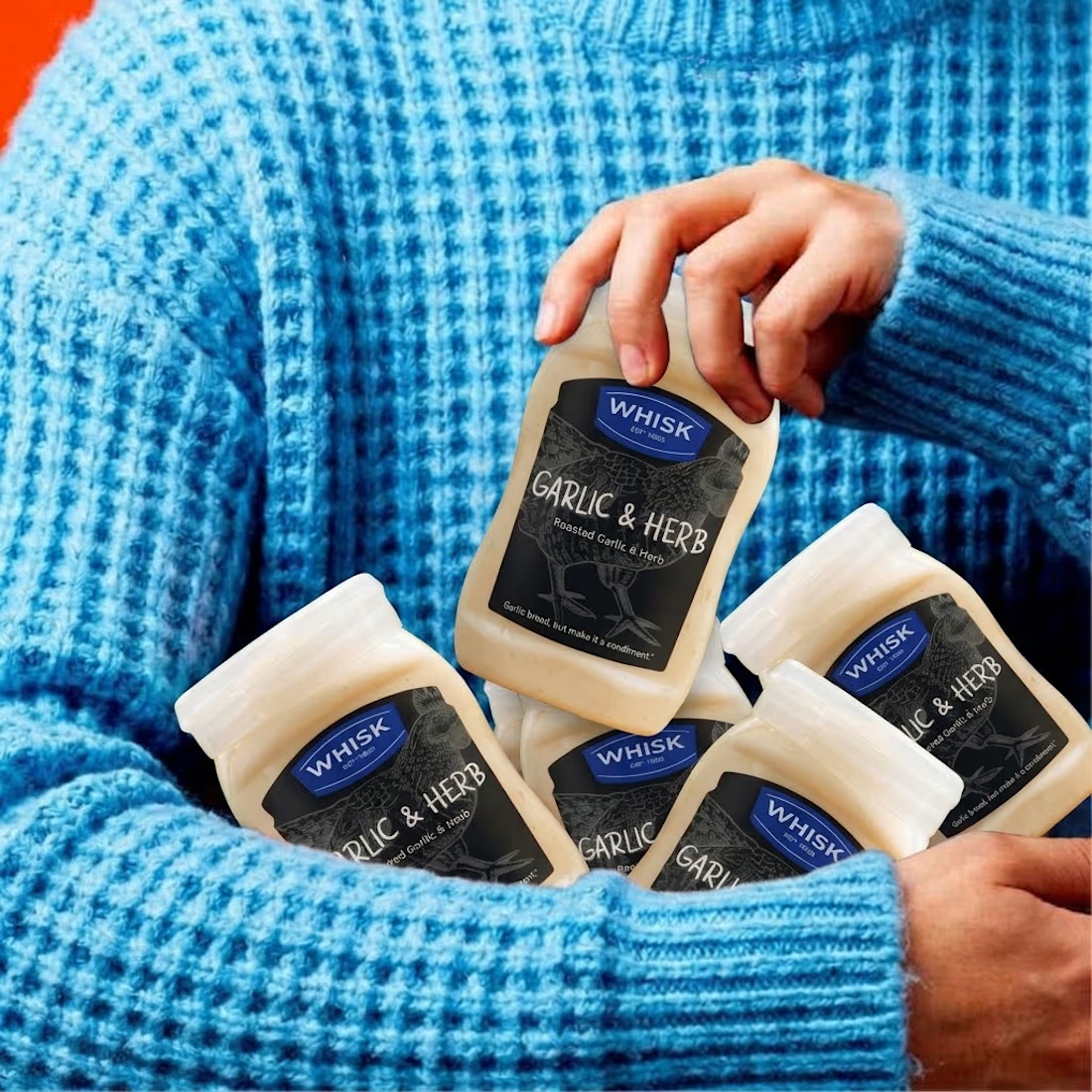
Spent the past week designing WHISK, an artisan mayonnaise brand built on one idea: even the most overlooked item in the fridge deserves a brand that takes it seriously.
No squeeze bottle, no label built to disappear into the shelf. Just a glass jar, a short ingredient list, and four flavors told apart by one accent color each. Classic, garlic and herb, smoked chili, vegan. 🫙
Sometimes the boldest thing a condiment can do is be particular about itself.



The animation looks top tier! Nice work

Introducing Finora
A modern fintech app designed to make personal finance simpler, smarter, and easier to understand.
Built with a consistent Inter-based design system and a soft, modern visual language.
#UIUX #ProductDesign #Fintech #MobileApp #Figma


All experience in one app well designed.