The network for creativity
Join 1.25M professional creatives like you
Connect with clients, get discovered, and run your business 100% commission-free
Creatives on Contra have earned over $150M and we are just getting started
Back to feedPost

The network for creativity
Join 1.25M professional creatives like you
Connect with clients, get discovered, and run your business 100% commission-free
Creatives on Contra have earned over $150M and we are just getting started

Challenges
View all


Related posts


Recently designed and developed this restaurant website. Had to change the name and can't share the overview of the design because of an NDA, and honestly didn’t have the time to make mockups manually haha, so AI came in handy for the presentation.
What do you think of the design?

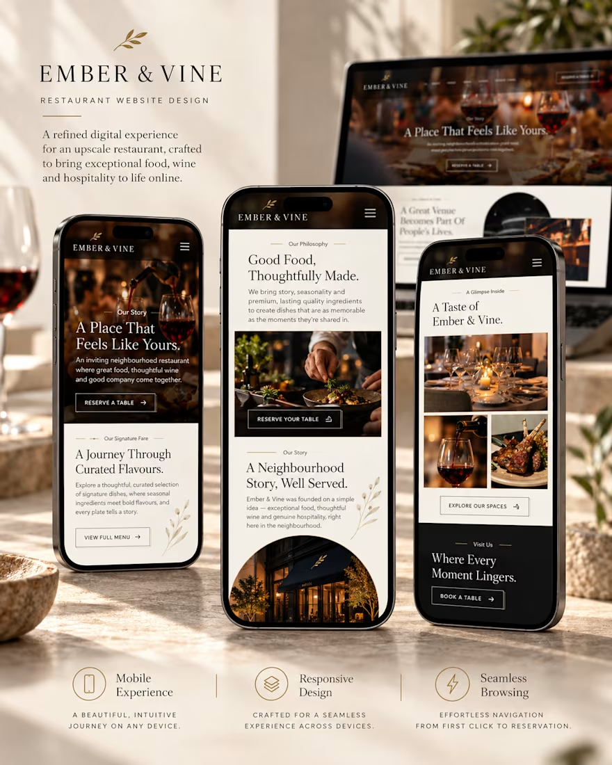
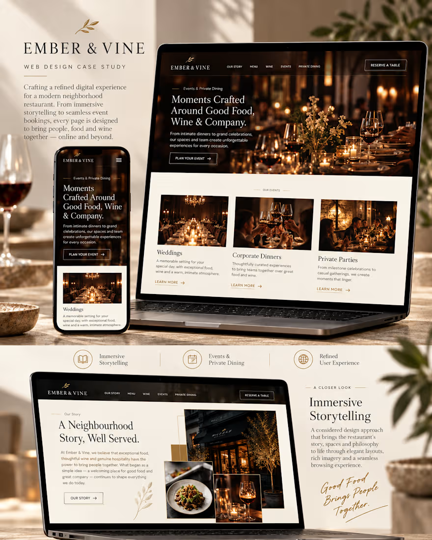
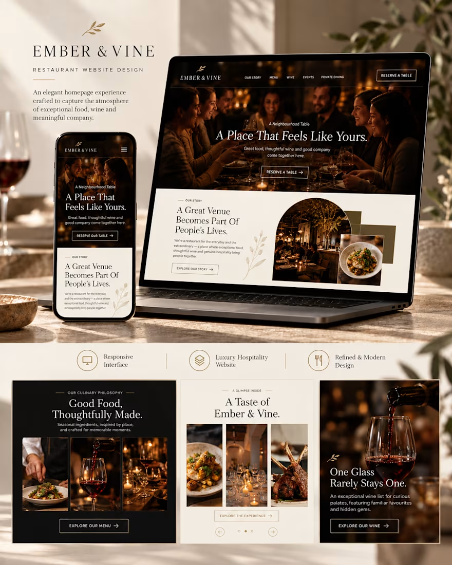
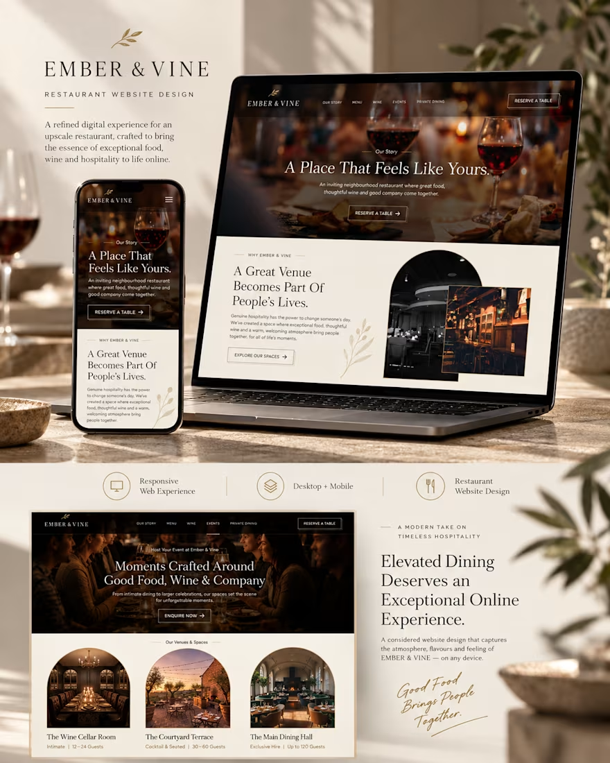


Which design looks more premium, attractive, and professional?


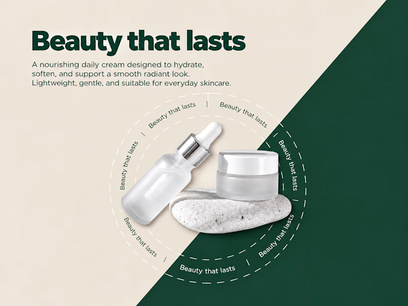
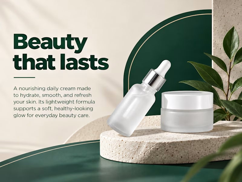
7 votes
Ends in 42m

Number 1

Hello Guys 🤗,
Look at this amazing logo design I pulled off for Chicklet 🐣. It's nice, simple and beautiful 😍. I hoped you like it.
What do you think about it?