The network for creativity
Join 1.25M professional creatives like you
Connect with clients, get discovered, and run your business 100% commission-free
Creatives on Contra have earned over $150M and we are just getting started
Back to feedPost

Something I’ve been thinking about lately, and this article put it into words really well!
There’s a lot of noise around AI replacing designers. But what’s actually happening is almost the opposite: demand for senior designers is going up. Not because AI isn’t changing things, but because it’s raising the bar for what good design actually means.
The tools are getting faster and the outputs are getting better. But the creative thinking behind them? That’s still 100% human. Strategy, taste, judgment and context. Those don’t come from a prompt!
If anything, I think this is a great moment to double down on craft and on building a point of view that is distinctly yours.
Are you with me on this, or are you still on team doomsday?
Worth a read either way: https://www.figma.com/blog/why-demand-for-designers-is-on-the-rise/


figma.com
Why Demand for Designers Is on the Rise | Figma Blog
Our latest study suggests that AI is driving renewed momentum in design hiring. We unpack why that is, what hiring managers prioritize, and which skills designers need to get ahead.
The network for creativity
Join 1.25M professional creatives like you
Connect with clients, get discovered, and run your business 100% commission-free
Creatives on Contra have earned over $150M and we are just getting started








Related posts


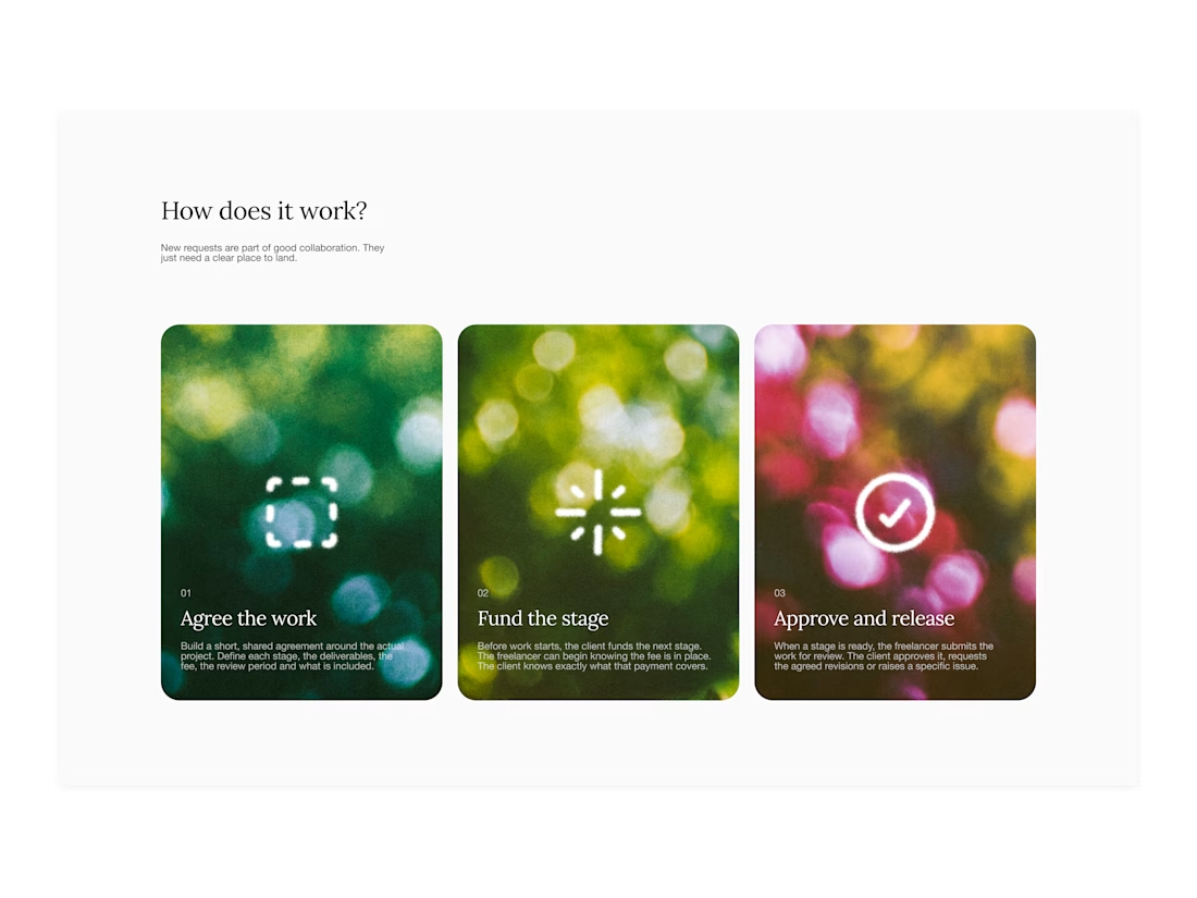

Your web sections always have such strong art direction. Great to see the brand carried right into the layout.

I created a brand identity concept for Velora, an AI productivity platform. I explored the logo, colors, typography, and how the brand could look across a website, mobile app, and everyday products. I wanted everything to feel consistent, modern, and easy to recognize.

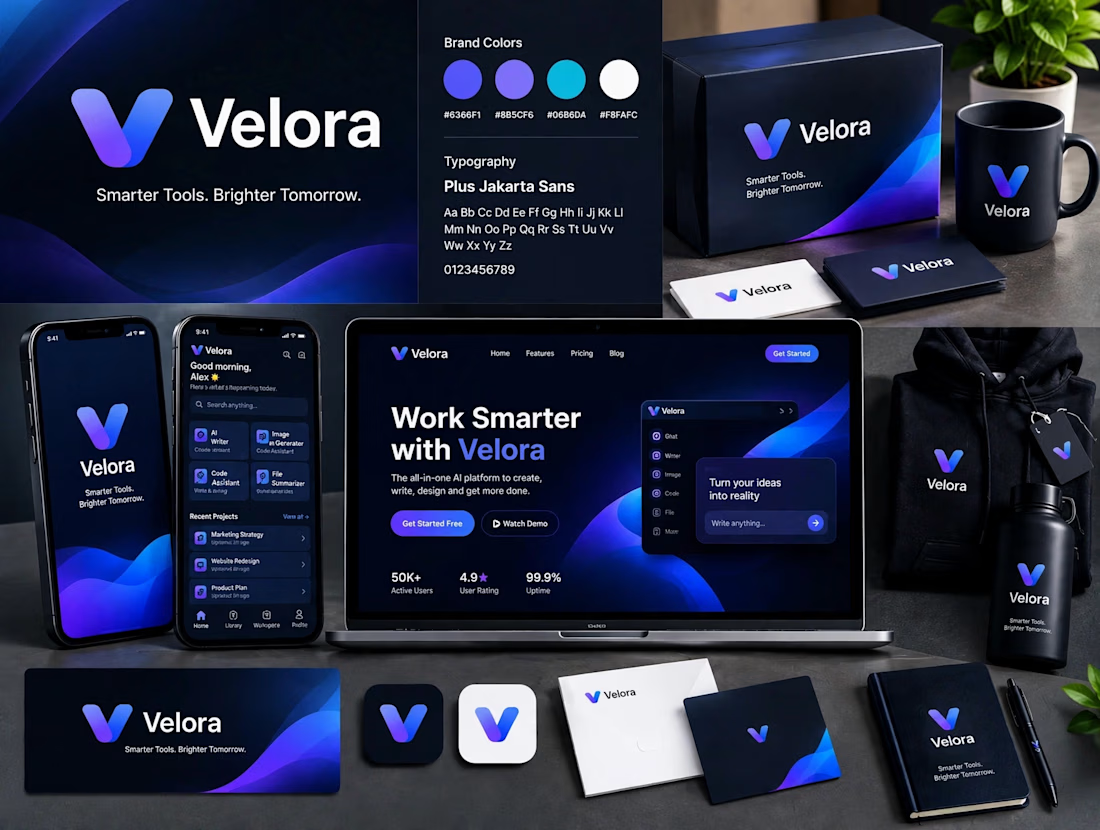

The blue is perfect for this. I’ve seen so many AI brands do boring black/white but this gradient gives it energy. And Plus Jakarta Sans was a great choice, keeps it friendly.


Some flavors take you back to a place. Some bring a memory to life.
Ferma Kumbusha is a beverage branding concept built around the connection between flavor, culture, and the moments we carry with us. From the packaging to the typography and visual details, every element works together to tell a story that feels authentic, distinctive, and full of character.
Because great branding doesn't just catch your eye. It makes you feel something.
#BrandIdentity #PackagingDesign #BeverageBranding #VisualIdentity #BrandDesign

Flavour and memory is a strong idea for a beverage brand because it gives the packaging a story to carry rather than a flavour to announce. The typography is doing most of that work here. Is Ferma Kumbusha a concept or heading to shelves?