The network for creativity
Join 1.25M professional creatives like you
Connect with clients, get discovered, and run your business 100% commission-free
Creatives on Contra have earned over $150M and we are just getting started
Back to feedPost

I'm recording a youtube video right now and talking about having a strong portfolio and how important it is to show your work made me remember mine has been dormant for a while 🫣
This is a pretty simple logo animation I did a while ago but for some reason I just love it - maybe it's the colors or just the simplicity of it?
Would love to hear your thoughts!


I like how it makes you stay curious to see the full logo reveal!

Looks good

This looks awesome! 👌
thanks!

There's something about the pieces that stay simple that end up aging the best, the complicated ones are usually what starts to feel dated first. What's actually stopping you from updating the portfolio, is it a time thing or more not knowing which recent work to lead with?
it's also quite simple - just forgetfulness lol

Awesome animation!


Amazing work👏🔥🔥
The network for creativity
Join 1.25M professional creatives like you
Connect with clients, get discovered, and run your business 100% commission-free
Creatives on Contra have earned over $150M and we are just getting started



Related posts



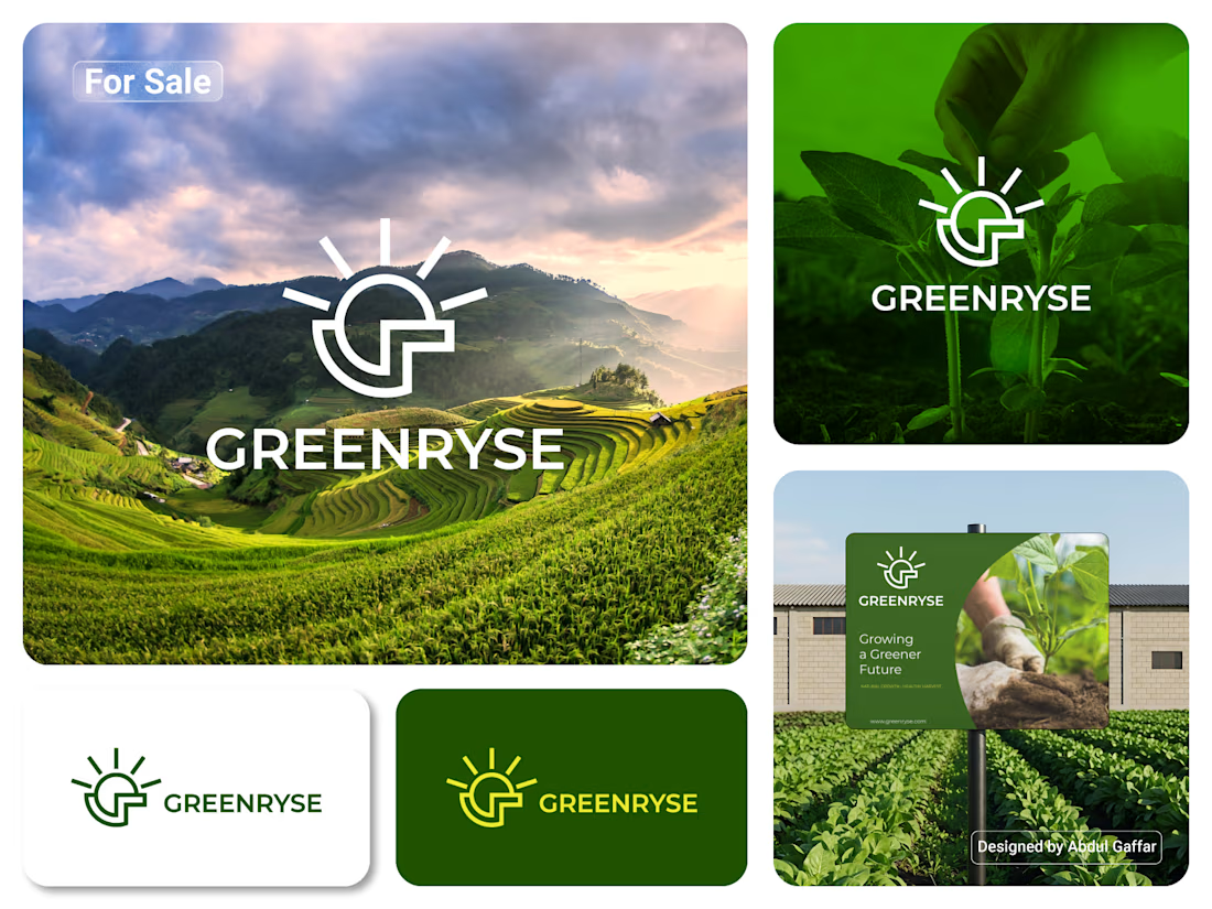
GREENRYSE – G Lettermark, Sun Logo Design, Sustainable Agriculture.
Introducing GREENRYSE, a modern logo concept inspired by nature, agriculture, and the power of growth. The symbol combines a geometric letter G with a rising sun, representing new beginnings, natural energy, and a brighter future for agriculture.
The presentation explores how the logo works across different backgrounds and applications, including agricultural landscapes, product imagery, and outdoor signage. Its clean geometric structure and fresh green color direction create a natural yet professional look.
Designed for agricultural companies, organic farming businesses, crop production, sustainable agriculture, and modern agritech ventures.



Stunning!

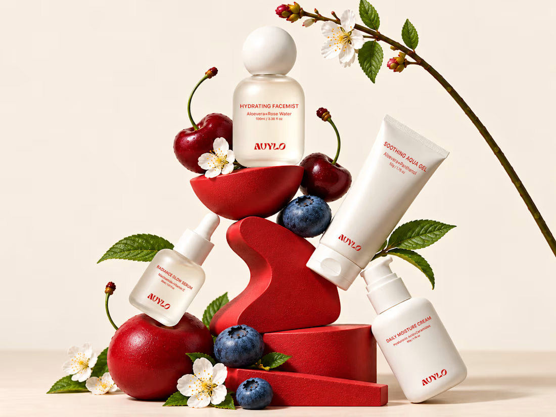
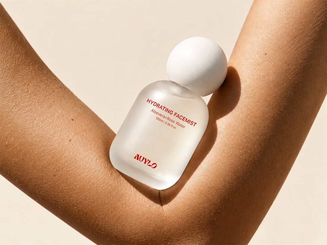
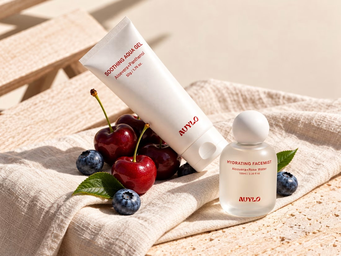
AVYLO Skin Care Packaging Design

Good job