The network for creativity
Join 1.25M professional creatives like you
Connect with clients, get discovered, and run your business 100% commission-free
Creatives on Contra have earned over $150M and we are just getting started
Back to feedPost

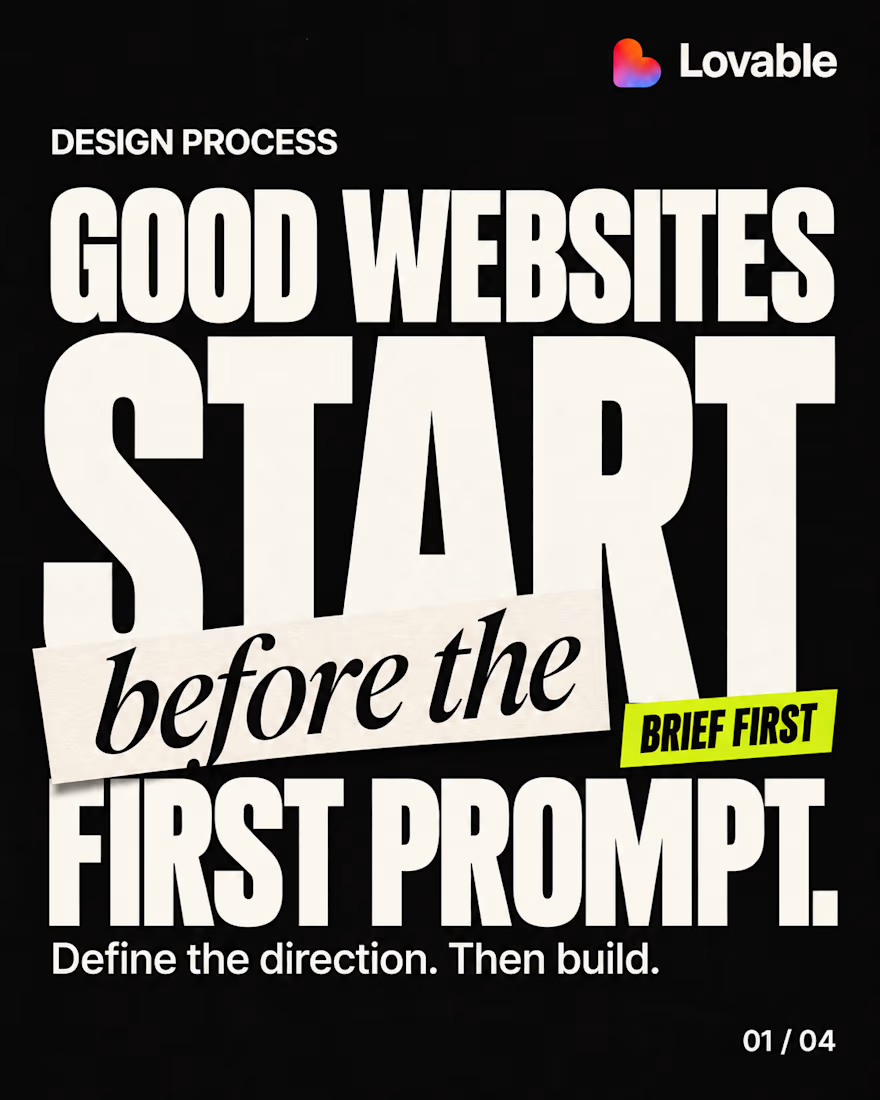
Good websites start before the first prompt.
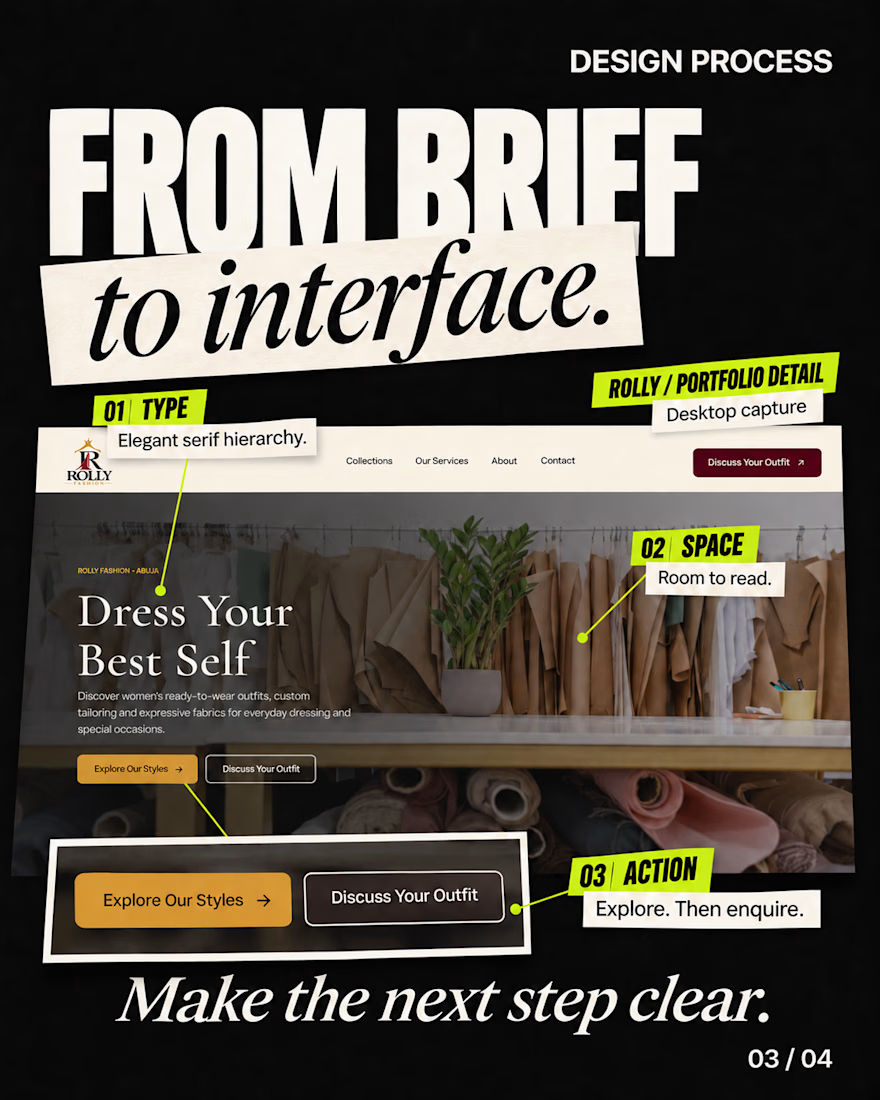
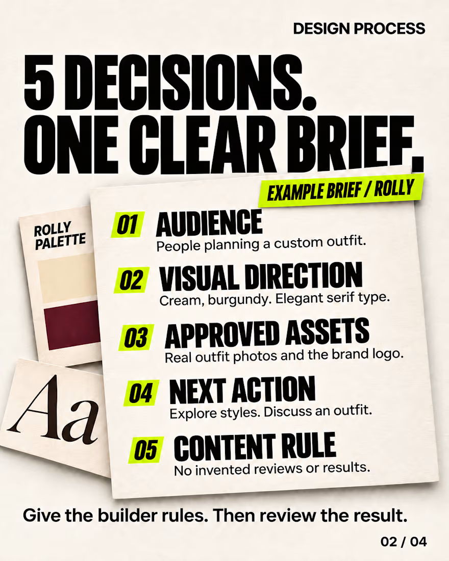
Define the audience, visual direction, approved assets, and what visitors should do next. Then turn those decisions into typography, layout, and clear actions.
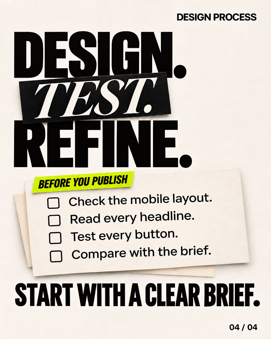
Using my Rolly website as a visual example, this carousel breaks down a simple brief structure—and the checks to make before publishing.
Have a website idea? Let’s give it a clear direction.
#Lovable #WebDesign #UIUX


The network for creativity
Join 1.25M professional creatives like you
Connect with clients, get discovered, and run your business 100% commission-free
Creatives on Contra have earned over $150M and we are just getting started





Related posts

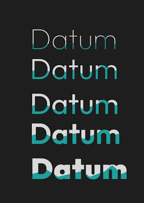
What happens to a logo the moment you ask an AI to move it? 🌊
I gave ChatGPT my Datum type system, five weights partly filled with water, and asked for a looping GIF where only the tide moves.
First try: it dropped a row, redrew the letters, turned my flat teal into glossy cyan and cycled the whole stack instead of the water.
So I steered it. Only the water line moves, everything else stays locked, and the last frame matches the first. The second try kept all five rows and the type intact, with a seamless 5 second loop built with ffmpeg.
Still to fix: thin seams in the teal at the tide’s peak, and the rows rise in sync instead of rolling like a swell.
Original on the left, loop on the right.
Which of your stills would you animate first, and what are you afraid it would break? 👇


Does your coaching program look like a method, or like a list?
A client of ours teaches a three-stage method for course creators. In the first draft it lived in a bullet list, and nobody remembered it.
So we gave it a shape:
One line connects the stages. A visible path tells the reader there is an order, and that they are somewhere on it.
The middle stage gets the weight. Stage two is where the real work happens, so it's the only dark card. The eye lands there first.
Every stage is a verb. Map, Build, Launch. A method people can repeat is a method people buy.
A list explains. A path promises progress.
How do you show a method on a sales page?

I've spent years obsessing over the stuff nobody notices on a website. Until it's missing.
AI can now build a whole site in an afternoon. I think that's great.
But it still can't decide what feels right.
I don't think AI is the problem. It just stops at "it works". The last part, the spacing, the type, the way things move when you scroll, still needs someone who cares about it.
That's the part I've always loved doing. So I made a small thing around it: you bring the site AI built, I finish it in Webflow.
It's called Verdikt https://verdikt.studio


Agreed. AI gets you a working layout fast, but spacing and type rhythm are where it still feels off. I'd add forms and mobile checks to that list too. What's the most common fix people bring you?