The network for creativity
Join 1.25M professional creatives like you
Connect with clients, get discovered, and run your business 100% commission-free
Creatives on Contra have earned over $150M and we are just getting started
Back to feedPost
JACQUEMUS × LE CREUSET. This collaboration doesn't exist, but I wish it did. 🍊
Meet La Cuisine — Tableau de Soleil, a speculative campaign concept I've been playing with, set in Capri.
I started with a question: what would happen if these two brands actually designed something together, rather than simply putting their logos next to each other?
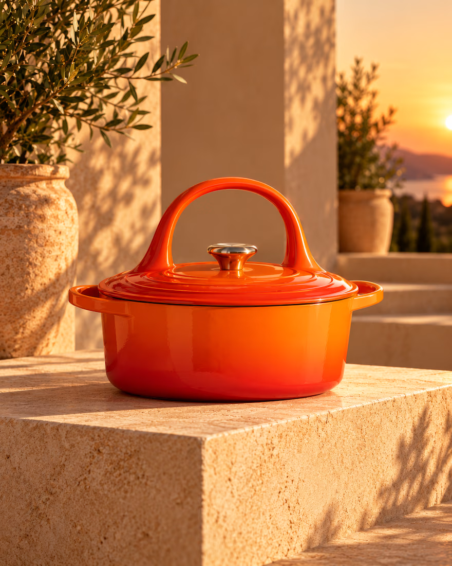
That led to a Le Creuset cocotte with a Jacquemus handbag-inspired handle, a tomato-shaped pot, and a visual world built around colour, sculptural silhouettes and the Mediterranean art of doing absolutely nothing in a hurry.
The most interesting part for me was figuring out how far I could push the playfulness without losing what makes either brand recognisable.
An independent creative exploration, not an official collaboration.
Now I'm curious: which would you actually want them to make — the tangerine handbag-handle cocotte 🍊 or the tomato pot 🍅?
#ArtDirection #ConceptDesign

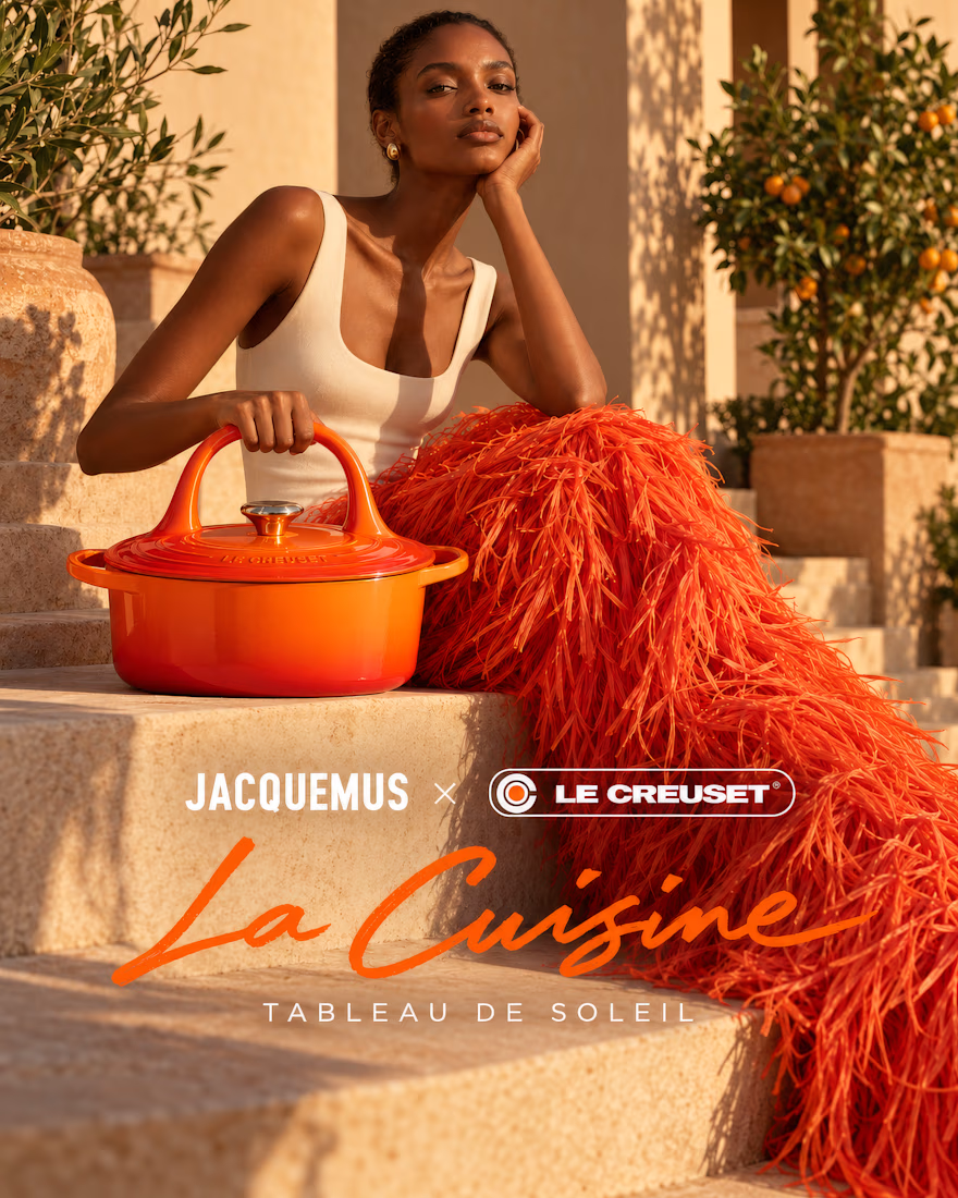
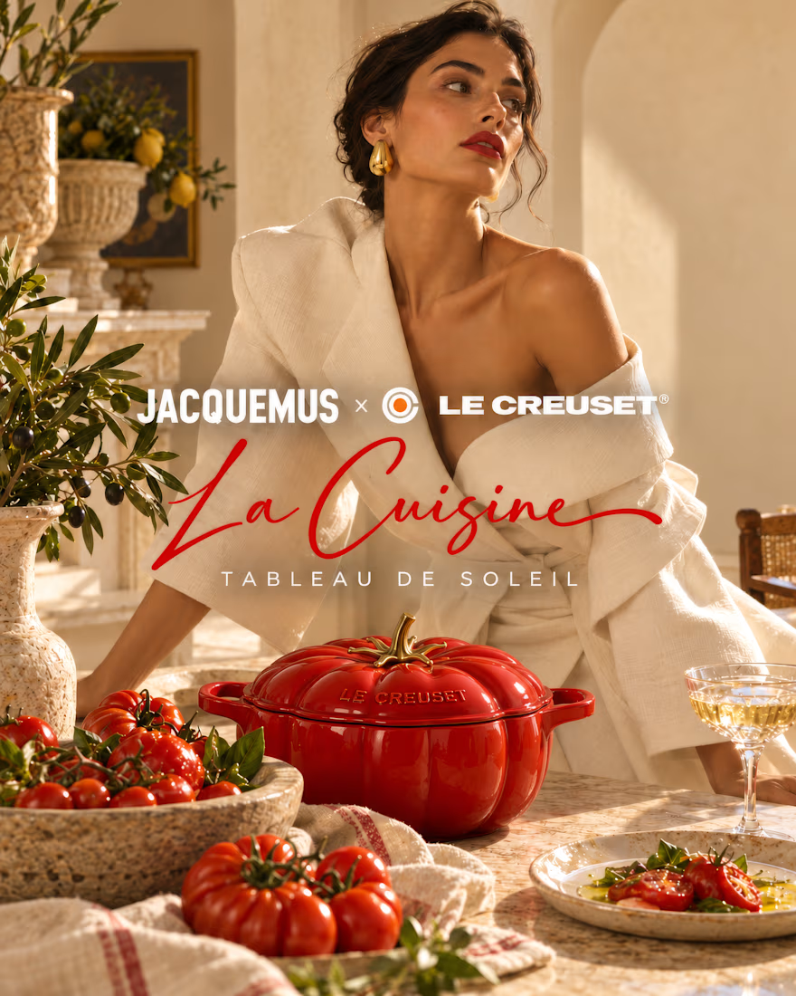
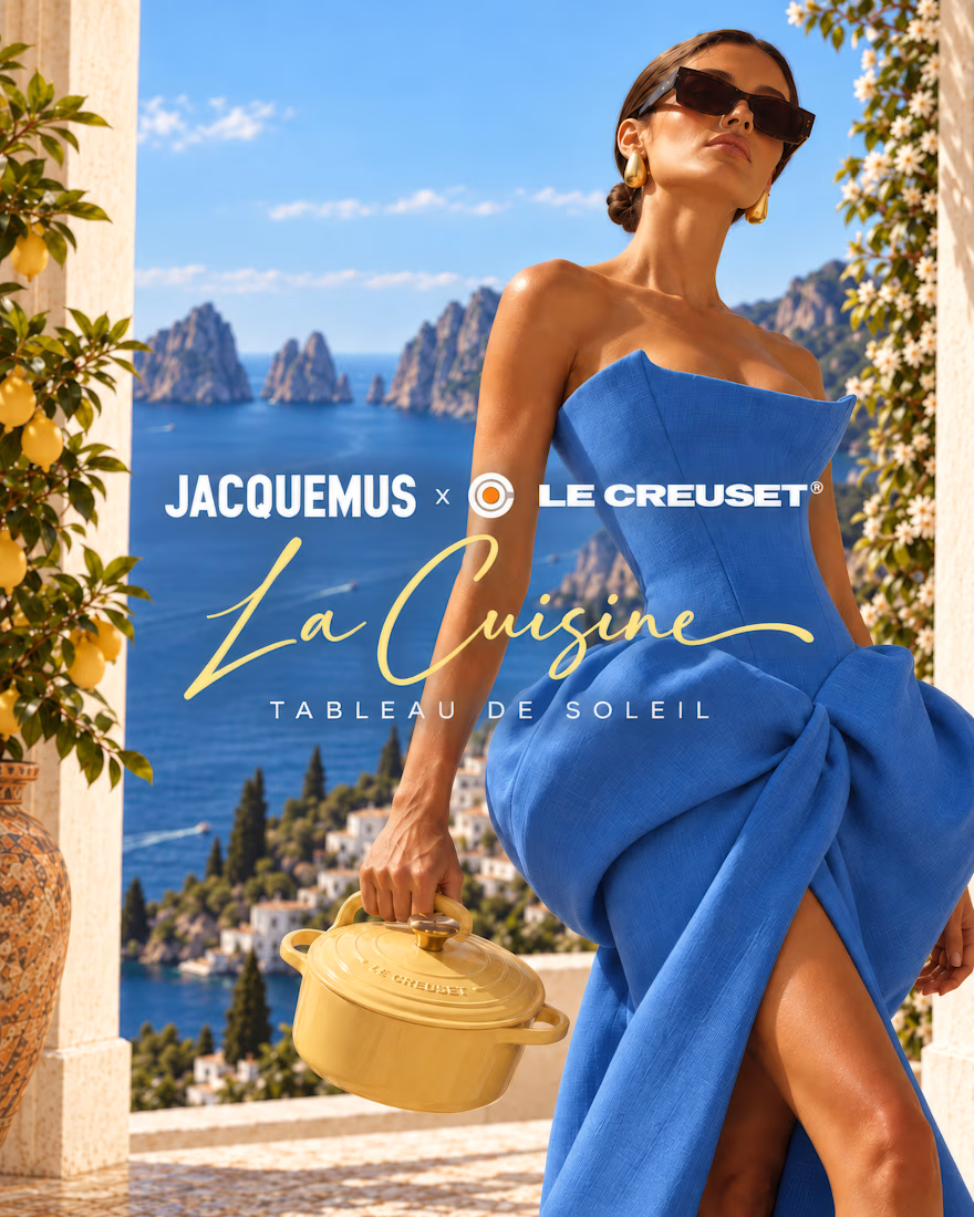

The tension between playful design and brand recognition is a real challenge. Pushing a silhouetted handle on a cocotte tests how much visual identity a brand can swap before its core product recognition disappears.


This is exactly the kind of conversation I was hoping this concept would spark! I kept wondering how far I could push Jacquemus' playful, sculptural language while still retaining the elements that make a Le Creuset cocotte instantly recognisable. The handle became my little...
The network for creativity
Join 1.25M professional creatives like you
Connect with clients, get discovered, and run your business 100% commission-free
Creatives on Contra have earned over $150M and we are just getting started



Related posts

generated these little fellas for a concept and now i want to build a whole brand around them.
if you're making something that helps people dream and aspire, they're looking for a home:)



adorable!🥹

Brand work for HauntChain
I'm loving building this brand and the results so far
A deFi platform with some gamification


That's cute ❤️

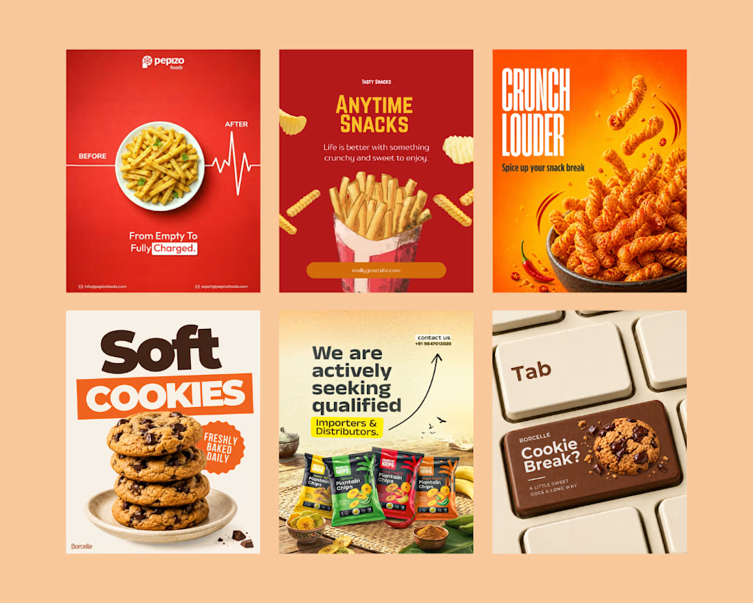
Created eye-catching social media creatives for a snack brand, focusing on mouth-watering visuals, bold typography, and engaging layouts.
The designs highlight product appeal, grab audience attention, and help the brand promote its snacks, offers, and new launches effectively across social media.
Social Content DesignphotoshopposterdesignSocial Media MarketingTypographyAdobe PhotoshopCanvaChatGPT



great job🙌