The network for creativity
Join 1.25M professional creatives like you
Connect with clients, get discovered, and run your business 100% commission-free
Creatives on Contra have earned over $150M and we are just getting started

The network for creativity
Join 1.25M professional creatives like you
Connect with clients, get discovered, and run your business 100% commission-free
Creatives on Contra have earned over $150M and we are just getting started



Related posts

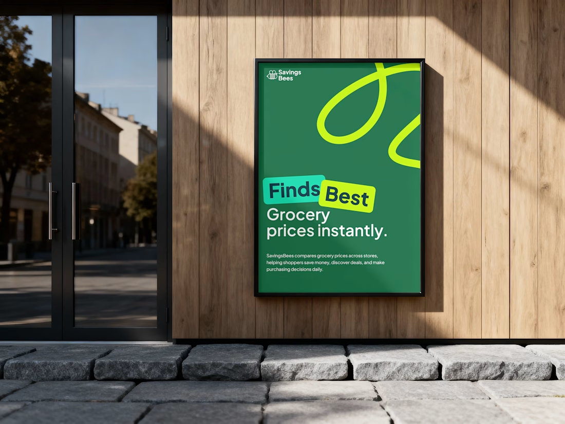
SavingsBees — Making smarter grocery shopping easier
Industry: Retail technology / grocery
Project: Advertising poster
Deliverable: Outdoor advertising design
The business challenge
Grocery shoppers often struggle to compare prices across different retailers, making it difficult to identify the best deals and manage everyday spending.
The objective was to communicate SavingsBees' core value proposition instantly and attract attention in a competitive advertising environment.
The design approach
I combined a bold headline, high-contrast typography, and a distinctive green color palette to establish immediate brand recognition. The playful graphic elements reinforce the brand identity, while concise messaging communicates the primary benefit without unnecessary information.
The visual hierarchy emphasizes the central promise: finding the best grocery prices instantly.
The business value
The resulting advertising concept transforms a functional price-comparison service into a clear, memorable consumer proposition, helping communicate its value, strengthen brand awareness, and encourage potential users to explore the platform.
The result: a recognizable advertising concept that makes everyday savings simple to understand and hard to overlook.




I read a founder's launch of an open standard for cookie banners. One reply called it the most unglamorous useful thing ever. Fair.
If you sell to big companies in Europe, the banner is part of their first look at you.
• If you run analytics or ad pixels for visitors from the EU or UK, get consent before those scripts load
• Make reject as easy as accept
• Keep it in your brand, not a default grey box
• Link your privacy page and a security page from the footer
Legal and security teams read these pages when they review a vendor. I learned that designing for banks.
Who on your team owns the cookie banner?


Landing page design for Lumo — banking for freelance life
Banks sell control — dashboards, charts, a card floating at fifteen degrees. Freelancers don't want control over their money. They want to stop thinking about it in the gap between sending an invoice and the money landing.
That gap is what the page is built on. The product sits in a meadow instead of on a dark grid, because the promise isn't "manage your finances better" — it's "we handle the part that keeps you up." And the strongest line on the page isn't a feature: no waiting for Monday. Freelancers don't lose weekends to fees. They lose them to timing.
The proof follows the same rule. One freelancer, one number — 4% lost on every international payment. A percentage someone can check against their own account beats any adjective.


great visuals 🙌