The network for creativity
Join 1.25M professional creatives like you
Connect with clients, get discovered, and run your business 100% commission-free
Creatives on Contra have earned over $150M and we are just getting started
Back to feedPost

Web3 Gaming & Rewards Platform Dashboard for Powerblocks.io


The network for creativity
Join 1.25M professional creatives like you
Connect with clients, get discovered, and run your business 100% commission-free
Creatives on Contra have earned over $150M and we are just getting started








Related posts


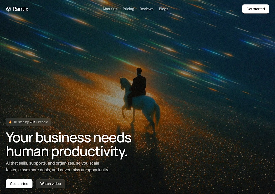

Great design the visual effects is unique 🎉🎉


This is what happens when payments meet motion 🔥.
Every tap. Every transition. Every sound effect 🎧.
Built a fully animated payment transfer prototype. Turn your sound ON. Trust me, you’ll feel the difference.


I love this


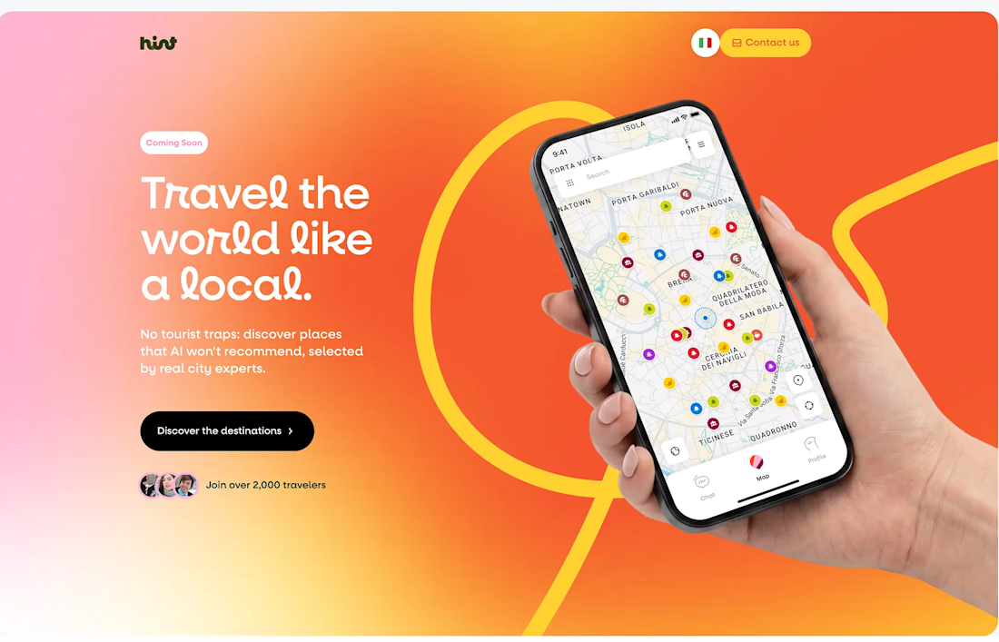
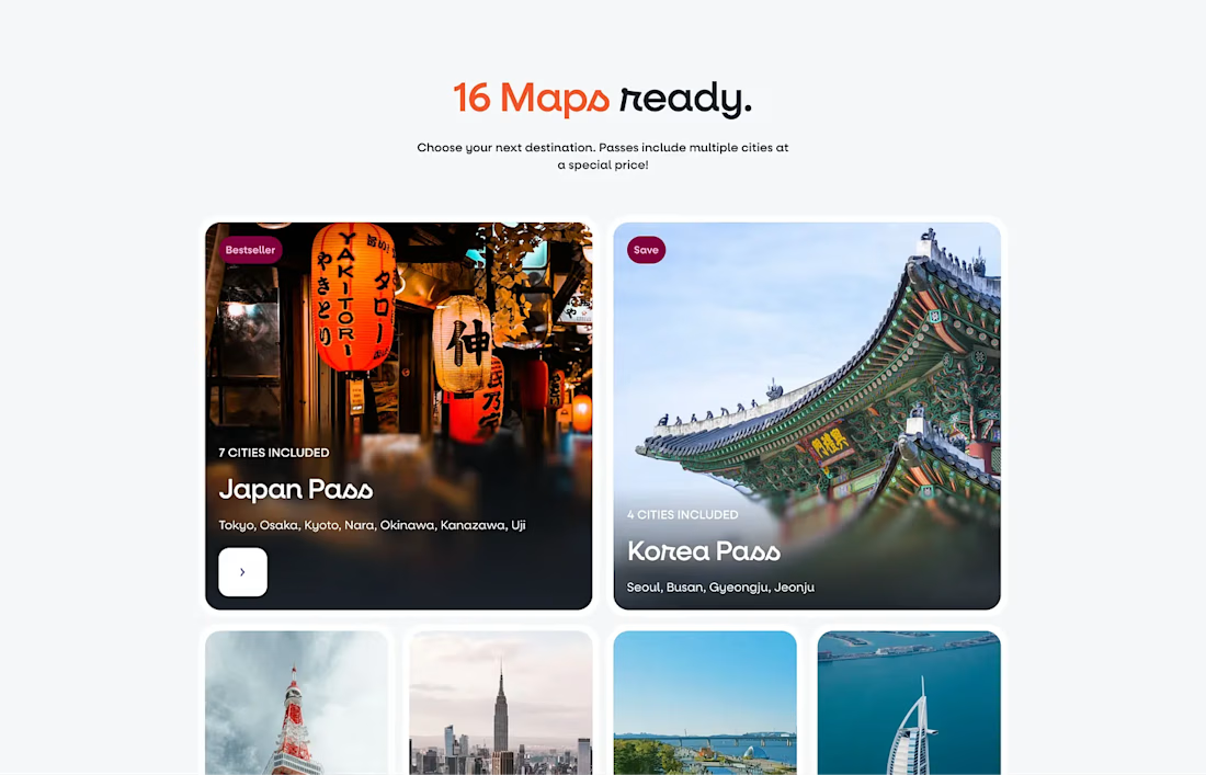
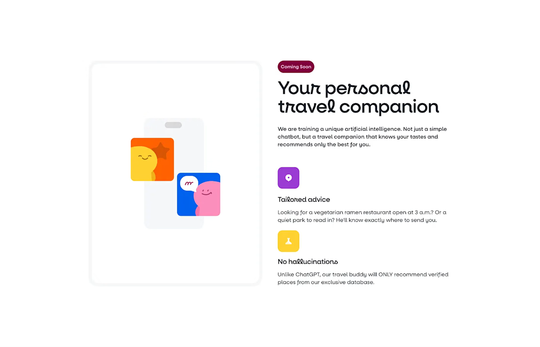
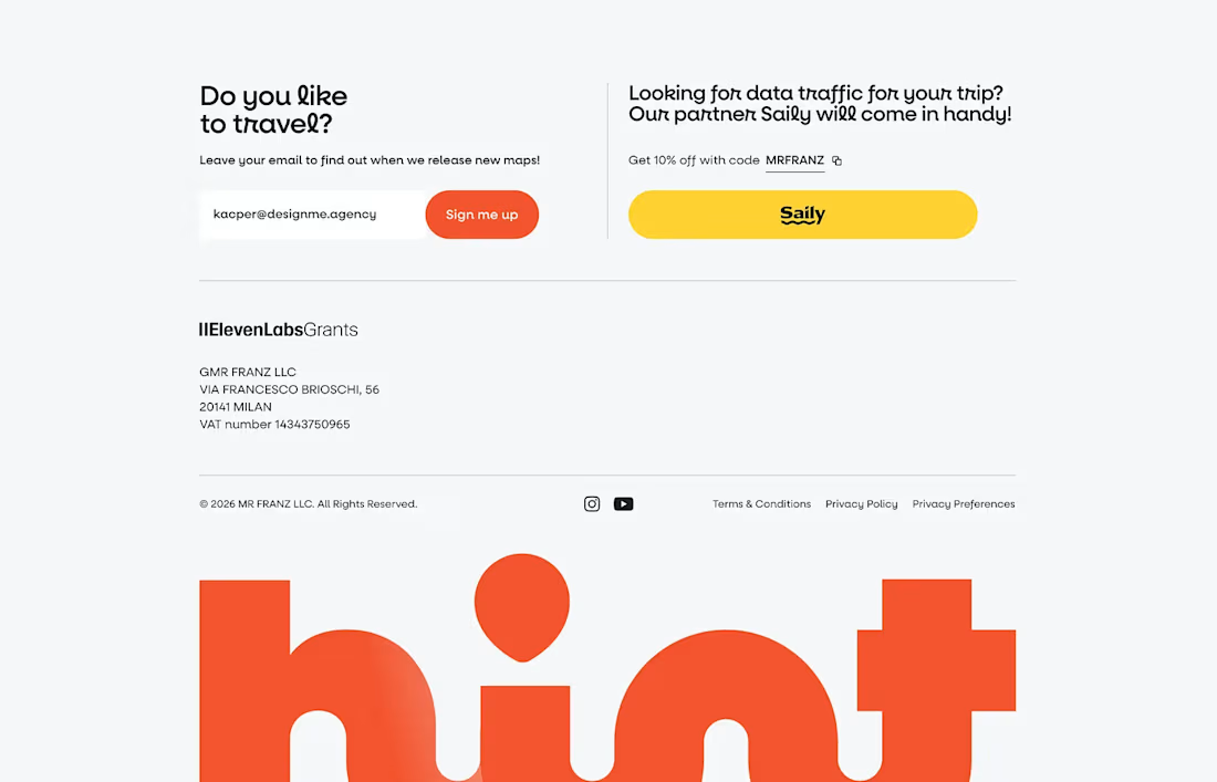


The design feels clean and inviting. Love the direction for Hint!