The network for creativity
Join 1.25M professional creatives like you
Connect with clients, get discovered, and run your business 100% commission-free
Creatives on Contra have earned over $150M and we are just getting started
Back to feedPost

High River makes small-batch hot sauce in New York with no extracts and no fillers. It’s also the team behind the NYC Hot Sauce Expo. The brand has plenty of personality, with loud bottle art, award wins and a real festival community, so we wanted a store that feels as fiery as the product. This is a self-initiated concept, built to show how the brand could look and sell on Shopify.
The challenge
Hot sauce is an impulse buy, and it’s a crowded shelf. The site had to do four things:
Make nine different sauces easy to compare and choose between
Turn one-time buyers into repeat customers
Bring the Expo and festival side of the brand into the store
Earn trust quickly through awards, origin story and real reviews
The design direction
We went with a retro, comic-book look: heavy condensed headlines, thick black outlines, offset card shadows and a palette of chilli red, mustard yellow, cream and deep navy. Sauce-drip dividers run between sections, sunburst backgrounds frame the products, and scrolling ticker bars carry the brand promises: Small Batch · No Fillers · Award Winning · Made in NY.
Key sections
“Crank Up Your Bottle” hero: the full lineup sits in a smoky, fiery illustrated scene, with clear calls to action to shop the sauces or join the club.
“Pick Your Poison” flavour finder: a carousel of sauce cards. Each card shows a heat meter, a flavour profile and a tasting note, with a one-tap “Grab a bottle” button. Picking a sauce feels more like a game than a scroll through a catalogue.
Create-a-Case: customers build their own 12-bottle mix.
“Heat On Repeat” subscription builder: choose 3, 6 or 12 bottles, then one-time or subscribe and save. The price updates live, so the value of subscribing is clear right away.
“Come Taste It In Person”: the NYC Hot Sauce Expo gets a ticket-style feature with dates and a buy-tickets button, plus a “find us on the road” festival schedule.
Brand in numbers: 9 sauces, first bottle in 2011, 13 expos, 0 extracts or fillers.
“What The Burned Say”: reviews on tilted, highlighted cards, styled like notes pinned to a board.
“Built On Real Peppers”: a short origin timeline (2011 → 2013 → today) on a navy section.
“Judged Blind, Won Anyway”: an award wall with year-by-year wins tied to specific sauces.
“Fresh Out The Kitchen”: a news and drops feed with filter tabs for Expo, product and awards.
Footer: a giant scrolling HIGH RIVER marquee over a field of illustrated peppers.
Interaction and motion
Every section has its own motion: the hero bottles rise in, the tickers scroll, the flavour cards change with a radial burst, sauce drips mark the section breaks, and buttons respond with playful hover states. The motion has a job, too. It slows people down on the parts that sell, like the flavour cards, the subscription builder and the reviews.
Outcome
The result is a store that matches the attitude of a small-batch sauce brand and is built around what drives revenue for one: easy flavour discovery, bundles, subscriptions and community. It shows High River as more than a product page, as a brand people want to taste, collect and come back to.


The comic-book look with sauce-drip dividers suits a loud hot sauce brand perfectly. How did you handle comparing nine sauces on mobile without it turning into a long scroll?
The network for creativity
Join 1.25M professional creatives like you
Connect with clients, get discovered, and run your business 100% commission-free
Creatives on Contra have earned over $150M and we are just getting started


Related posts

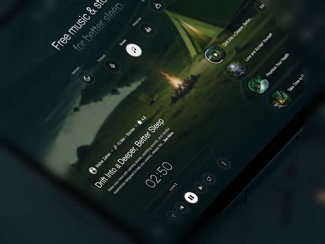
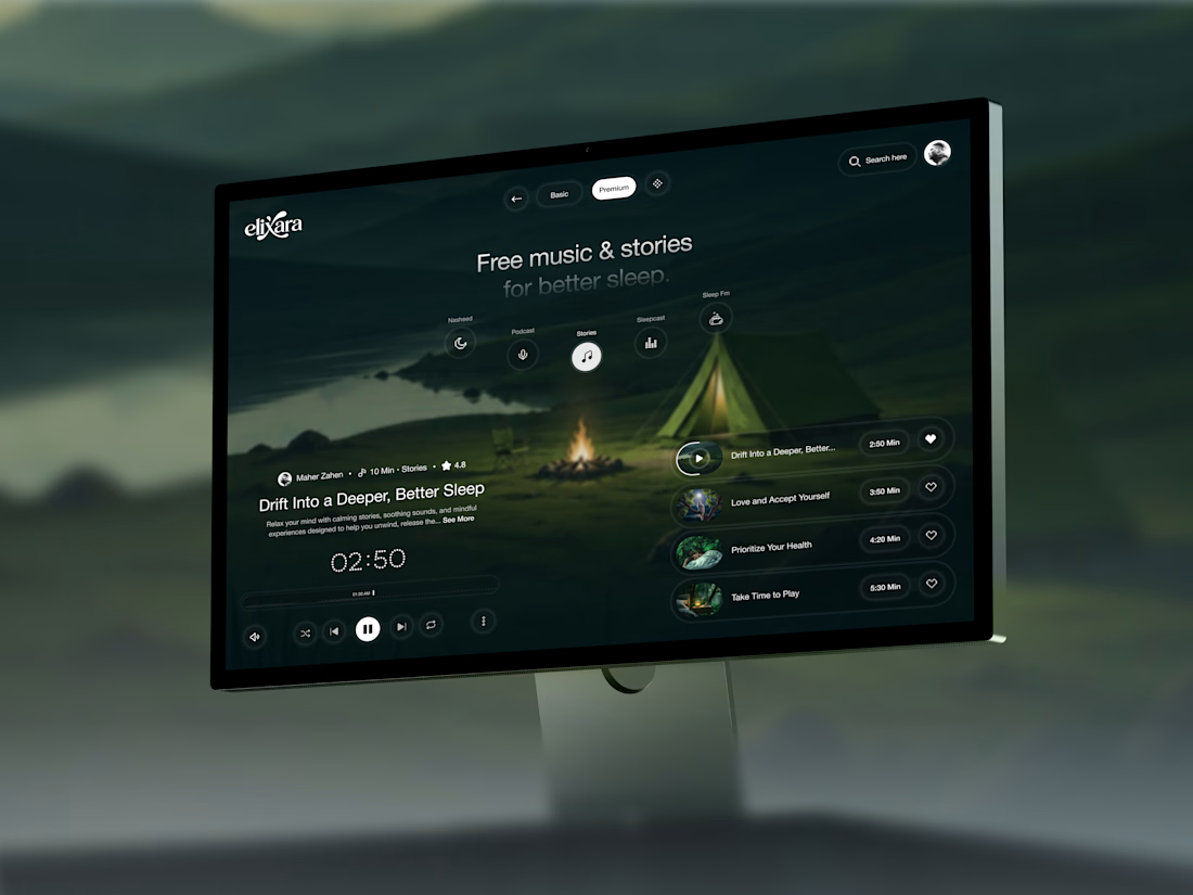
Your body is ready for sleep. But is your mind ready to switch off?
That’s the moment Elivara is designed for.
Instead of another endless scroll, imagine opening an experience that makes slowing down feel natural.
Because better rest starts with how you end your day.
Would you trade 20 more minutes of scrolling for 20 minutes of peace?
#SleepApp #UIUXDesign #ProductDesign #WebDesign #MotionDesign



Great UX understands the user's state of mind, not just what they want to click.

Tendee - Dating App UI UX Design
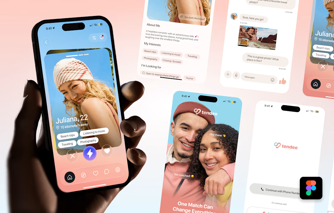
A mobile app UI design showcase focused on discovery, profiles, matching and conversation.
The visual challenge was to bring profile content, interest tags, primary actions and messaging into a consistent mobile experience. The design uses a soft lavender and coral palette, clear typography, rounded cards and recognizable navigation.
The selected mockup presents a profile discovery screen, detailed profile information, chat, onboarding and sign-in views. These screens demonstrate visual hierarchy, consistent interface styling and attention to mobile interactions.
Personal portfolio showcase. Project cost is an illustrative quote for comparable design work, not a past client payment. The date marks this showcase's preparation in October 2026; duration is an estimated production timeframe.

Love the colors!

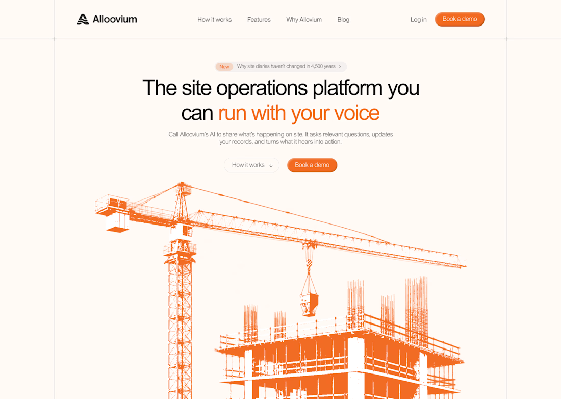
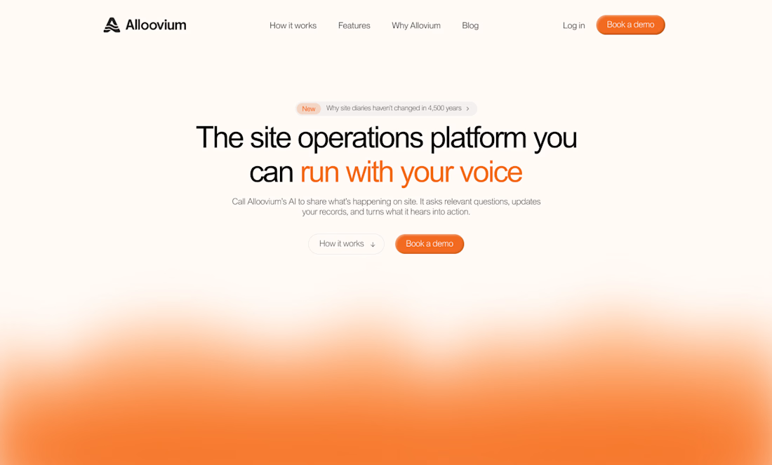
've reviewed 50+ startup websites, and I noticed a pattern.
Their hero sections are often simple. They tell you who the product is for and what it does.
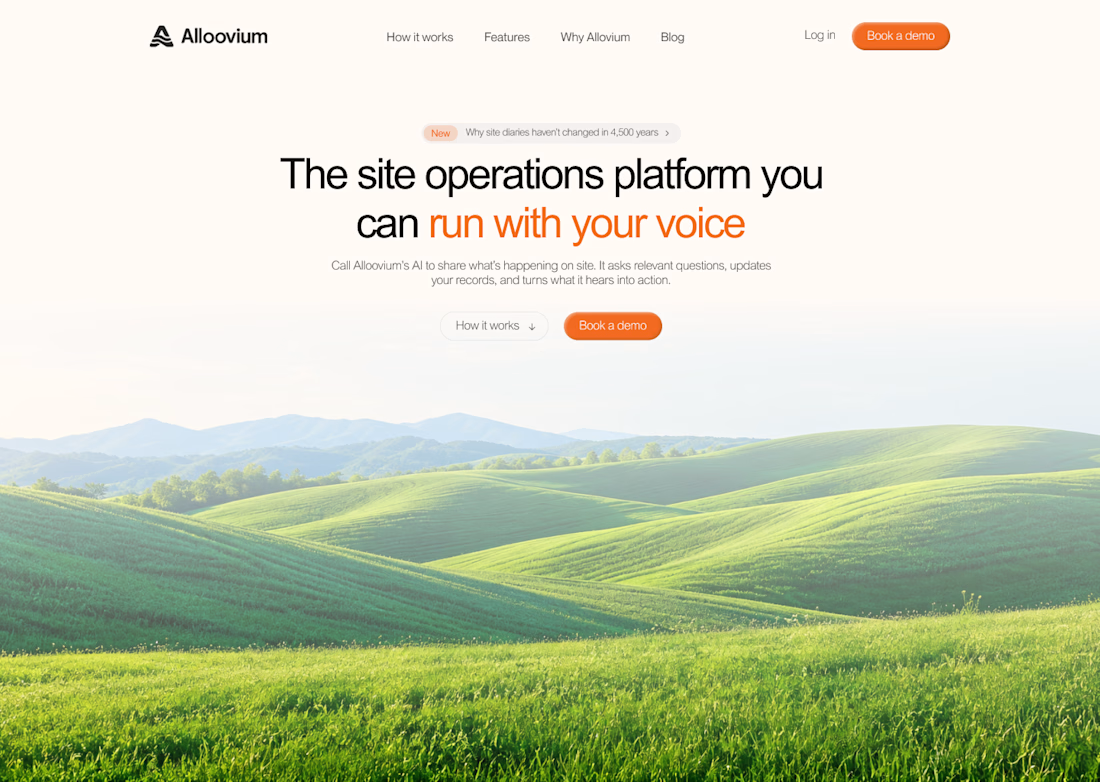
While working on this redesign concept for
@Alloovium, I wanted to explore a different direction.
Their original website already explained the product and its audience.
But what if the hero also used visuals that reflected the world their customers work in?
People often scan websites before deciding what to pay attention to.
Relevant visuals can catch their attention and create a connection with the audience before they start reading.
So I explored a few visual directions inspired by the construction industry.
Building a startup? I'd love to help you explore a new direction for your website.

The construction visuals work well.