The network for creativity
Join 1.25M professional creatives like you
Connect with clients, get discovered, and run your business 100% commission-free
Creatives on Contra have earned over $150M and we are just getting started
Back to feedPost
Taste Test
I am currently working on a portfolio website design project and would like to know which direction the Hero section should follow.
Should the image be centered or on the right?
#uiuxdesign #porfoliowebsitedesign #resumedesign
4 voted
57%
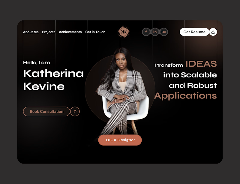
3 voted
43%
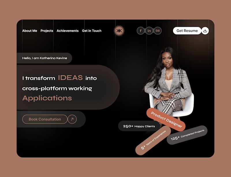
7 votes
Closed

I’d choose the image-right version. It gives the headline a clearer reading path and leaves more room for a strong CTA without making the hero feel crowded.

Oh, okay, thank you for your feedback.
Also, can you please vote on your choice?

Image-right for me, it keeps the eye moving left to right straight into the CTA instead of splitting attention down the middle. Is this hero for your own portfolio or a client project?
Thank you for your feedback and it's for a client portfolio.
The network for creativity
Join 1.25M professional creatives like you
Connect with clients, get discovered, and run your business 100% commission-free
Creatives on Contra have earned over $150M and we are just getting started





Related posts

Which hero visual feels right for this brand?
While working on the homepage for Halfspace, a website design and SEO agency, I explored two different hero visuals for the same headline and layout. Same message, same structure, just a different visual metaphor and mood.
Option 1 - Rocket Launch. Bold, literal, and energetic, visually reinforcing the "launch your business" message with motion and fire.
Option 2 - Glass Cube. Abstract, sleek, and premium, giving a more refined, tech-forward feel without relying on a literal metaphor.
Would love your honest UX/UI take, which direction feels more impactful, memorable, and aligned with a web design/SEO brand, and why?
11 voted
41%
16 voted
59%
27 votes
Closed

Both design are great; it's hard to choose one


Both of them are great but the bottom one is better because it's visibility great job 🎉🎉🔥🔥


Which is the better clip to kick start the new 'campaign' for Lowkey.Club
1 voted
20%
4 voted
80%
5 votes
Closed

Optical is new fresh & good to eye