The network for creativity
Join 1.25M professional creatives like you
Connect with clients, get discovered, and run your business 100% commission-free
Creatives on Contra have earned over $150M and we are just getting started
Back to feedPost

If you're a relationship coach and your website isn't booking consultations for you — this post is for you.
Meg came to me with a coaching practice that was already working. Couples loved her. Results were real. But her website was doing absolutely nothing to show that.
No clear flow. No brand warmth. Nothing that made a struggling couple land on the page and feel "these are the people who can help us."
So I got to work.
I built her a full relationship coaching website for her Austin-based practice — structured around three coaching paths so visitors could immediately find what fit their season. Pre-engagement, premarital, marriage. Clean navigation, warm visuals, Google reviews front and center, and a booking flow that made the next step obvious.
By the end, her site wasn't just pretty — it was working like a second team member, filtering the right couples and moving them toward that first consultation.
"It finally feels like a website that matches the quality of what we actually do."


The network for creativity
Join 1.25M professional creatives like you
Connect with clients, get discovered, and run your business 100% commission-free
Creatives on Contra have earned over $150M and we are just getting started



Related posts


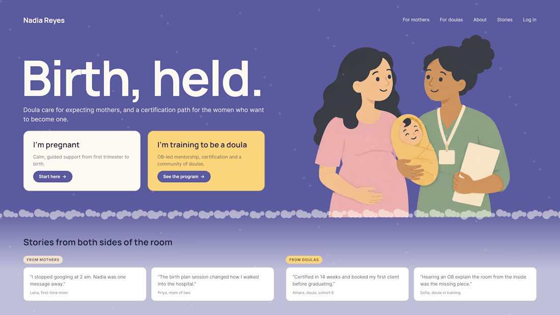
What happens when one website has to talk to two different people?
A client of ours teaches two audiences at once: expecting mothers who want a calm pregnancy, and women who want to become doulas. One brand, one site, two very different reasons to visit.
The usual fix is a hero that speaks to "everyone" and lands with no one. We designed it as a fork in the road instead:
1. Two doors in the hero. "I'm pregnant" and "I'm training to be a doula", side by side, equal weight. The visitor picks a path in one click, and the headline above them stays about the shared value.
2. One voice, two tones. The mothers' path is softer: fewer words, more room, gentle photos. The doula path is more structured: modules, certification, dates. Same fonts, same colors, different rhythm.
One proof section, split in two. Testimonials from mothers on the left, from doulas on the right. Each visitor sees people like them before the price.
Writing for everyone is writing for no one. Give each reader a door.
Have you ever designed a page for two audiences at once? How did you split it?

Really great point! Designing for two distinct audiences under one brand is always a challenge. Excited to see your approach to solving it.


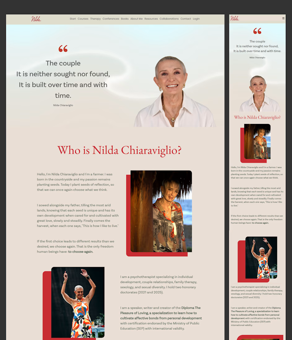
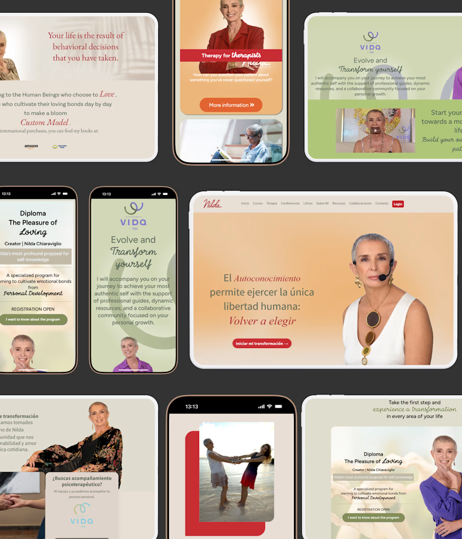
Kajabi Wellness Education Platform Development
Developed a Kajabi-based wellness education platform for Nilda that combined online learning, CRM integrations, and a structured course ecosystem. The project focused on creating an intuitive educational experience, streamlining user journeys, and supporting long-term engagement through scalable platform architecture and conversion-focused design.


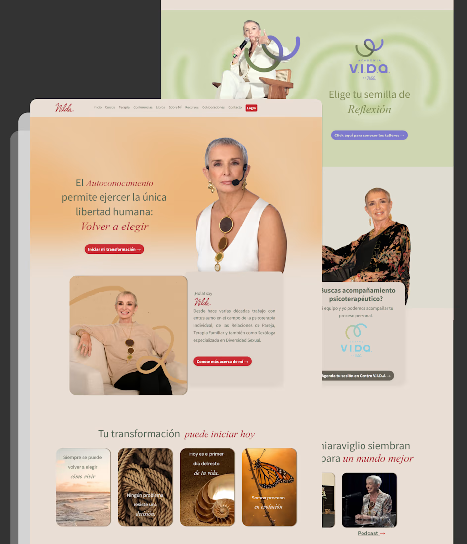
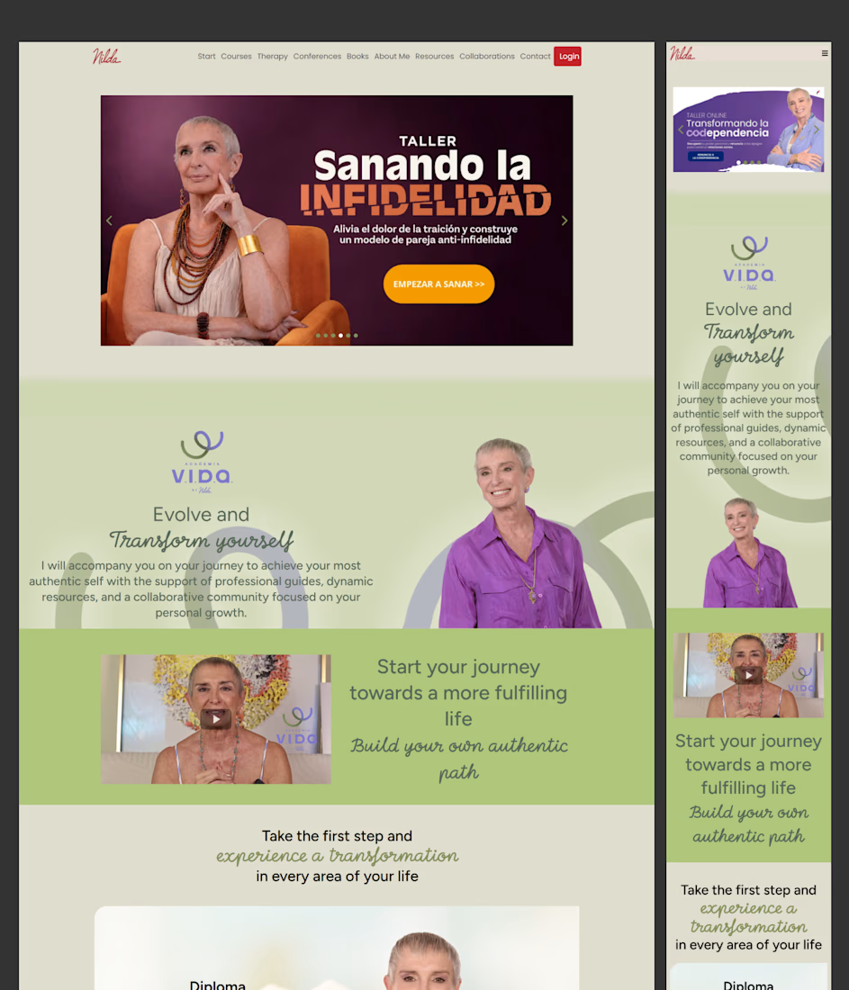

The Kajabi-to-CRM handoff is a useful part of this build to unpack. I’d check that a learner who purchases stops receiving prospect follow-ups and gets the right access message, including when the same email already exists in the CRM. Which system owns that customer-status change here?

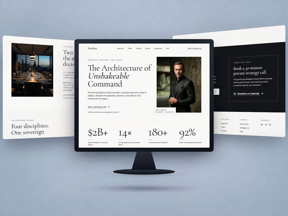
Just wrapped up this executive coaching website project.
The goal was to create a digital experience that feels as strategic and considered as the brand itself.
Built in Kajabi, the website combines editorial typography, a structured coaching framework, and a clear path toward booking a strategy call.
I paid particular attention to how each section flows into the next, keeping the experience cohesive from the first impression to the final call to action.

Awesome Work