The network for creativity
Join 1.25M professional creatives like you
Connect with clients, get discovered, and run your business 100% commission-free
Creatives on Contra have earned over $150M and we are just getting started
Back to feedPost

Land More Interviews with an ATS Optimized Resume!
Is your resume getting rejected before a recruiter even sees it? I can help. As a Career Coach, Resume Expert, and Ghostwriter, I create professional, ATS-friendly resumes and CVs tailored to your target role.
ATS-Optimized Resume/CV
Professionally Written & Branded
Tailored to Your Industry
Fast Delivery, Ready in Just a Few Hours
Let's transform your resume into a powerful tool that gets you noticed. Message me today to get started!


The network for creativity
Join 1.25M professional creatives like you
Connect with clients, get discovered, and run your business 100% commission-free
Creatives on Contra have earned over $150M and we are just getting started











Related posts

My latest Framer template, CAREO, is built for career coaches and consultants. It features a clean, professional layout and is easy to customize, even with basic editing skills.
Check it out: https://www.framer.com/marketplace/templates/careo/


Clean and confident, Redwan. The Let's Take Your Career to the Next Level headline with the warm portrait beside it does the trust building instantly. For coaches buying a template, is the booking flow the part they customize most, or is it mostly the copy?

Behind the scenes: turning a plain listing into an SEO-friendly one. 🔍
Before: "Water bottle. Good quality."
After: "Insulated Water Bottle, 750 ml | Reusable Tumbler with Handle"
My process:
→ Find the main keyword (what would a shopper type?)
→ Put it near the start of the title
→ Add the real details: size, material, use
→ Keep the description clear and easy to read
This is a practice example with a made-up product.

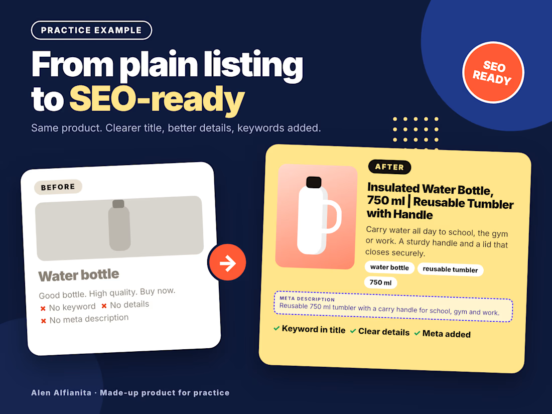

Clean before/after. One thing I'd add for marketplace titles: keep the main keyword and the key detail inside the first ~80 characters, since mobile cuts the rest off. Do you pick the main keyword from search volume, or from what competitors rank for?

Hey everyone! 👋 Working on two wordmark directions for a client and would love a quick typographic gut check from fellow designers.
Which of these two options feels more readable to you? Drop your vote and let me know your thoughts below.
Thanks
8 voted
73%
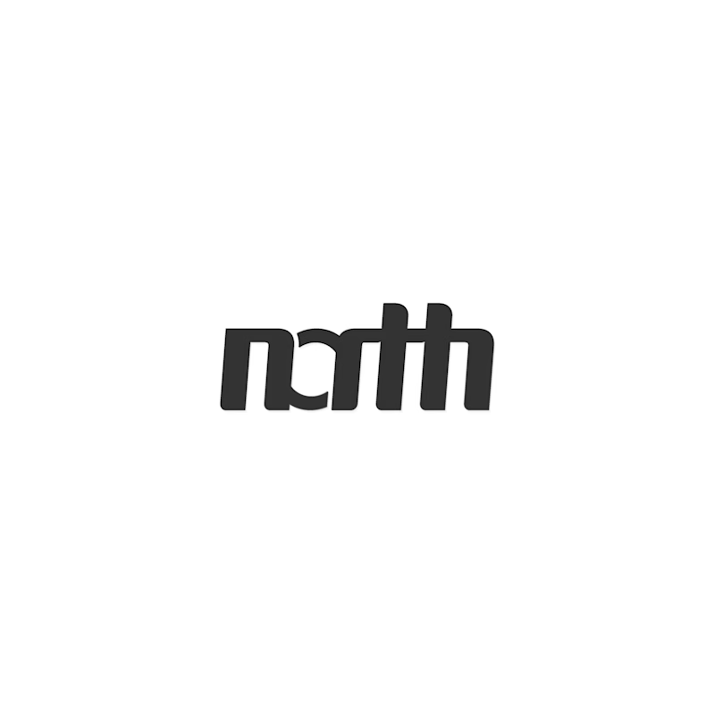
3 voted
27%
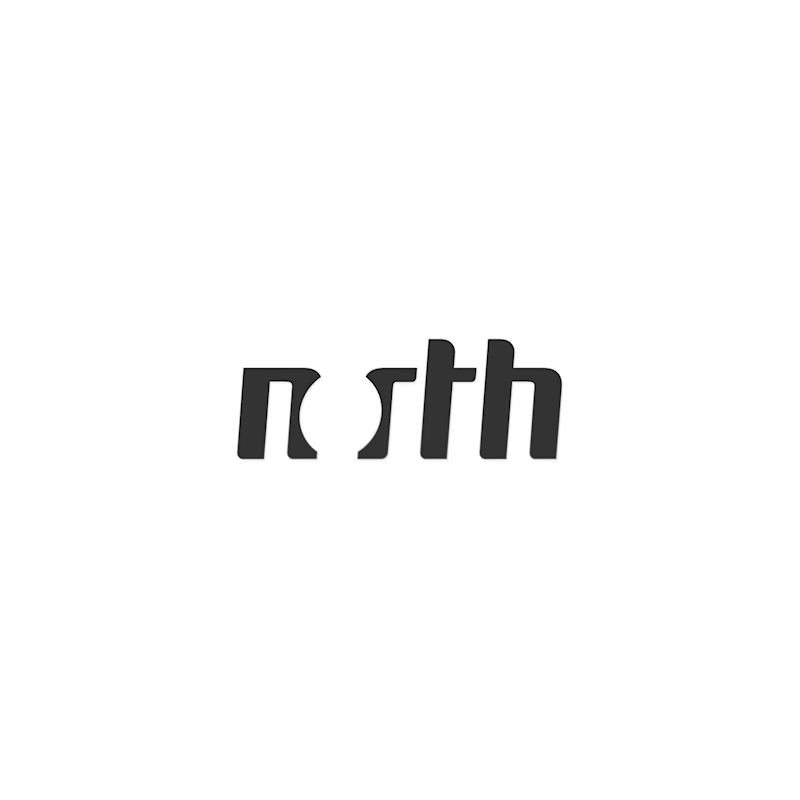
11 votes
Closed

Hey Dumitru! 👋 Great exploration! The first option (nth) has super strong character - that custom n with the curved stem + connected sth ligature feels very bold and editorial. For readability though, the sth connection is a bit tight at small sizes - might read as "rth" at...