The network for creativity
Join 1.25M professional creatives like you
Connect with clients, get discovered, and run your business 100% commission-free
Creatives on Contra have earned over $150M and we are just getting started
Back to feedPost

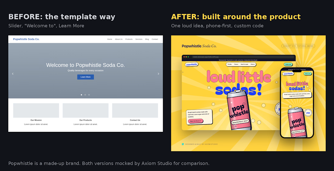
Would you buy a soda from the left one?
Same made-up soda brand, two homepages. Left is the template way: a slider, "Welcome to," a Learn More button, three gray boxes. Right is how we built it: one loud idea from the product itself, designed phone-first, custom code.
Nothing on the left is wrong. It just doesn't tell you anything about the drinks. The right one tells you in a second what it would feel like to open the can.
Popwhistle is a fictional brand. We mocked both versions to show the difference.
Which would you click "buy" on, A or B? Or drop your site below and we'll tell you the one fix we'd make first. 🥤
The network for creativity
Join 1.25M professional creatives like you
Connect with clients, get discovered, and run your business 100% commission-free
Creatives on Contra have earned over $150M and we are just getting started


Related posts


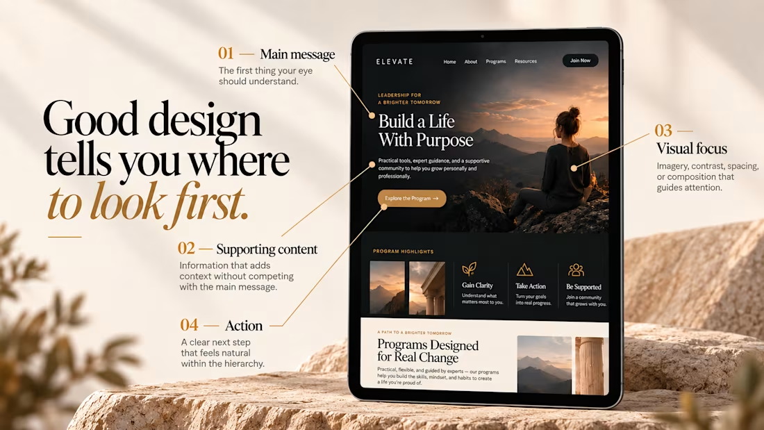
Good design tells you where to look first.
Visual hierarchy isn’t just about making some elements bigger than others.
It’s about creating a clear path through the design — so the viewer knows what matters, what comes next, and where to take action.
01 – Main message
The first thing your eye should understand.
02 – Supporting content
Information that adds context without competing with the main message.
03 – Visual focus
Imagery, contrast, spacing, or composition that guides attention.
04 – Action
A clear next step that feels natural within the hierarchy.
When everything is competing for attention, nothing feels important.
Good design creates focus, flow, and intention.

"Where to look first" is the simplest way to explain hierarchy to clients. Clear breakdown, Serge.

This morning: a design exploration.
Tonight: a whole brand.
Calling. Numbered, glitched, answered.
Case study dropping soon.
Pick up.


Amazing!