The network for creativity
Join 1.25M professional creatives like you
Connect with clients, get discovered, and run your business 100% commission-free
Creatives on Contra have earned over $150M and we are just getting started
Back to feedPost
Taste Test
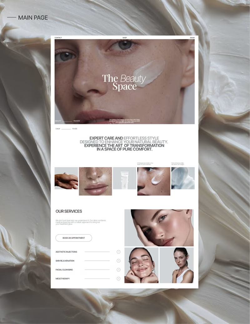
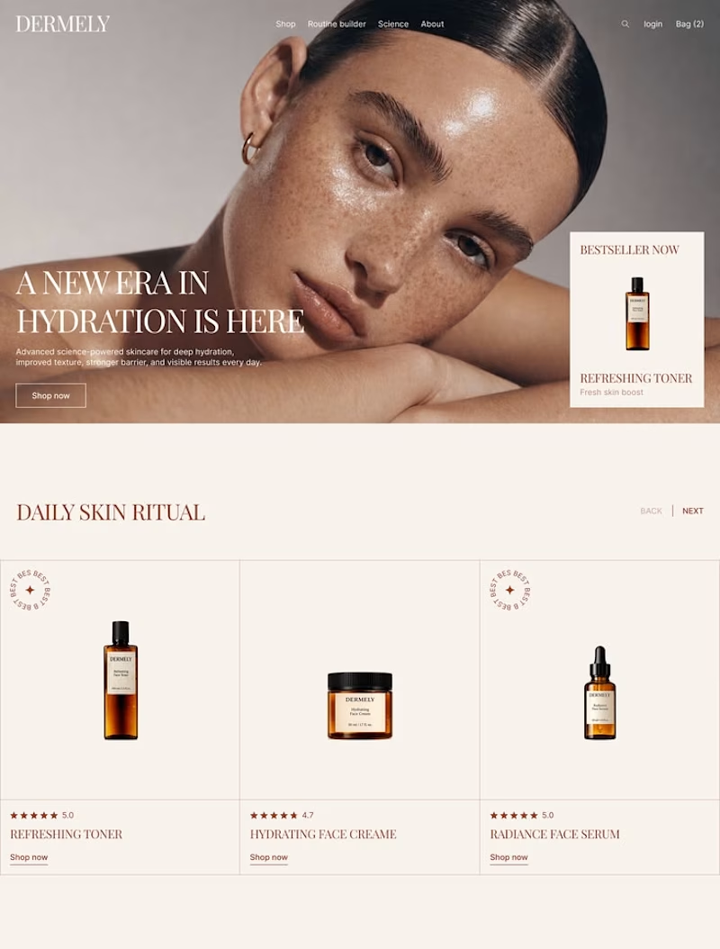

Both directions feel polished—the editorial hero in Option 1 has a stronger first read, while Option 2 makes the product hierarchy immediately scannable. I’d lean Option 1 for the calmer beauty-space storytelling.

Thank you very much, your opinion matters to us. 🔥

Thank you very much, your opinion matters to us. ❤️

Tough call to make

I agree with Option 2. The color palette resonates perfectly with the hydration theme, making the UI feel both elegant and effortless to navigate.

The network for creativity
Join 1.25M professional creatives like you
Connect with clients, get discovered, and run your business 100% commission-free
Creatives on Contra have earned over $150M and we are just getting started

Challenges
View all


Related posts

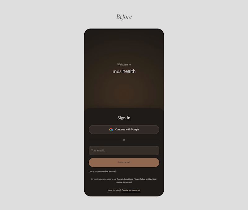
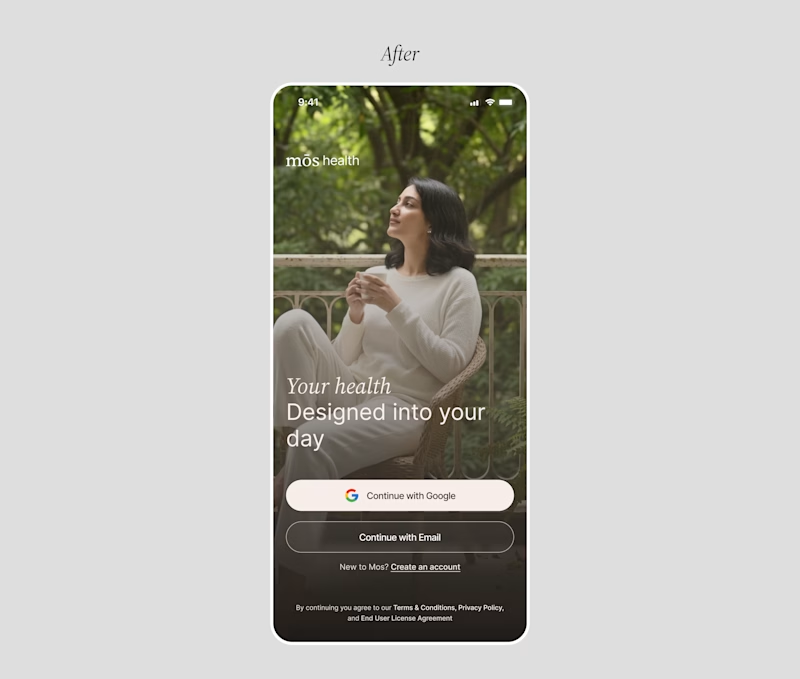
A founder ask me for a feedback on there product, so i started reviewing the healthcare app, and something felt off.
The website felt warm and welcoming. You could tell there were real people behind the brand.
But once you opened the app to sign up, that feeling was gone.
And honestly, for something as personal as healthcare, that matters. People need to feel comfortable before they trust you with their health.
So I worked on the onboarding screen to bring that feeling back.
Nothing complicated. I added a human touch through imagery and kept the screen simple, while making the app feel more connected to the website.
Sometimes, it's not about adding more to a screen. It's about making what's already there feel right.
Which would make you more comfortable signing up:
Before or After?

4 voted
14%
25 voted
86%
29 votes
Closed

Good catch on the disconnect between the website and signup flow. Carrying that human warmth into onboarding feels especially relevant for healthcare. Have you had a chance to test the redesign with new users?

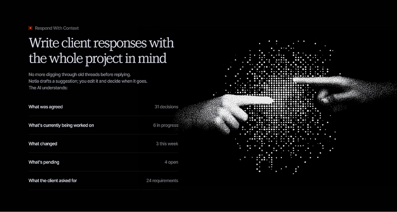
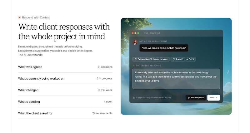
We Finished one of our Cleanest Website recently, and created few ideas during our Initial Explorations.
Which one do you like the most?
Check the Entire Casestudy, Our Process here

4 voted
50%
4 voted
50%
8 votes
Closed

both are looking outstanding

This looks so minimalistic.


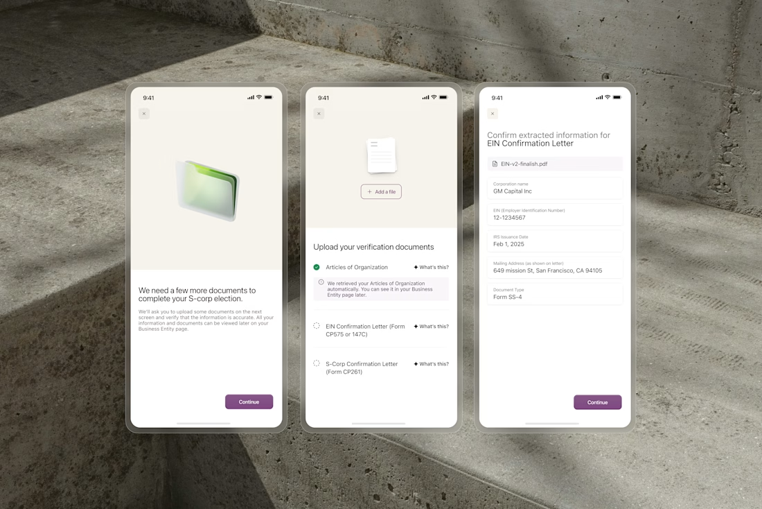
OCR extracts business names, formation dates, and addresses from uploaded documents automatically. But users still need to trust what the system found before anything gets submitted.
We designed the confirmation flow around editable fields that surface extracted data clearly....

Great work.