The network for creativity
Join 1.25M professional creatives like you
Connect with clients, get discovered, and run your business 100% commission-free
Creatives on Contra have earned over $150M and we are just getting started
Back to feedPost

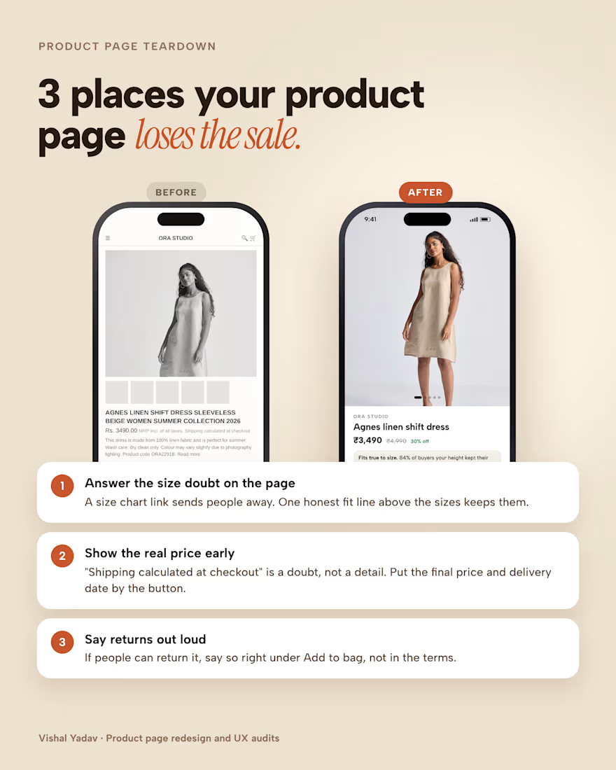
Most product pages lose the sale in the same three places.
1. The size question has no answer on the page. A "size chart" link sends people away. One honest fit line above the sizes keeps them.
2. The real price shows up too late. "Shipping calculated at checkout" is a doubt, not a detail. Put the final price and delivery date right by the button.
3. Returns are hidden in the terms. If people can return it, say so right under Add to bag.
Before and after above. If your product page has traffic but not sales, my UX audit gives you a ranked fix list in 5 days.
The network for creativity
Join 1.25M professional creatives like you
Connect with clients, get discovered, and run your business 100% commission-free
Creatives on Contra have earned over $150M and we are just getting started


Related posts

New E-Commerce Conversion & UX Copy case study live on my profile! ☕️
Specialty coffee brands often lose everyday buyers in two spots: pretentious tasting-note jargon on the product page, and subscription anxiety right before checkout.
For this self-initiated RoastCraft concept, I rewrote the path from product discovery to express checkout:
• Plain-English Flavor Copy: Swapped complex wine-style notes for clear sensory cues ("Milk Chocolate • Toasted Hazelnut • Zero Bitterness").
• Friction-Free Subscriptions: Added transparent microcopy right inside the selector ("Skip, pause, or cancel in one click — no emails required").
• Slide-Out Cart UX: Paired a dynamic free-shipping progress bar with exact roast/ship dates to lift AOV and prevent cart abandonment.
Take a look at the full breakdown on my profile and let me know if you're team Whole Bean or Espresso! 👇

Most small-business sites don't need five pages. Fight me.
Hot take: Home, About, Services, Gallery, Contact is a habit, not a plan. Each page ends up thin, and visitors have to guess which one to click.
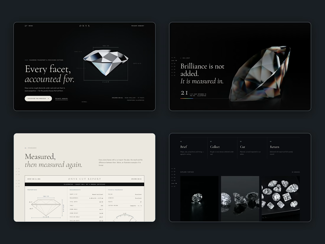
We'd rather build one page that tells the story in order. Here's our Onyx concept, a fictional diamond cutter: the promise, the proof, the standards, then the process, all in one scroll. Nobody has to hunt through a menu.
There are real exceptions, like restaurants with menus or shops with a catalog. But for most service businesses, one strong page beats five weak ones.
Agree or disagree? Drop your site and we'll tell you which page we'd merge first. 🔥

Two website reveals, two completely different moods 🎬
A🟣 — Montrium: an abstract world of glass, soft spheres and close-ups of the product
B🟨 — Mitrex: a sunlit desk, one click, and the whole site unfolds into a flowing wall of pages
Real question for designers and founders: does a website reveal sell better with a story or with style? Vote and tell me why 👇
Watch the full videos on my profile 👀
Looking for a reveal like this? Send me a DM — I partner with studios and work directly with brands.
11 votes
Ends in 23h

Mitrex - the best one🔥 🔥 🔥