The network for creativity
Join 1.25M professional creatives like you
Connect with clients, get discovered, and run your business 100% commission-free
Creatives on Contra have earned over $150M and we are just getting started
Back to feedPost

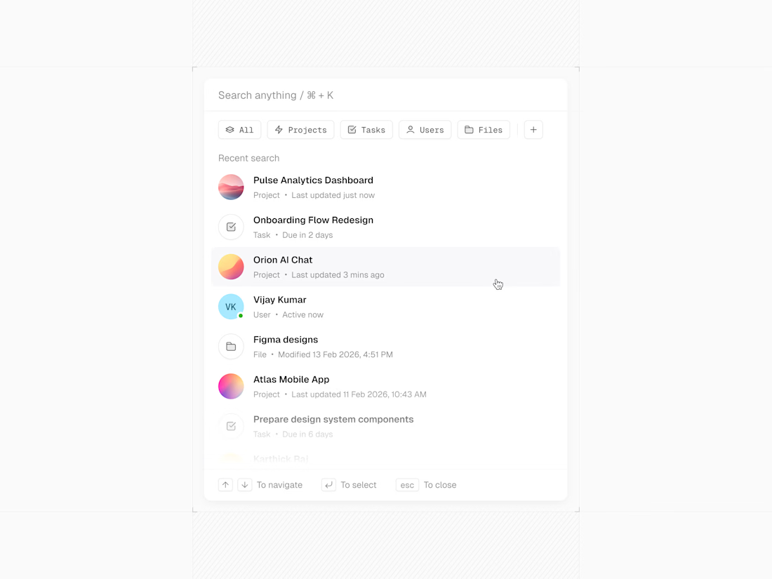
Designed a clean, focused Global Search experience for a SaaS platform, bringing Projects, Tasks, Users, and Files together in one powerful command palette for faster navigation and smarter workflows.
The network for creativity
Join 1.25M professional creatives like you
Connect with clients, get discovered, and run your business 100% commission-free
Creatives on Contra have earned over $150M and we are just getting started





Related posts

More value from the energy you generate and store. Wattbank helps homeowners manage solar panels and home batteries using electricity prices and weather forecasts to plan when to charge, power the home, or sell surplus energy.
The landing page connects an immersive, nature-inspired visual direction with a clear product story, showing how smarter energy management works throughout the day and how operators can manage their communities.
View the project on Dribble:


Clean cash dashboard design
Buoy is a cash dashboard for finance teams. Every number is measured against one line: the least cash the company wants in the bank. Here, the weekly cash update: pick who gets it, add a line, send.
A concept I designed in Figma and built as a working prototype.
Case study: https://buoy-case-study.vercel.app

Crisp, clean, and effective.

Most SaaS products don’t need more features.
They need clearer priorities. 🎯
As products grow, it’s easy to keep adding dashboards, filters, settings, and new flows.
But for users, more options often mean more friction.
The best product experiences usually do a few things really well:
✅ Make the next step obvious
✅ Show the right information at the right time
✅ Keep complex workflows feeling simple
✅ Remove decisions users shouldn’t have to make
Good SaaS design is not about making everything minimal.
It’s about reducing the effort required to get value from the product. ✨
That’s the kind of product experience I enjoy designing: clear, scalable, and built around real user workflows.