The network for creativity
Join 1.25M professional creatives like you
Connect with clients, get discovered, and run your business 100% commission-free
Creatives on Contra have earned over $150M and we are just getting started
Back to feedPost

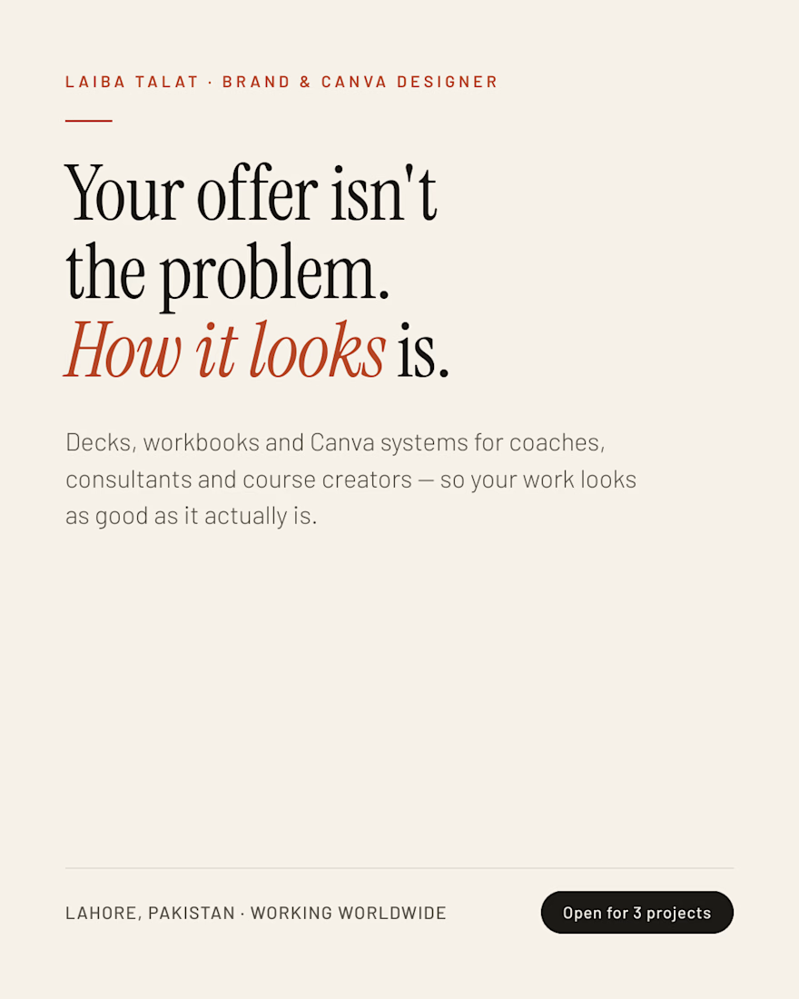
Your offer isn't the problem. How it looks is.
Most coaches and creators don't have a positioning problem. They have a presentation problem.
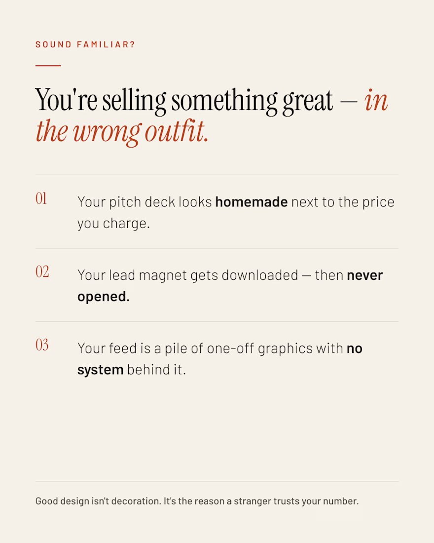
You've got a 14-page workbook nobody finishes. A deck you rebuild from scratch every single launch. A feed that looks like six different people designed it.
None of that means your work isn't good. It means nothing is holding it together visually.
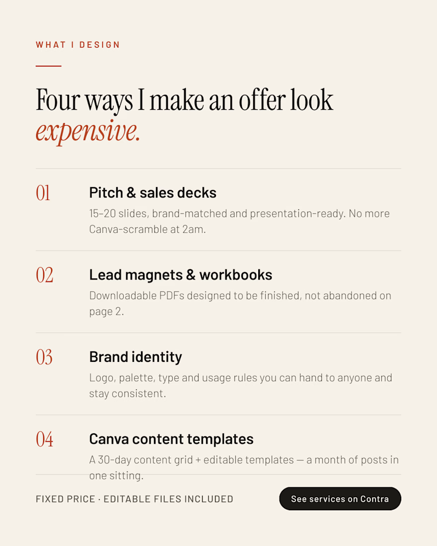
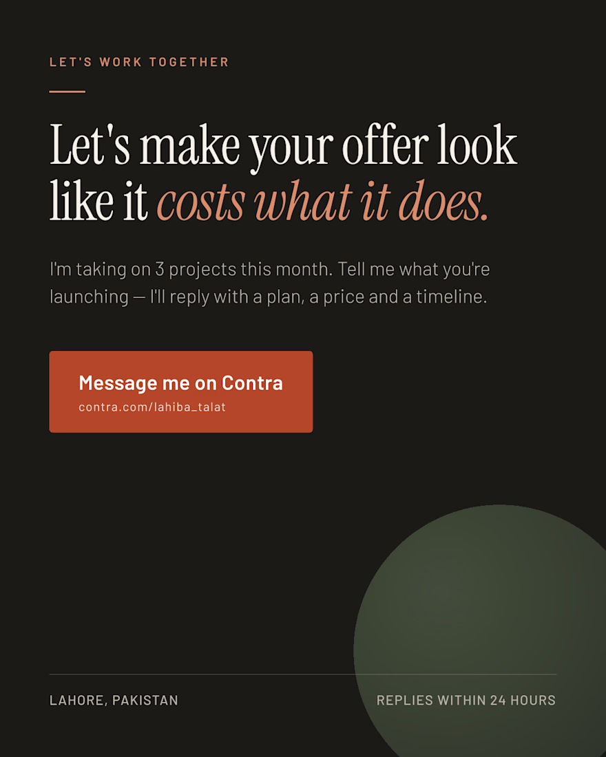
That's the part I fix. I'm a brand & Canva designer — I build the decks, lead magnets, workbooks and template systems that make an offer look like it costs what it does.
→ Open for 3 projects this month. → Message me here on Contra, or comment "DECK" and I'll send you my services.:


The network for creativity
Join 1.25M professional creatives like you
Connect with clients, get discovered, and run your business 100% commission-free
Creatives on Contra have earned over $150M and we are just getting started







Related posts

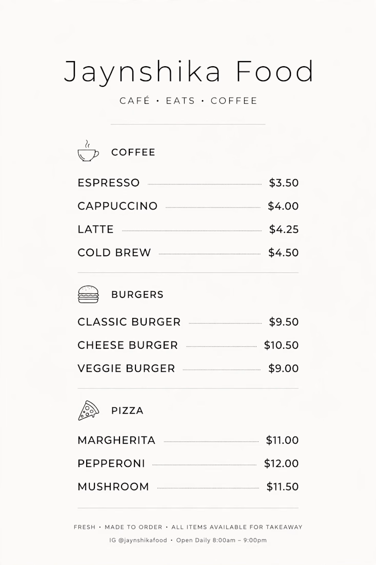
Minimal Cafe Menu Design for Jaynshika Food - Cafe Eats Coffee ☕
Created a clean and modern menu layout for Coffee, Burgers and Pizza. Used minimal icons, dotted pricing and premium typography for easy readability.
Tools: Canva, Photoshop
Client: Jaynshika Food
Available for Menu Design and Branding work. DM to order your custom menu!


I'm a menu designer
Trust me
I'll serve you better


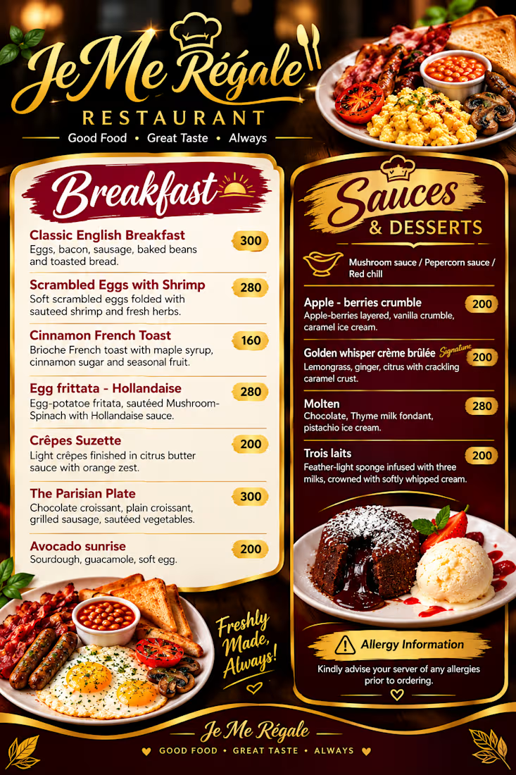

The script Breakfast heading against the gold sauces column makes the two sides easy to scan, and those small price pills keep the numbers from fighting the food photos. Did you build the item rows as a Framer component so the spacing stays locked?

When we work with founders, companies who sell to bigger companies, the same thing comes up.
The product or service is good. But the deck looks like one company, the site looks like another, and the copy says the same sentence every AI company says.
With a startup client that doesn't cost you much. One founder tries it and decides.
Inside a bigger company it's five people, and most of them never speak to you. Someone in procurement, someone in security, a VP who hasn't heard your name. They pass your deck and your site around and decide without you in the room.
So we start with the brand and build the site on top of it, so both say the same thing.


The Volition wordmark on that painted landscape makes the infrastructure feel grounded instead of abstract. The custom mark in the i stays quiet enough that the building still leads.