The network for creativity
Join 1.25M professional creatives like you
Connect with clients, get discovered, and run your business 100% commission-free
Creatives on Contra have earned over $150M and we are just getting started
Back to feedPost

Built the Classroom learner UI for Learning Heroes — Nuxt + Vue + TS. Modules, sessions, clean layouts. Case study on my profile → Check it out


The network for creativity
Join 1.25M professional creatives like you
Connect with clients, get discovered, and run your business 100% commission-free
Creatives on Contra have earned over $150M and we are just getting started











Related posts

Mission Manual: a retro-futuristic portfolio template for developers who want their work to do the talking.
Projects swing into view as you scroll, stats roll in like odometers, and a live status readout shows you're online. Every project gets its numbers, its decisions and its own case-study page.
Built with Astro 5 + Tailwind CSS v4. Fast, accessible, and yours to edit in minutes.
Ship it. Show it. Get hired.


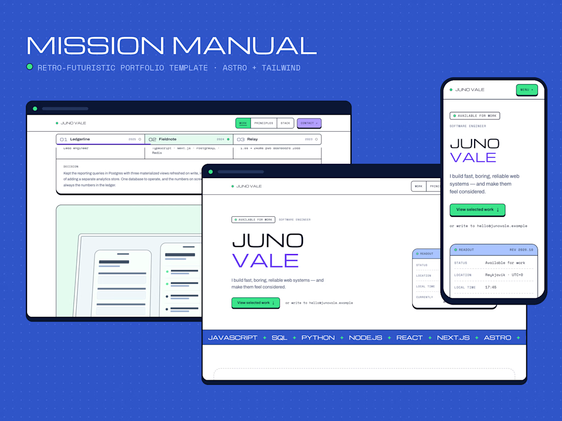


stats rolling in like odometers. SOLD

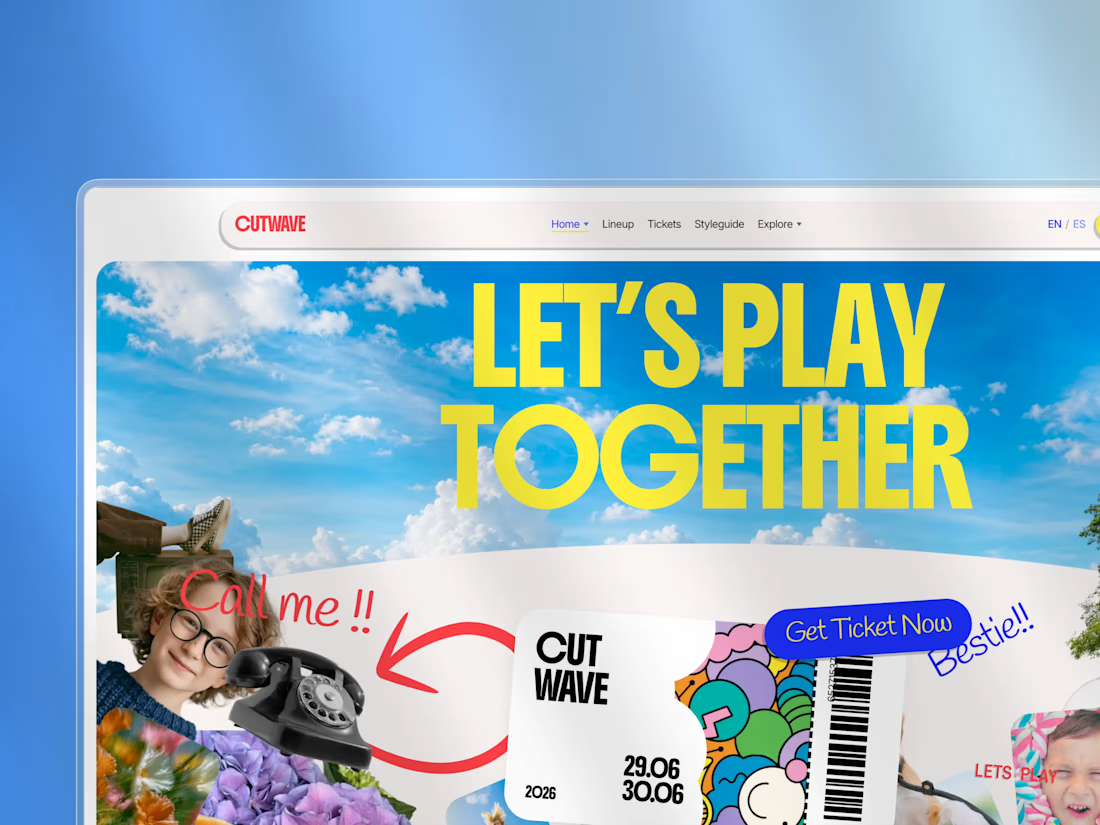
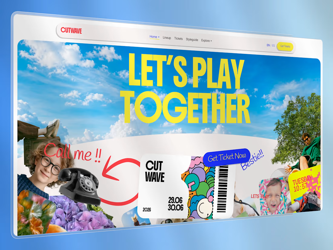
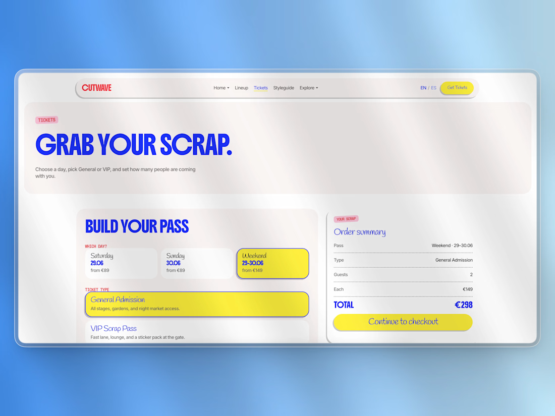
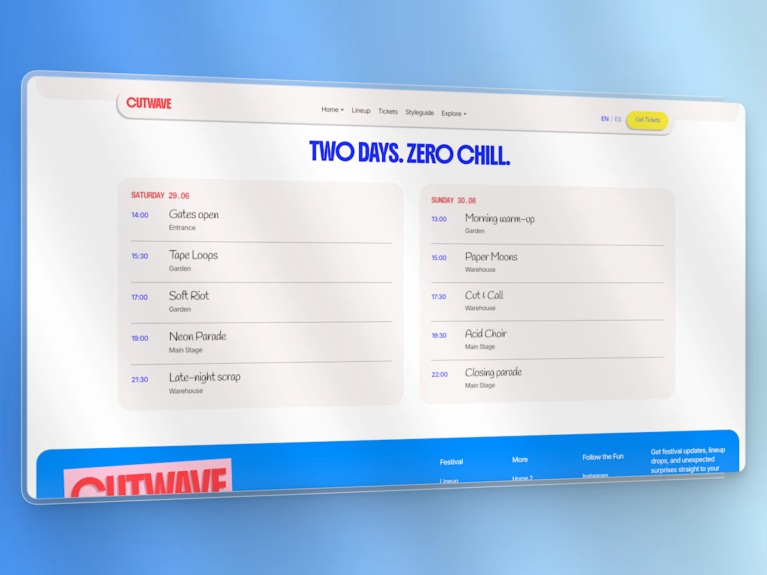
Cutwave is a premium festival & event website theme built with Astro 6. It ships as a static frontend — no CMS or payment provider locked in — so agencies and freelancers can brand it, connect their own stack, and deploy anywhere.
The visual language is a high-energy collage / scrapbook system: rotated cutouts, sticker CTAs, expressive display type, cream card sections, and intentional home-page motion (GSAP + Lenis).
Who it’s for
Festival, rave, conference, and cultural-event organizers
Agencies building one-off event microsites for clients
Freelancers who need a distinctive Astro starter that isn’t another SaaS landing page
What’s included
Pages
Home (collage hero + motion stack)
Alternate home demo (/demos/alt)
Spanish locale demo home (/es/)
Lineup + artist detail
Schedule (two-day timeline)
Experiences
News / blog index + post
Gallery + accessible lightbox
Location (venue + map hook)
Tickets (picker UI → checkout integration hook)
Contact, FAQ, Privacy, Terms
Styleguide (live tokens & components)
Custom 404
UI & UX
Slim sticky nav with Home variants dropdown + Mega Menu (pages & components)
Mobile drawer / accordion
Design tokens in CSS (colors, type buckets, spacing)
Sticker / pill buttons, ticket graphic, photo cards, widgets
Content
Astro Content Collections (JSON/MD) for artists, schedule, experiences, tickets, posts, gallery
Easy to replace demo copy and images
Motion
GSAP + ScrollTrigger on the home page
Lenis smooth scroll
Documented recipes in docs/ANIMATIONS.md
Integration-ready
Ticket checkout hook: src/lib/checkout.ts
Contact & newsletter form actions via config
Optional Decap CMS starter in extras/
Sitemap + SEO / Open Graph / JSON-LD
Docs for buyers
Installation, customization, integration, site map, animations, credits, commercial license
Tech stack
Astro 6 (static)
TypeScript
GSAP, Lenis
Fontsource (Boldonse, Inter, Handlee, Chivo Mono, Libre Barcode 128)
Deploy: Netlify, Vercel, Cloudflare Workers (workflow included)
Requirements
Node.js ≥ 22.12
npm (package-lock.json included)
What you get in the ZIP
Full source theme
LICENSE (commercial — 1 production project)
Buyer docs + preview screenshots
START_HERE.md quick guide
Demo assets (replace before production — see CREDITS.md)
License (summary)
Commercial proprietary license by USG STUDIO.
One production project per purchase. No redistribution or resale of the template.
See LICENSE in the package for full terms.
Support
Product & licensing: usgstudio.dev
Live demo: usgcutwave.netlify.app



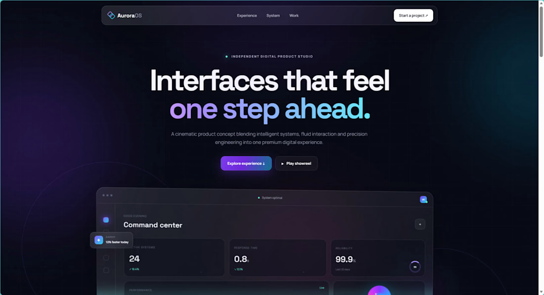
I recently launched AuroraOS, a self-initiated landing page concept exploring premium glassmorphism, responsive layouts, animated gradients, and interactive UI.
Built with HTML, CSS, and JavaScript.
I am currently available for landing page development, website redesigns, and responsive frontend projects.
Live project: