The network for creativity
Join 1.25M professional creatives like you
Connect with clients, get discovered, and run your business 100% commission-free
Creatives on Contra have earned over $150M and we are just getting started
Back to feedPost
👨💻The user interface of Netflix is designed to deliver a smooth, engaging, and highly personalized streaming experience. It features a clean and minimal layout where content is organized into horizontal rows based on categories such as trending, recommended, and genre-specific collections. The homepage dynamically adapts to user behavior, using algorithms to suggest movies and shows based on viewing history, which enhances user engagement.
☺️The navigation is simple and intuitive, with a top menu that includes sections like Home, TV Shows, Movies, and My List, allowing users to quickly find content. One of the standout features is the autoplay preview, where content trailers start playing when users hover over a title, creating an interactive browsing experience. The dark-themed design reduces eye strain and keeps the focus on visuals like thumbnails and banners.
🚀Overall, the Netflix UI emphasizes usability, speed, and personalization, making it easy for users to discover and watch content seamlessly across devices such as smartphones, tablets, and smart TVs.
The network for creativity
Join 1.25M professional creatives like you
Connect with clients, get discovered, and run your business 100% commission-free
Creatives on Contra have earned over $150M and we are just getting started
Related posts
The last screen deserves as much attention as the first.
Designed this portfolio footer with a retro-inspired interface, modern UI details, and a stronger project CTA. Every component was built to make the experience feel intentional from start to finish.
#UIUX #WebDesign #CreativeDirection
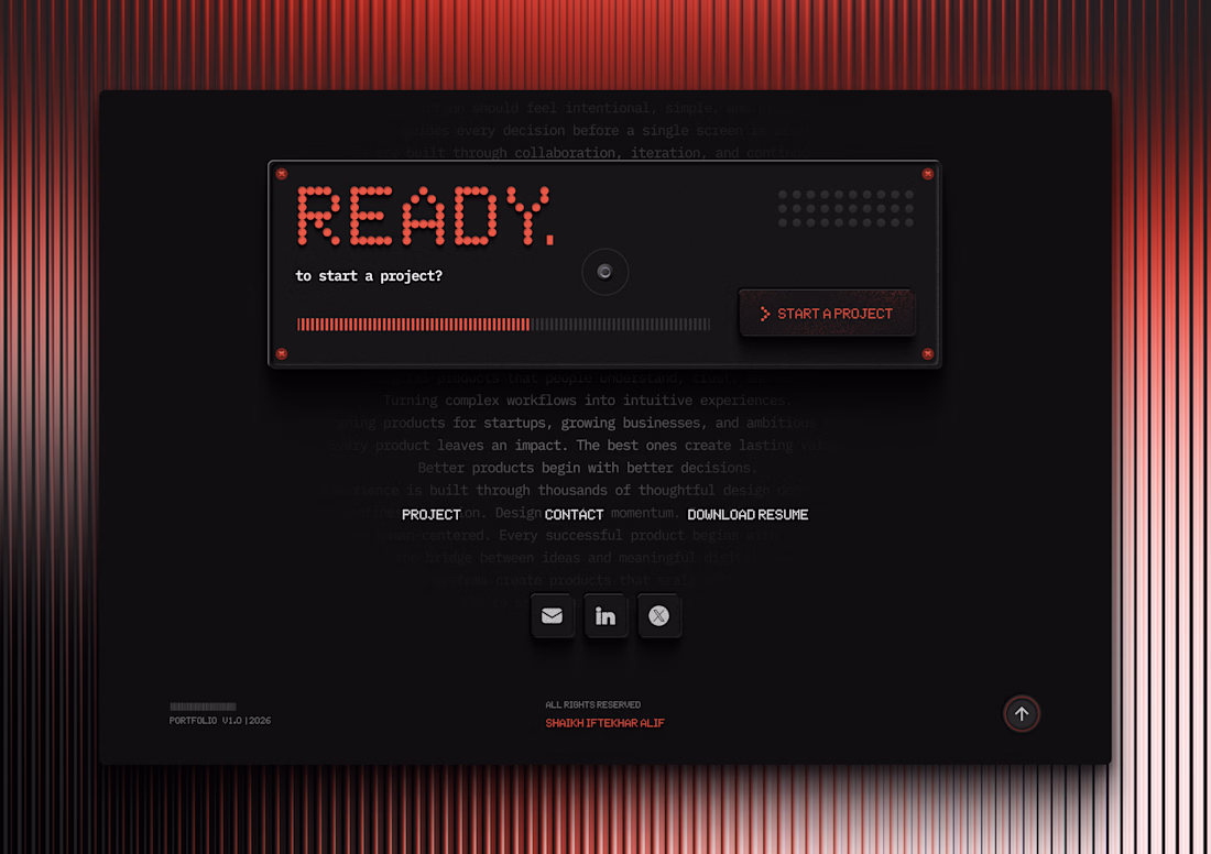
Like the pixelized fonts with a great black & red combination along with great placement with correct hierarchy. Good design!
One of my favorite UI experiments so far.
I challenged myself to create a cinematic Pepsi landing page where the interface feels like it's floating above the background instead of sitting on top of it.
✨ Features:
🎥 AI-generated animated background
🥤 Scroll-driven storytelling with different Pepsi products
🪟 Glassmorphism & Frosted Glass UI
🌊 Smooth blur, reflections, and premium lighting
⚡ Framer Motion animations
📱 Fully responsive
🎯 Built with React, Vite & Tailwind CSS
The goal wasn't just to build another landing page :it was to create an immersive experience where motion, depth, and interaction tell the story.
Still polishing the animations and interactions, but I'm really happy with how it's coming together.
What would you improve? 👇
#React #TailwindCSS #FramerMotion #UI #UX #WebDesign #Frontend #Glassmorphism #LandingPage #Pepsi #CreativeCoding #MotionDesign
The floating interface effect actually works here, it reads more like a movie poster than a landing page. How did you handle the scroll-driven storytelling technically, is that all Framer's native scroll effects or did you need custom code for the parallax depth?
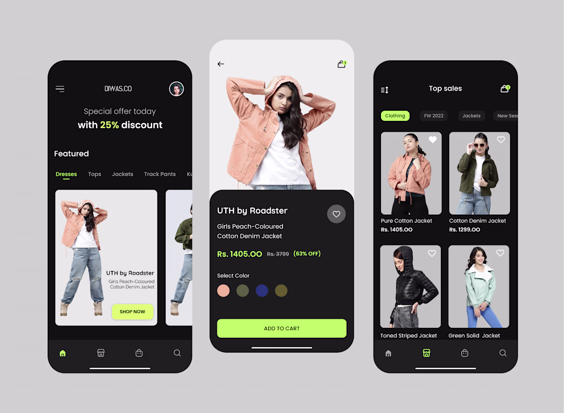
🛍️ E-Commerce Mobile App UI/UX Design | Figma
Excited to share my latest E-Commerce Mobile App UI/UX Design concept, crafted with a focus on creating a seamless and engaging shopping experience.
✨ Design Highlights
• Modern dark theme with vibrant accent colors
• Clean and intuitive user interface
• Product discovery with category filters
• High-converting product detail screen
• User-friendly navigation and shopping flow
• Responsive layouts and reusable design components
• Pixel-perfect UI designed entirely in Figma
💡 My Value as a UI/UX Designer
Good design is more than just beautiful screens. My goal is to solve business problems through thoughtful user experiences.
✅ User-centered design approach
✅ Increased usability and accessibility
✅ Higher engagement and conversion-focused layouts
✅ Consistent design system for scalability
✅ Fast collaboration with developers using organized Figma files
✅ Interactive prototypes for better product validation
Whether you're building an MVP, startup, SaaS platform, or eCommerce application, I help transform ideas into intuitive and visually appealing digital products.
💬 Looking for a professional UI/UX Designer for your next project? Let's connect and create an exceptional user experience together.
Trending
Claude
Claude has entered the design space. How are you using Claude Design?
Contra University
Learn from expert creatives how to earn more using next-gen AI tools.
creativeaiflow
Creative AI workflows are evolving. What tools do you use, and what are their strengths and weaknesses?
freelancerlife
Freelancer life is wins, pivots, and everything in between. What’s yours right now?