The network for creativity
Join 1.25M professional creatives like you
Connect with clients, get discovered, and run your business 100% commission-free
Creatives on Contra have earned over $150M and we are just getting started
Back to feedPost

The client had this idea from the start:
“Can we build a mirror of how people see you?”
Everything is anonymous.
Different people. Different timing. Different intensity.
What came out of that is this graph.
It combines all of it:
- different groups
- different moments in time
- how strong the feedback actually is
Then the rest started layering on top.
Strengths, weaknesses, trends, written feedback…
even AI insights later on.
This wasn’t “just a chart.”
It became the foundation of the product.
Take a look at the full report:
https://mirror360.org/app-tours/self-awareness-report
The network for creativity
Join 1.25M professional creatives like you
Connect with clients, get discovered, and run your business 100% commission-free
Creatives on Contra have earned over $150M and we are just getting started





Related posts


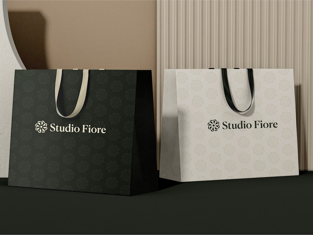
the cream logo lockup on the black tote is such a clean pairing

Created this masterpiece ❤️
The goal was to create a design that communicates and solve the clients problem.

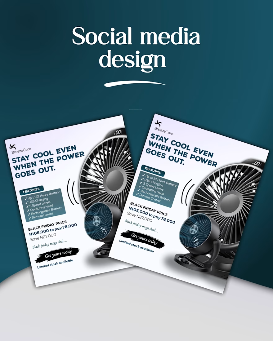
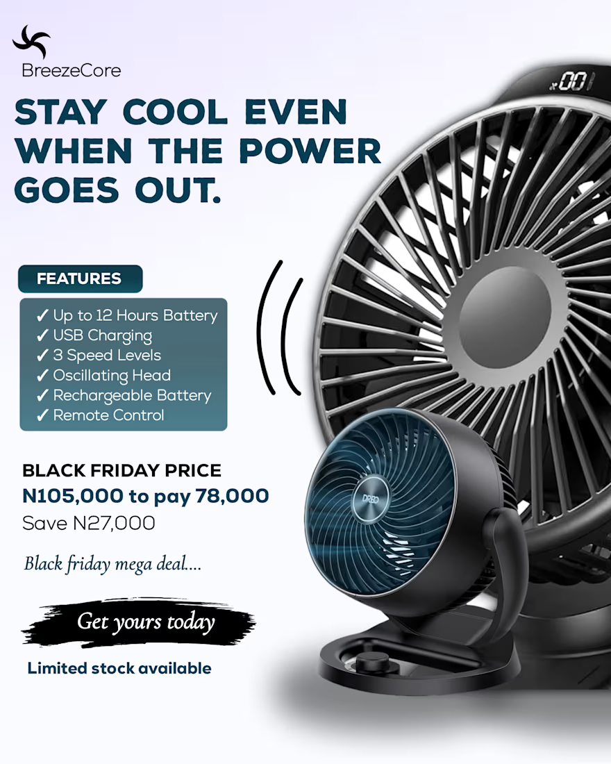
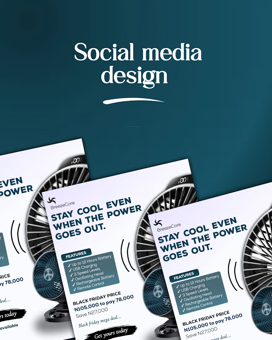

Stay cool even when the power goes out is a very good line, because it names the exact pain a fan buyer has, and the Black Friday price with the saving amount is clear. Blunt point: the feature checklist and the price compete with the fan in the same frame. For a product ad I...

Not every design needs to sit still.
A little depth. A little movement. A whole new experience.
Exploring 3D motion and interactive UI concepts through Say It in Daylight, a mental wellness concept built around connection, reflection, and self-expression.
Your next idea could look this good in motion.
Available for creative projects and collaborations.
#3DMotion #MotionGraphics #DigitalDesign #Contra