The network for creativity
Join 1.25M professional creatives like you
Connect with clients, get discovered, and run your business 100% commission-free
Creatives on Contra have earned over $150M and we are just getting started
Back to feedPost

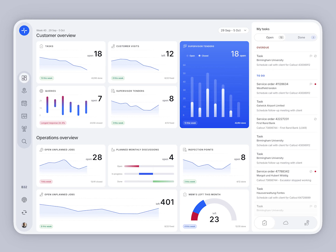
In 2016 I led the UX for SMT, KONE's tablet app for maintenance supervisors. It brought Salesforce, KONECT and KFF into one overview. Ten years later I redesigned that screen and built it as a working prototype with Claude. The redesign is self-initiated, not a KONE release.
The original was made for a 1280x800 Android tablet. Each dashboard card had room for a number and little else. In the redesign, every card shows how many items are left, keeps the done count for context, and adds a small trend chart, which the old screen had no room for.
Tapping a card opens its filtered list. The My tasks panel stays on the right and can switch between tasks, customer activity and operations without leaving the overview.
Building an internal tool that has to pull several systems into one screen? I'm open to new projects.


The network for creativity
Join 1.25M professional creatives like you
Connect with clients, get discovered, and run your business 100% commission-free
Creatives on Contra have earned over $150M and we are just getting started
Related posts

Hero section for an AI search analytics tool platform.
Animation LIT up the hero section.
Definitely gonna convert "maybe" users to instant "sign-up".
Full landing page WIP, should be finished by tomorrow.

Stunning

Designed a premium audio e-commerce storefront for VickMix 🎧
From the bold headphone hero section to product listings, audio technology highlights, and a clean product-focused layout, every section is designed to showcase the products and make browsing effortless.
What do you think of this design? Would you keep the minimalist look or make it more colorful? 👇


I'd keep it minimal. The grey palette lets the headphones do the talking.

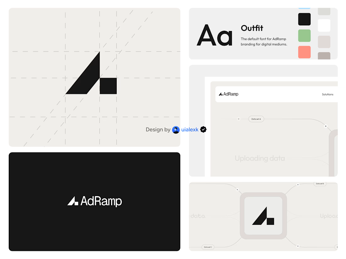

The A mark built on a diagonal grid, with the ramp stepping up on the right, is simple and holds up on the black AdRamp card. My challenge: the palette shows green and salmon swatches next to the black, but every application tile is black, white or grey. If the accent colours...