The network for creativity
Join 1.25M professional creatives like you
Connect with clients, get discovered, and run your business 100% commission-free
Creatives on Contra have earned over $150M and we are just getting started
Back to feedPost
Taste Test
Sticky navigation — dark or light? 🤔
One rule of landing pages: your nav sets the entire brand tone.
Design A: Frosted dark navbar, white logo, and ghost buttons.
Design B: Pure white navbar, colourful logo, solid CTA.
Which converts better in your experience?
2️⃣ = Dark nav | 1️⃣ = Light nav
#UIDesign #LandingPage #WebDesigner #ProductDesign #Contra
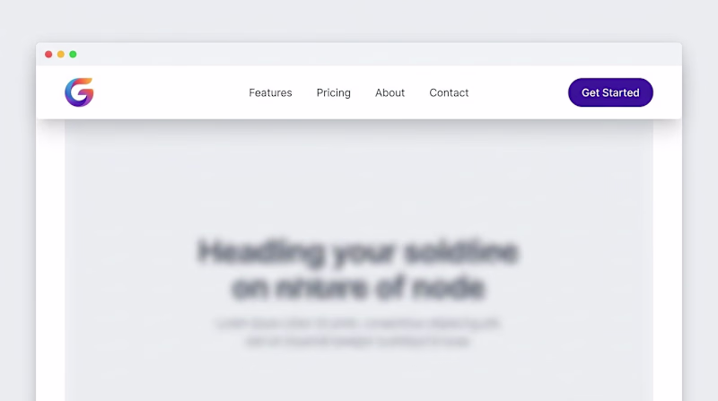
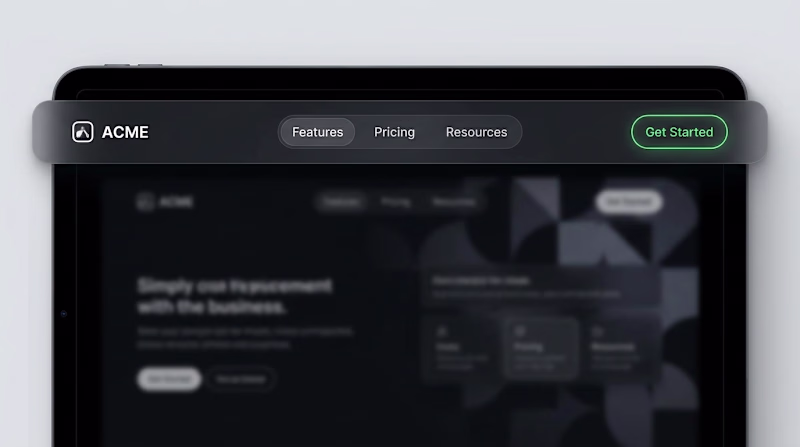
7 votes
Ends in 15h
Dark nav for me. The frosted treatment keeps the nav from visually competing with the hero content, and ghost buttons feel right for a design-forward audience. The light version with the colorful CTA ends up pulling focus away from whatever the headline is trying to say.
The dark navy looks better
The network for creativity
Join 1.25M professional creatives like you
Connect with clients, get discovered, and run your business 100% commission-free
Creatives on Contra have earned over $150M and we are just getting started
Related posts
New home section exploration.
I created a set of home section concepts showing how different brands can use layout, motion, typography, and visuals to create a stronger first impression.
The goal was simple:
Make each website feel custom, premium, and clear from the first screen.
I’m a web designer and developer helping founders, agencies, and brands create high-quality websites that don’t feel like templates.
Available for new web design and development projects on Contra.
Both of my goats goes to your works today, great collection! 👍
I'm starting this new series
Road to a $1M. I'm not far, and I'd like to document the way there.
Not only for me, but for people to see what it takes, get inspired and understand you can do it yourself.
What are the does and don'ts and ultimately what works for me.
Not sure how many episodes this series will have, as much as it takes I guess.
Enjoy, and comment below if you have any questions :)
Wow. I am inpsired that people really make money on Contra. I am going to start taking contra diffrently. Let us connect bro
My business now runs on autopilot thanks to the Contra MCP
check it out: https://contra.com/features/mcp
Can it go through projects and automatically apply for jobs? 😃
Challenges
View allTrending
Claude
Claude has entered the design space. How are you using Claude Design?
Contra University
Learn from expert creatives how to earn more using next-gen AI tools.
MagicPath
The canvas is infinite, and exploration is becoming the workflow. How are you using MagicPath?
creativeaiflow
Creative AI workflows are evolving. What tools do you use, and what are their strengths and weaknesses?
freelancerlife
Freelancer life is wins, pivots, and everything in between. What’s yours right now?