The network for creativity
Join 1.25M professional creatives like you
Connect with clients, get discovered, and run your business 100% commission-free
Creatives on Contra have earned over $150M and we are just getting started
Back to feedPost

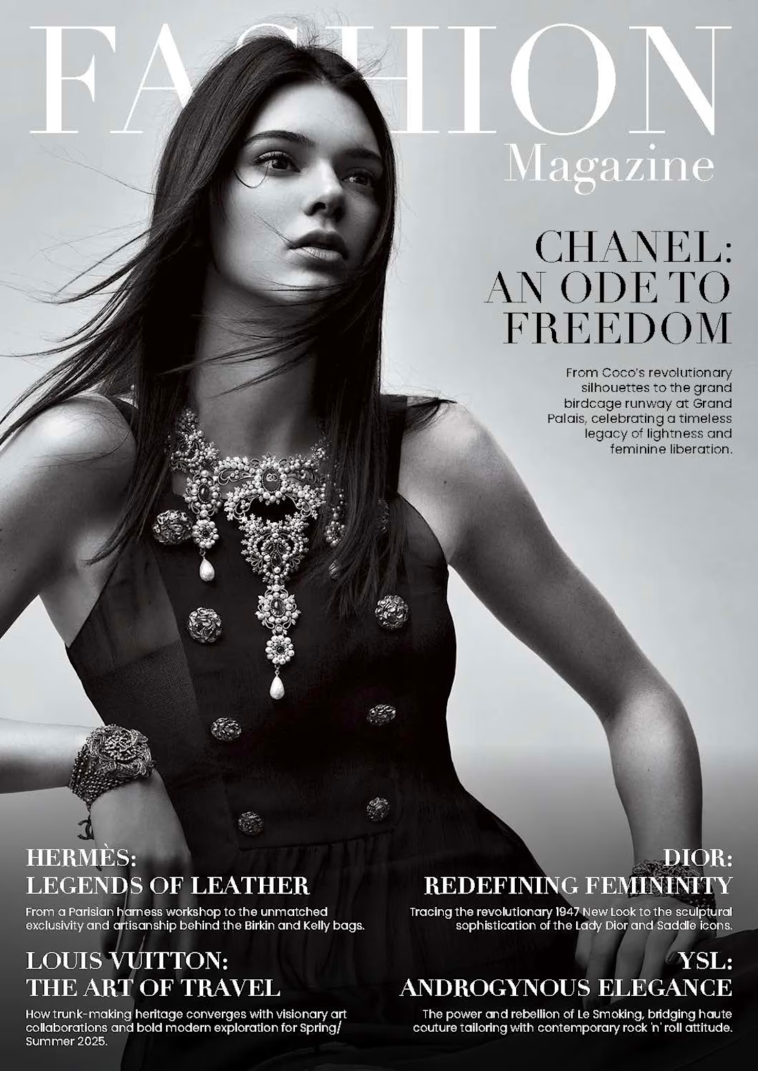
A cover isn’t just a pretty picture with a masthead slapped on top. It sets the entire architectural pacing for the publication.
With high-fashion editorial layouts, the balance between bold serif typography and quiet negative space dictates whether an issue feels commercial or collectible.
Here’s a recent cover concept exploring scale contrast, refined typography hierarchy, and controlled breathing room. Built from scratch in Adobe InDesign.
Full layout breakdown and selected double-page spreads linked in the first comment below. 👇
#EditorialDesign #MagazineLayout #ArtDirection #Typography #InDesign #FashionEditorial #PublicationDesign

The network for creativity
Join 1.25M professional creatives like you
Connect with clients, get discovered, and run your business 100% commission-free
Creatives on Contra have earned over $150M and we are just getting started



Related posts

A few months ago I got to work with Coderhouse, one of the leading education brands in Argentina, and the place where I took several courses myself.
So this one feels like a full circle. A brand that shaped my career and helped me grow as a designer, and now I got to design for it.
The funny part is Chris had no idea I was a former student when he reached out. I was really happy when that message came in.
I built a visual system for their 60+ course covers, made so their team can keep producing them on their own. Today it lives across their app, website and Meta ads.
Thanks Chris for trusting my work and for the opportunity 🧡 And thanks @Contra HQ for making connections like this one possible.


This looks great

Another very cool brand Identity project I got to work on this year for Elio Mortgage.
Bringing warmth and love to a brand that is usually cold and stressful. Elio are doing things differently to make mortgages easier to deal with. We made a brand that felt more approachable.
Full case study here:
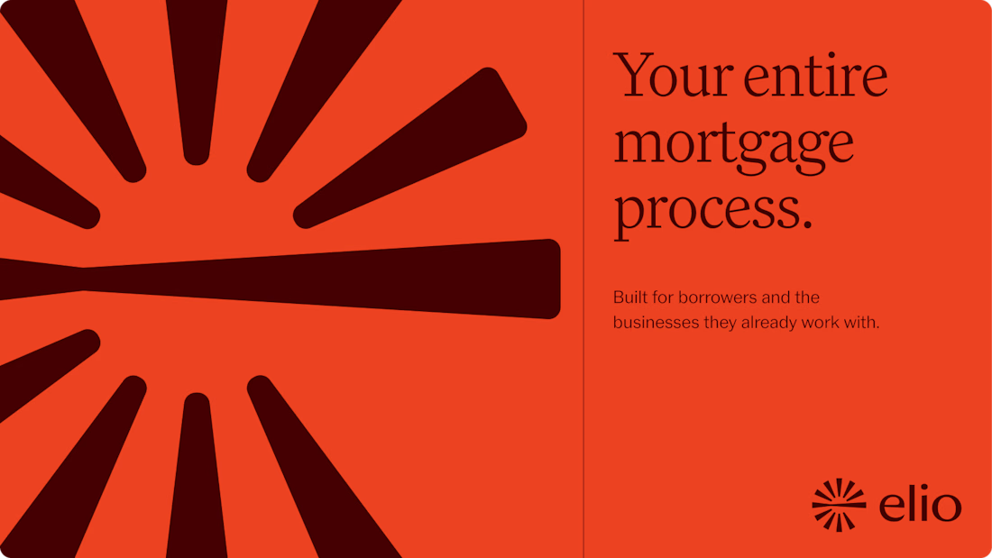
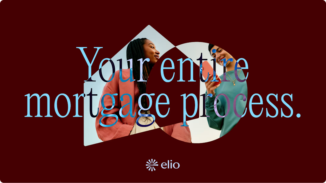
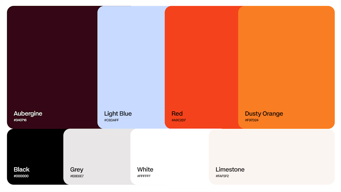
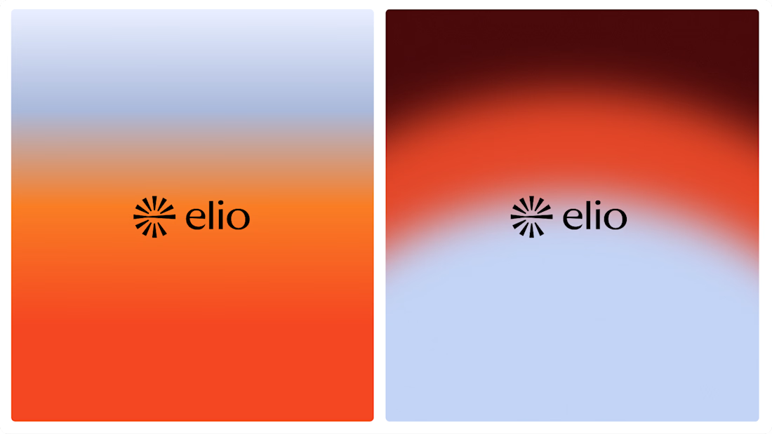

Warm, approachable identity for stressful mortgages.

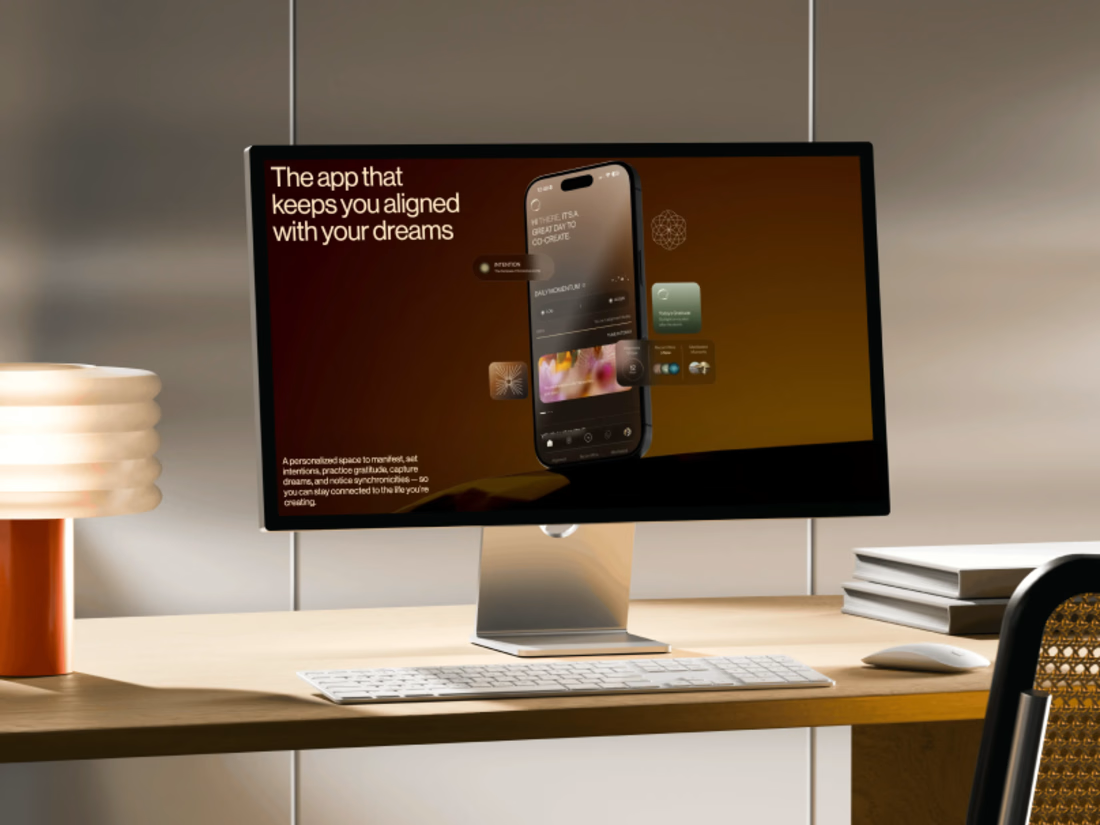
Promo video for a manifestation and wellness app. 48 seconds of kinetic type, UI motion and warm footage that show what the app does.


The warm footage really suits a wellness app, it keeps the kinetic type from feeling too techy. Lovely pacing for 48 seconds