The network for creativity
Join 1.25M professional creatives like you
Connect with clients, get discovered, and run your business 100% commission-free
Creatives on Contra have earned over $150M and we are just getting started
Back to feedPost

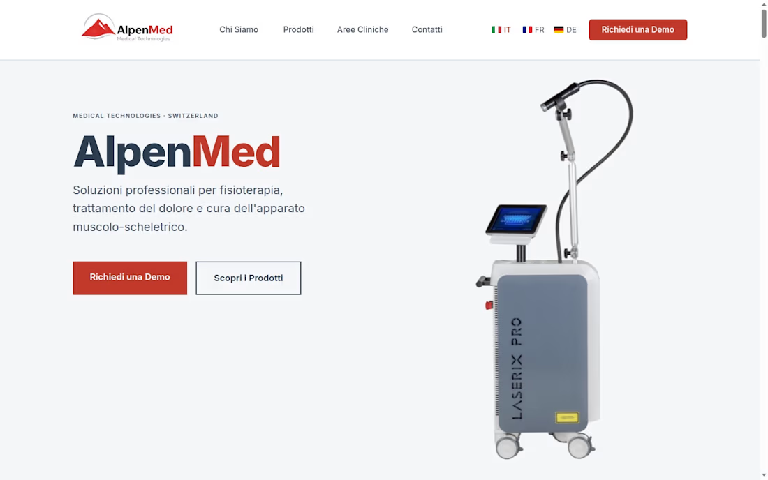
Healthcare Website Redesign & Multilingual Content Management – AlpenMed Switzerland
Designed and optimized a modern healthcare website for AlpenMed Switzerland, focusing on multilingual content, user experience, responsive design, and SEO to improve accessibility and strengthen the clinic’s digital presence.
AlpenMed required a professional website that reflected the quality of its healthcare services while providing an intuitive experience for patients across different languages.
The objective was to create a clean, trustworthy, and responsive website that communicates medical services clearly while improving navigation and search visibility.


The network for creativity
Join 1.25M professional creatives like you
Connect with clients, get discovered, and run your business 100% commission-free
Creatives on Contra have earned over $150M and we are just getting started











Related posts


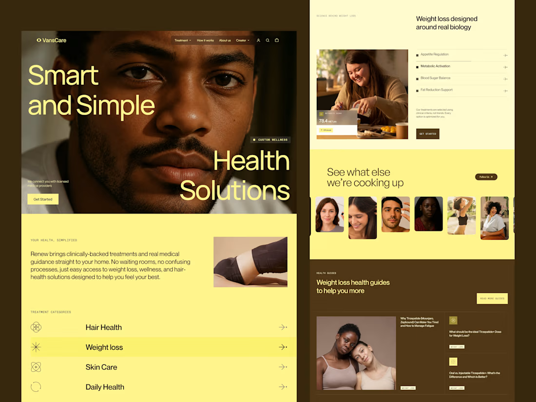
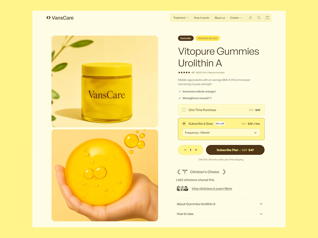
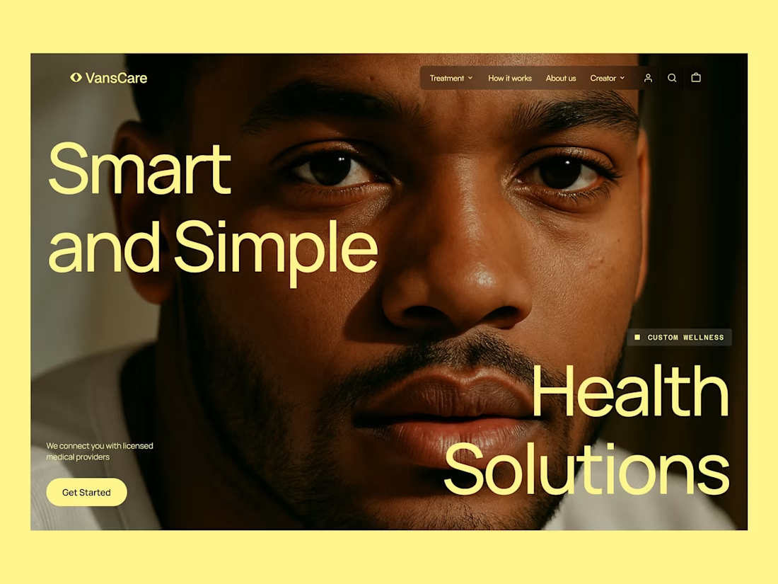
Healthcare & Supplement Ecommerce Website Design
Telehealth Design, Supplement Ecommerce, Healthcare UX/UI, Wellness Website Design, Ecommerce Design, Healthcare Website Design, Product Page Design, Conversion Rate Optimization, DTC Healthcare, Nutrition Supplement Design, Shopify Design, Health and Wellness, Landing Page Design, Mobile Ecommerce, Digital Health, Telehealth Website, Supplement Branding, Ecommerce UX, Healthcare Branding, Wellness Product Design

thats nice, i love that you dared to play with that strong of a color!

looking for a great designer

Behind the scenes of the Treal Studio brand film.
Built in one week, from creative direction to sound design.


Love the overall feel, looks amazing 👌🏼

