The network for creativity
Join 1.25M professional creatives like you
Connect with clients, get discovered, and run your business 100% commission-free
Creatives on Contra have earned over $150M and we are just getting started
Back to feedPost

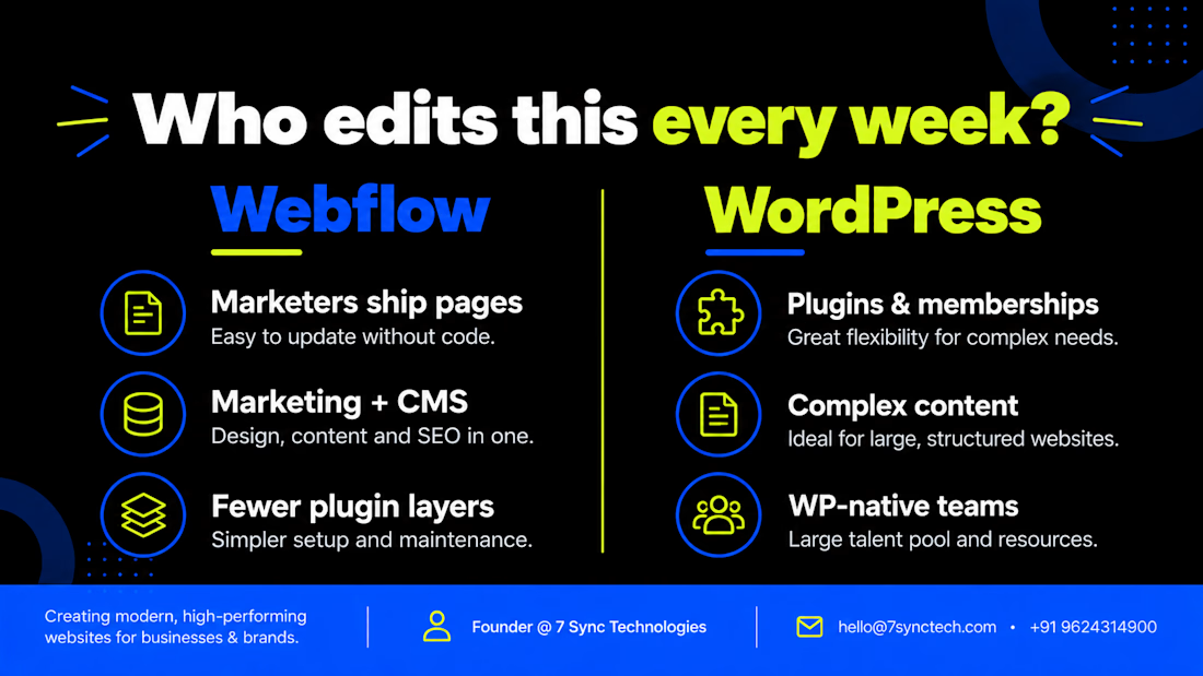
Webflow vs WordPress — short version for founders:
Choose Webflow when marketers need to ship pages without waiting on a sprint, and the site is mostly marketing + CMS collections.
Choose WordPress when you need plugins, memberships, complex content models, or a team that already lives in WP.
Wrong question: “Which is better?”
Right question: “Who edits this every week?”
That answer usually picks the stack.
— with @7sync_tech
https://cal.com/yuvrajkhavad/15min
The network for creativity
Join 1.25M professional creatives like you
Connect with clients, get discovered, and run your business 100% commission-free
Creatives on Contra have earned over $150M and we are just getting started





Related posts

One of my favorite projects this year: a full migration of ecopiatech.com from a legacy PHP CMS to Webflow.
Ecopia builds AI-generated 3D maps, and their site had a lot going on. Smooth scroll, parallax, character reveals, a fullscreen menu with an animated tile grid, timeline carousels, before/after sliders. The brief was simple: rebuild it 1:1.
So instead of eyeballing it, I went into the live site's CSS and measured everything. Easing curves, delays, durations, even the "random" text reveal turned out to be a 6-step delay cycle per word. Then I rebuilt it in Webflow so it feels exactly like the original, but now the team can update everything on their own.
On the content side:
220+ blog posts, news and case studies moved into Webflow CMS
Before/after sliders, videos and map embeds inside rich text, handled with simple shortcodes the editors can use
250 redirects mapped and verified so no old URL breaks
HubSpot forms restyled to match the brand, plus tracking set up for launch
The fun part of projects like this is the details nobody notices when they're done right.
Take a look: https://www.ecopiatech.com/


Two layout directions for LenderSearch, a mortgage marketplace by Scotsman Guide.
A: centered hero text, full-width property image, content sits in a lifted white card
B: hero image bleeds into the content section, layout feels more connected and continuous
Same product, different flow. Which one feels easier to trust with a mortgage decision? 👇


14 votes
Ends in 7h

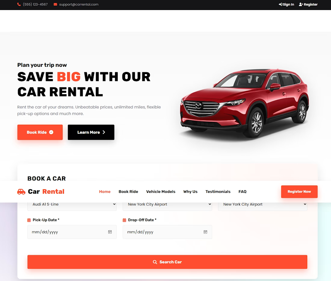
Developed a professional WordPress landing page with a clean and structured design to showcase the business's services, build credibility, and encourage visitors to take action.



I love this design