The network for creativity
Join 1.25M professional creatives like you
Connect with clients, get discovered, and run your business 100% commission-free
Creatives on Contra have earned over $150M and we are just getting started
Back to feedPost

🚨 I stopped guessing my ad performance. Here's what changed:
For months, I was flying blind with my ad spend.
The problem?
I had data everywhere but insights nowhere.
Google Ads showed clicks.
Meta showed impressions.
Neither showed me what actually mattered.
So I built a Looker Studio dashboard.
Now I see:
☑︎ Real-time ROAS across every platform.
☑︎ Which campaigns bleed money.
☑︎ Where every dollar actually goes.
What it fixed:
No more logging into 5 different platforms.
No more "gut feeling" budget decisions..
For campaign optimization.
For client reporting.
For weekly reviews.
For scaling what works.
Nothing beats having one source of truth.
Save this. Repost ♻️ to help someone in your network.
P.S. What's your biggest struggle tracking ad performance right now?


The network for creativity
Join 1.25M professional creatives like you
Connect with clients, get discovered, and run your business 100% commission-free
Creatives on Contra have earned over $150M and we are just getting started





Related posts


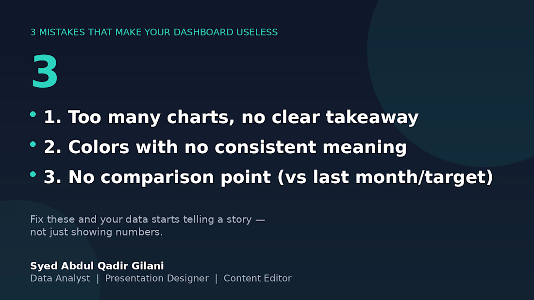
3 mistakes that will eventually make this board useless. 📉
I've reviewed several client dashboards over the years, and the same 3 problems show up over and over:
1️⃣ Too many charts, no clear takeaway — if I can't tell what to do after looking at it, it's decoration, not a dashboard.
2️⃣ Colors with no consistent meaning — red means "unacceptable" on one chart and "category 3" on the next. Pick a system and stick with it.
3️⃣ No comparison point — a number alone means nothing. "Revenue: $12,480" tells you nothing. "Revenue: $12,480 (+18% vs last month)" tells you everything.
Fix these three, and your data stops being numbers on a page — it starts being something people actually use to decide.
What's the most common dashboard mistake you've seen? 👇



Les comparto un poema que escribí. Gane un concurso internacional





the memory in this poem comes through so clearly. the image makes the feeling even more personal.

💡 You probably know your Amazon account less than you think.
I've managed stores for over three years, and I've seen the same pattern repeat: sellers check their dashboard daily, feel confident about their numbers, but have never opened the reports where the real problems hide.
Here's the 5-point audit I run for every client, every month:
Reimbursement Report – Amazon owes you for lost, damaged, or overcharged inventory. Claim it.
Stranded Inventory – unsellable stock still bills storage fees. Fix or remove it.
FBA Fee Preview – dimension errors overcharge you daily. Correct them.
Return Reasons by SKU – your customers tell you what to fix. Listen.
Inventory Age Report – old stock drains cash. Cut it before it costs more.
Time required: 30 minutes. Tools: just Seller Central.
This routine has recovered anywhere from $200 to $2,000 in a single sitting. No new products. No extra ads. Just plugging leaks that were already there.
The sellers who build this habit stop bleeding money and start compounding their margins. The ones who skip it stay busy and wonder where their profit went.
Which of these five reports will you check this week? And which one have you been avoiding? Let's talk. 👇
#AmazonFBA #ProfitRecovery #FBAAudit #EcommerceTips #AmazonSeller #BusinessHealth