The network for creativity
Join 1.25M professional creatives like you
Connect with clients, get discovered, and run your business 100% commission-free
Creatives on Contra have earned over $150M and we are just getting started
Back to feedPost

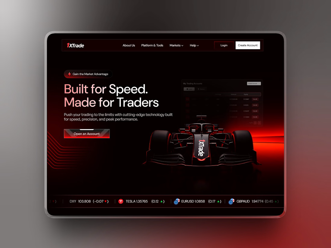
Recently designed an F1-themed trading platform 🏎️📈
Want me to post the complete design?
Drop a 🔥 or 👀 below 👇



Amazing Work!

The network for creativity
Join 1.25M professional creatives like you
Connect with clients, get discovered, and run your business 100% commission-free
Creatives on Contra have earned over $150M and we are just getting started





Related posts


Professional work

Brand identity work for WesoftAI



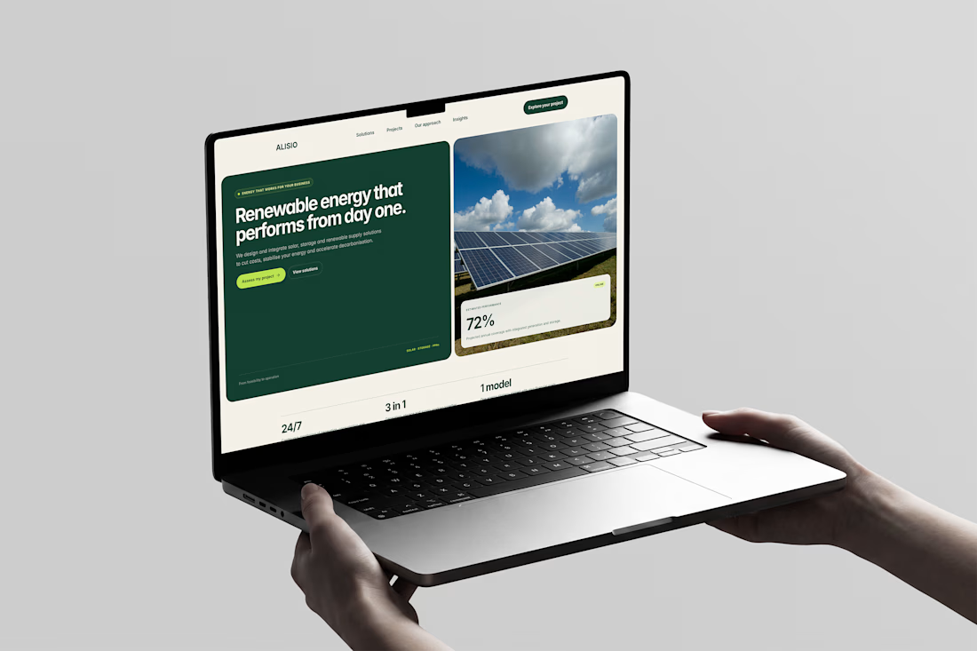
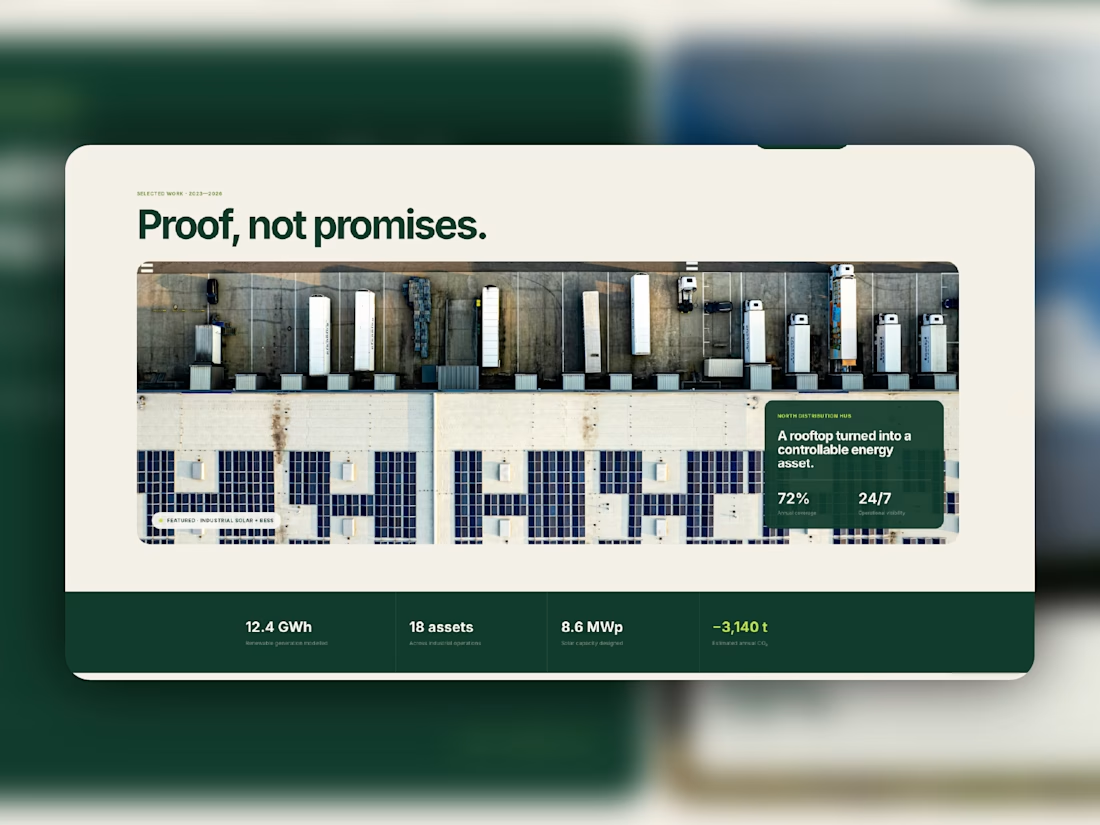
Meet Alisio, my latest Framer template for renewable energy and sustainability businesses.
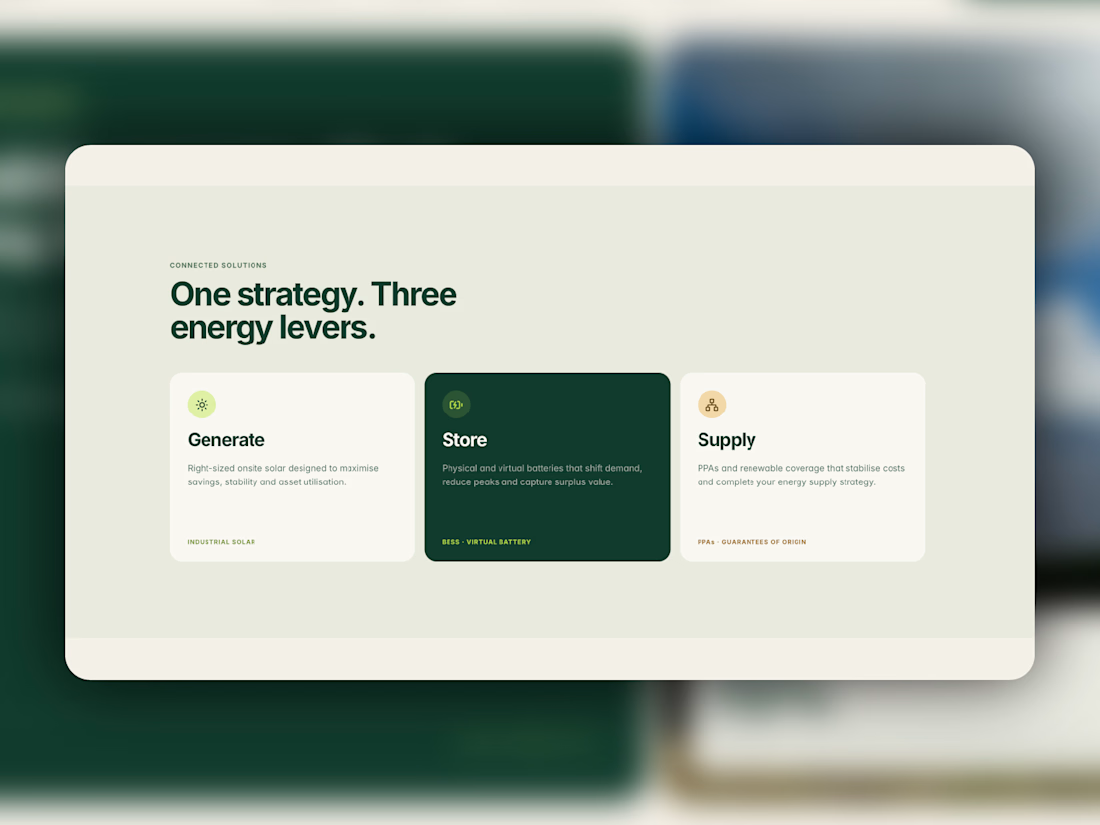
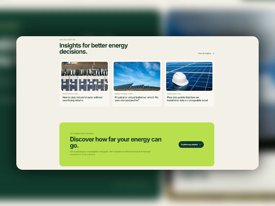
Deep greens, warm neutrals, bold typography, and a bright lime accent give it a distinctive visual identity. Dedicated service pages, CMS project case studies, and an insights blog help businesses explain what they do and showcase their work.
Designed for desktop, tablet, and mobile, with reusable components and subtle motion throughout.
Take a closer look at Aliso, or make it your own.


Love this!