The network for creativity
Join 1.25M professional creatives like you
Connect with clients, get discovered, and run your business 100% commission-free
Creatives on Contra have earned over $150M and we are just getting started
Back to feedPost

Convenience is cognitive relief, and the demand for it is at an all-time high.
Picture this, it’s 8am. You just realized you’re out of coffee pods. With a long work day ahead, coffee is non-negotiable.
Do I place a DoorDash order or go to the grocery store? I’ll check DoorDash and the grocery store online to compare prices. Fine, I’ll go to the grocery store. Should I bike or walk there? Okay I’m at the store… Intenso… Ristretto… Cremoso… Lungo… Hmmmmmm….
Which one is best for me? I snap a picture. Google AI says one thing, ChatGPT another.
Let’s ask Claude too… to make sure I GET THE BEST ONE!!
Noodling… Cooking… Ruminating…
Here’s the quick rundown:
Ristretto….
Different answers across the board lead to more pondering… WAIT! Do I even like dark or light roast? Fruity or smoky? JUST TELL ME THE BEST ONE!!!
By the time I get home, less than 30 minutes after waking up, I have made over a dozen decisions.
By the time I have my coffee, I am so exhausted.
These days everyone is looking to avoid the dread of decision fatigue and analysis paralysis.
Yet we find ourselves in that same loop daily.
I mean we’re only human and it’s only fair to want the best for ourselves! Right? What now? How can that be so bad?
Maybe the best thing we can do is eliminate unnecessary decisions,
without taking away meaningful choice.
Let someone else take on that toll.
Expend our energy on what truly matters.
The brands winning today have taken notice.
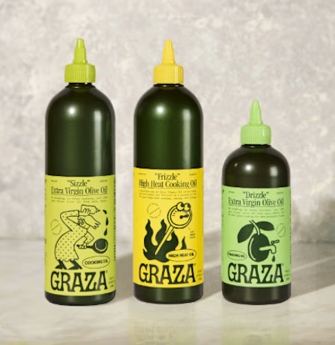
Take Graza, for example.
Instead of asking consumers to navigate an entire category of olive oils, Graza gives each product a clear purpose:
Cook? Sizzle. Finishing a dish? Drizzle. Need high heat? Frizzle.
Can’t remember to reorder? Subscribe.
Graza isn’t just selling olive oil. It’s selling a simpler system for using it.
I’m curious: What’s a decision you’ve eliminated recently?
The network for creativity
Join 1.25M professional creatives like you
Connect with clients, get discovered, and run your business 100% commission-free
Creatives on Contra have earned over $150M and we are just getting started


Related posts

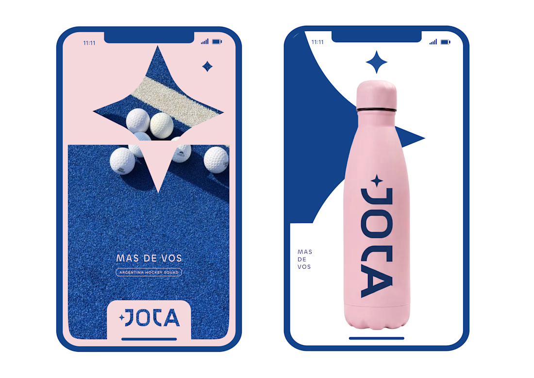
JOTA is an Argentine field hockey brand built for players who play with personality. The founder reached out to rethink how the brand shows up beyond the stick itself.


Wow project

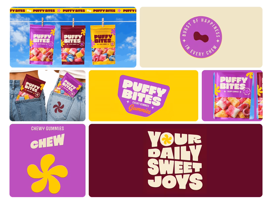
What makes a candy brand recognizable across every pack?
For Puffy Bites, I built the identity around rounded lettering, expressive symbols, and a palette of burgundy, purple, yellow, and cream.
The same visual language carries through pouch packaging, smaller wrappers, campaign imagery, and an animated brand showcase.
One design decision that ties it together: the packaging color changes, while the logo placement, product descriptor, and supporting graphics maintain a consistent structure.
I handled the full client project, from logo and visual identity to packaging and campaign applications.
Which colorway would catch your eye first—purple, burgundy, or yellow?
Explore the full Puffy Bites case study. If you’re developing a candy or snack brand, I’m available for branding and packaging projects.

Love it,
Great work

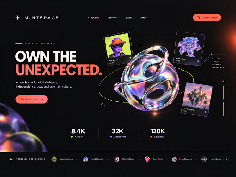
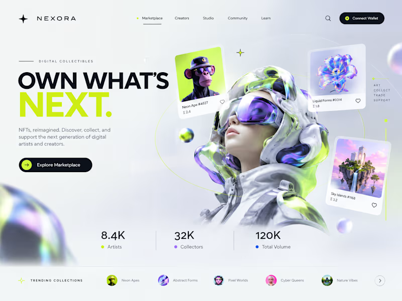
Two directions. One NFT marketplace.
Which visual direction would you choose?
🖤 A — Dark & Futuristic
🤍 B — Bright & Minimal
Both explore the future of Web3, but with completely different visual identities.
Drop your vote in the comments: A or B?
#UIUXDesign #WebDesign #NFT #Web3 #ProductDesign

10 voted
29%
25 voted
71%
35 votes
Closed

Strong design, well done