The network for creativity
Join 1.25M professional creatives like you
Connect with clients, get discovered, and run your business 100% commission-free
Creatives on Contra have earned over $150M and we are just getting started
Back to feedPost

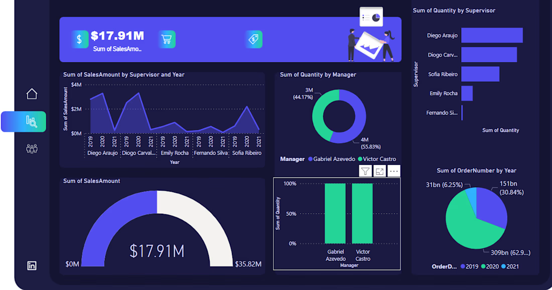
I recently built an interactive Power BI sales dashboard tracking $17.91M in total sales across supervisors, managers, and order years.
I then designed the data model and DAX measures behind the KPI cards, gauge, and trend visuals, and built drill-down views: sales by supervisor and year, quantity split by manager, and order volume by year.
I used combo visuals (donut, gauge, bar, and line charts) on one page so stakeholders can get the full picture without switching reports.
I also focused on a clean, single-screen layout that non-technical stakeholders can read at a glance.
#Microsoft Power BI #Daxko Operations #Data Visualization #Data Modeling #Business Intelligence


The network for creativity
Join 1.25M professional creatives like you
Connect with clients, get discovered, and run your business 100% commission-free
Creatives on Contra have earned over $150M and we are just getting started

Challenges
View all


Related posts

📊 Turning Data Into Insights
Sharing one of my recent Power BI dashboard projects.
I worked on transforming raw data into an interactive dashboard with a focus on:
• Data cleaning & transformation
• KPI tracking
• Interactive visualizations
• DAX calculations
• Trend & performance analysis
🛠️ Tools: Power BI • Power Query • DAX • Excel
Still learning, building, and improving with every project. 🚀
#PowerBI #DataAnalytics #DataVisualization #DAX #BusinessIntelligence #DataAnalyst #Analytics #Dashboard
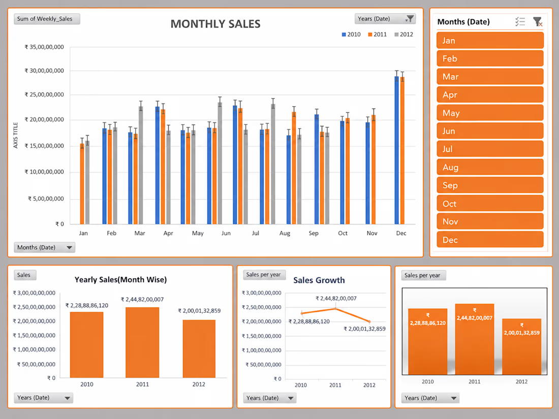


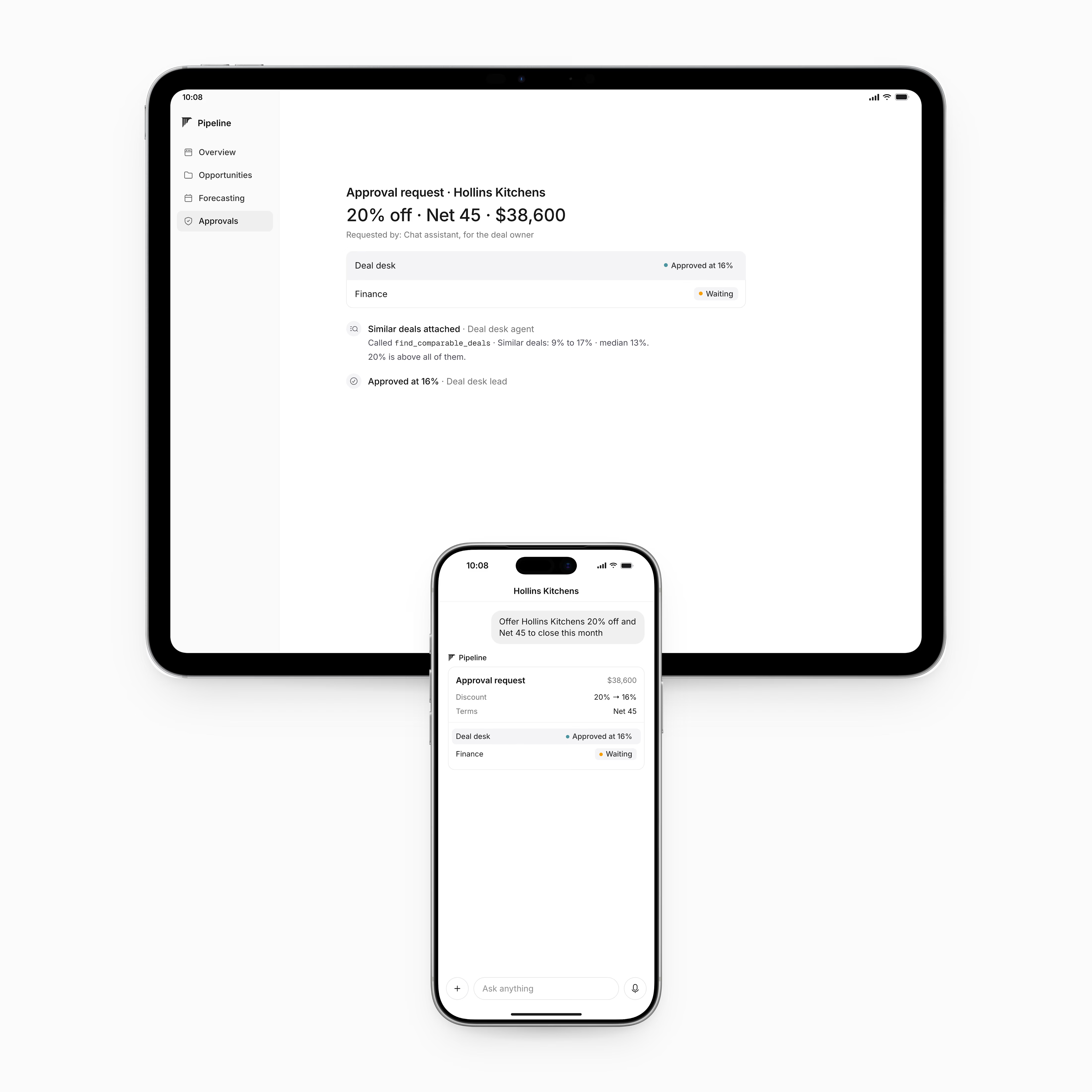
Dashboard and MCP request design for sales platform
The goal was the keep the experience simple for the users. Dashboards contain the majority of the information while the MCP request flags what's needed.
Check it out


I love this clean design 😍

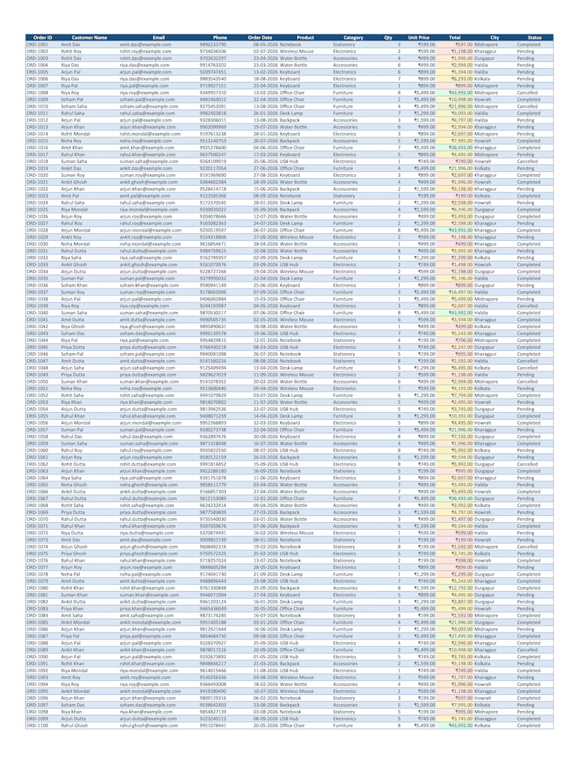
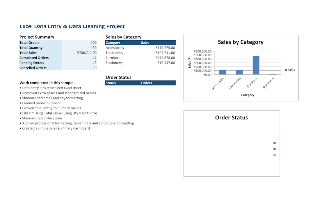
Created a professional Excel spreadsheet for data entry, data cleaning, formatting, calculations, and sales analysis. The project includes a structured order database, cleaned and standardized data, formulas, summary reports, and visual charts for easy data analysis.