The network for creativity
Join 1.25M professional creatives like you
Connect with clients, get discovered, and run your business 100% commission-free
Creatives on Contra have earned over $150M and we are just getting started
Back to feedPost

Website for Digital Marketing (Dark Theme)
This dark-themed digital marketing website uses a frictionless, top-down structure that tackles client FAQs early to build immediate trust. Its polished, component-driven UI and action-oriented navigation seamlessly guide analytical buyers from a bold value proposition straight to conversion.
Hero Section: A value proposition centered on transforming complex digital challenges into measurable strategies.
Core Services: Dedicated sections explaining their three primary pillars: Web Design, Search Engine Optimization (SEO), and Social Media Marketing.
Client Support Hub (FAQ): An introductory interactive section that addresses common client questions (timelines, services, guarantees, industries served, and pricing).
Process Breakdown: A step-by-step presentation of how they execute and continuously optimize client campaigns.
Social Proof: A carousel or grid featuring testimonials from business leaders (e.g., CEOs and marketing directors).
User Experience (UX) Design Aspects
The UX design focuses on minimizing friction, building immediate trust, and guiding potential clients down a clear conversion path.
Information Architecture & Hierarchy: The page uses a logical, top-down structure designed for an analytical buyer. It starts with an overarching promise (Hero), answers immediate practical questions (FAQs), proves its specific capabilities (Services/Process), establishes credibility (Testimonials), and ends with a conversion point (Footer/Contact).
Action-Oriented Navigation: The navigation bar relies on a traditional design layout to reduce cognitive load. Call-to-Action (CTA) buttons are consistently distributed throughout the journey, ensuring users never have to scroll far to take the next step.
Friction Reduction via FAQs: A deliberate UX choice places the "Client Support Hub Essentials" section higher up on the landing page. By addressing primary roadblocks early (such as pricing and timeline expectations), it qualifies leads and reduces user anxiety before asking them to reach out.
User Interface (UI) Design Aspects
The UI design is modern and clean, utilizing typical contemporary Webflow-style layouts to project digital expertise.
Iconography as Visual Anchors: Custom SVG icons are paired with text headers (e.g., in the FAQ and SEO process sections). This establishes a strong visual rhythm and allows users to intuitively categorize information before reading it.
Component-Driven Layouts: The UI relies on repeated modern design components—such as cards for services, grid alignments for process steps, and a clean testimonial slider. This consistency creates a unified brand identity across the entire page.
Responsive Media Integration: The interface uses fluid image sizes (most assets follow the standard 800x600px aspect ratio), which means it has a flexible grid system that scales smoothly across desktop, tablet, and mobile displays without misaligning the surrounding text.
Consistent Typography and Grids: The alignment of elements, structured text hierarchy, and standardized image aspect ratios give it a cohesive look that aligns well with current corporate design trends.
Polished Elements: The use of tailored SVG icons and smooth components gives it a sleek, modern finish typical of high-quality Webflow layouts.

The network for creativity
Join 1.25M professional creatives like you
Connect with clients, get discovered, and run your business 100% commission-free
Creatives on Contra have earned over $150M and we are just getting started
Trending
retrofuturism
Share your favorite designs from the past exploring the distant future. Or your own take on the aesthetic 🚀
halftone
Dots. Texture. Grain. Let's see your designs using the halftone technique.

Midjourney
Creatives are showing off what they're making with Midjourney.
colorgrade
Video editors sound off: How do you enhance the mood of your video in color grading?


Related posts


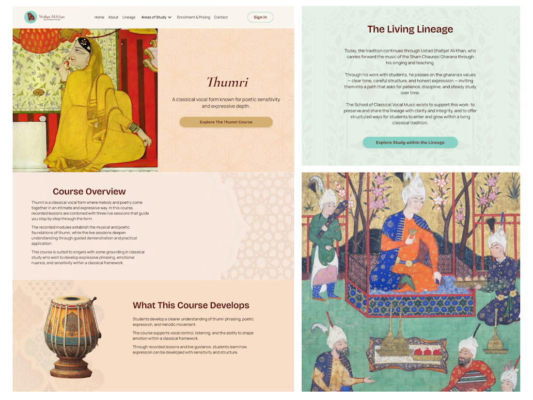
Another project completed! 🎉
This one was a little different from the Kajabi projects we usually work on.
Instead of building a platform for coaches or business creators, we worked with Shafqat Ali Khan Music – an online school dedicated to teaching the centuries-old tradition of classical South Asian vocal music.
The biggest challenge wasn't adding more features or making the design feel trendy. It was creating a website that respected the heritage behind the music while still providing a clear and intuitive experience for today's online students. Sometimes the best design is the one that quietly supports the content rather than trying to stand out.
We're especially happy that the client loved the final result – and even better, they've already seen an increase in course sales after launching the new website.
Projects like this are always a reminder that every audience is different, and good design starts with understanding the people you're designing for.


I am from India, and I must say your work is so perfect...

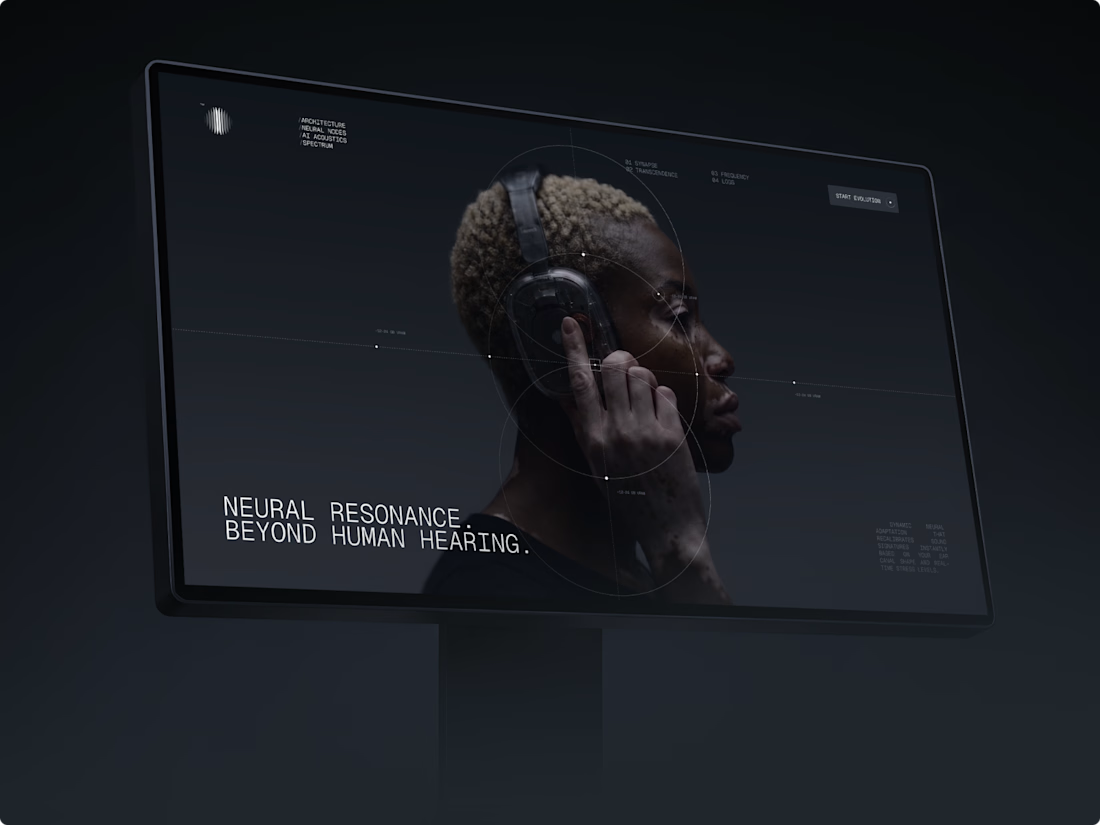
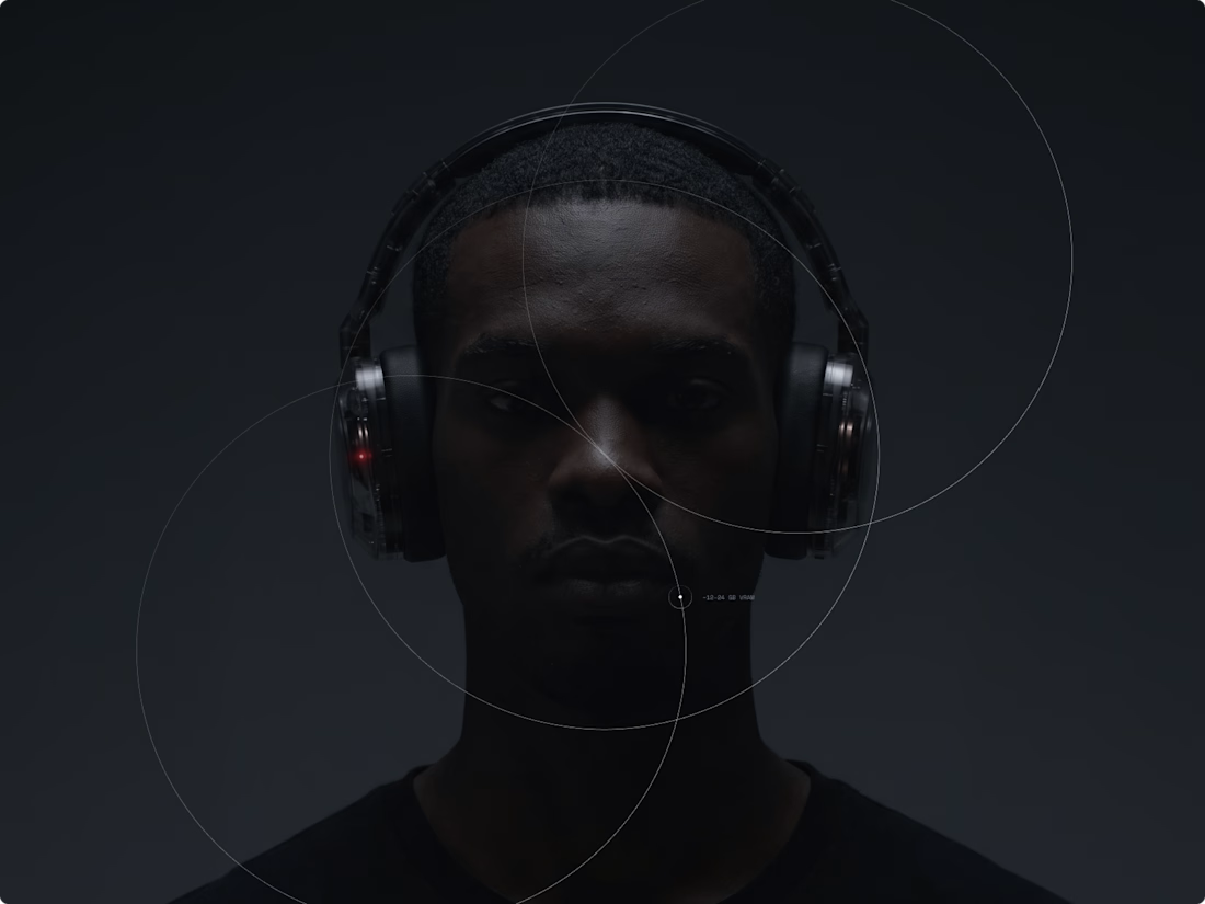
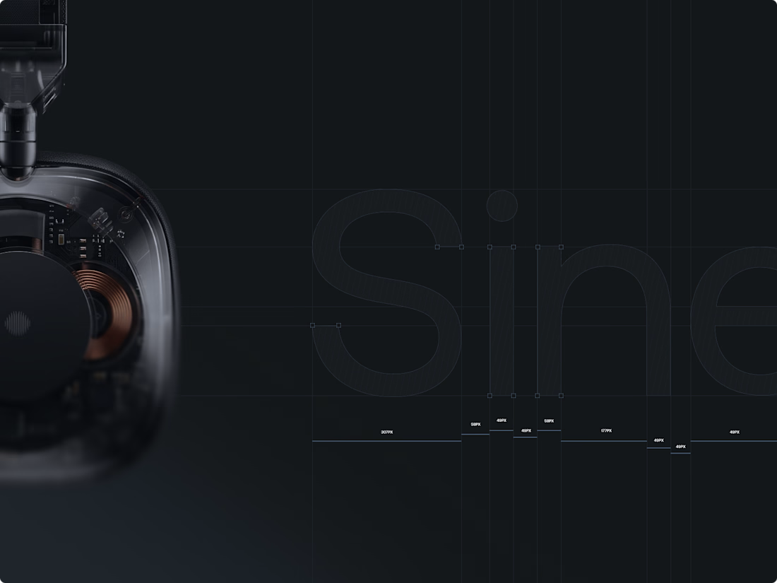
Exploring the intersection of neural AI processing and spatial acoustics with Sine audio technology. Full project : https://www.behance.net/Mitkow



This design makes everything look effortless!

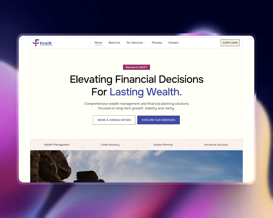
For our recent wealth management client, we designed a UI that's clear, trustworthy, and effortless to navigate.
✓ Simple design
✓ Confident messaging
✓ Nothing unnecessary
Because the best financial brands build trust long before the first conversation.


Loving the consistency and visual harmony!