The network for creativity
Join 1.25M professional creatives like you
Connect with clients, get discovered, and run your business 100% commission-free
Creatives on Contra have earned over $150M and we are just getting started
Back to feedPost

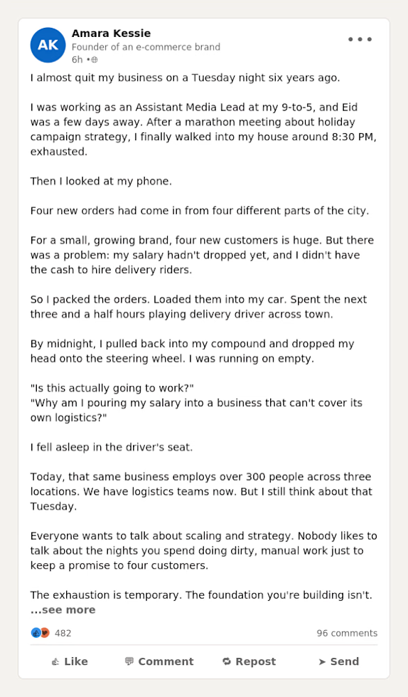
I wrote this LinkedIn concept post to show how to transform a standard business milestone into a scroll-stopping, high-engagement story


The network for creativity
Join 1.25M professional creatives like you
Connect with clients, get discovered, and run your business 100% commission-free
Creatives on Contra have earned over $150M and we are just getting started






Related posts

Just dropped my second UX & Conversion Copywriting concept on Contra! 📊
Pricing pages are where most SaaS and FinTech sign-ups stall. When tiers are packed with accounting jargon or hidden-fee anxiety, solo founders bounce instead of starting a trial.
For this self-initiated VeloceLedger concept, I focused on turning hesitation into clarity:
• Identity-Driven Tiers: Replaced vague labels like "Basic" with "Best for..." taglines so freelancers self-identify their plan in seconds.
• Zero-Risk Trial Microcopy: Explicitly reassured users they’ll auto-downgrade to the free tier when the 14-day trial ends ("zero surprise charges").
• Interactive Plan Helper: Built a 1-question prompt to eliminate choice paralysis right on the page.
Check out the full case study on my profile, what’s the #1 thing that makes you hesitate on a SaaS pricing page? 👇

🥣 The Unofficial Breakfast Club of Mumbai Local
Some of the best stories happen between two stations.
From shared tiffins and hurried breakfasts to women selling dosas and vada pavs, this piece captures the little rituals and connections that make Mumbai locals special.
I love turning everyday observations into stories that people can relate to and remember.
I'm open to freelance opportunities and collaborations in content writing, creative writing, blog writing, copywriting and editorial storytelling.
If you enjoy my work, leave a like and share your thoughts. ❤️
adeeteii.substack.com
The Unofficial Breakfast Club of Mumbai Local
I’ve probably collected more breakfast inspiration from the women travelling with me than from scrolling through food videos.

Nice article
Would need your skill if you’re open


Creating 2 concepts for a project, this is the first one.
I’m really enjoying the process!
Right now, we’re defining the strategy and visual direction, which will later serve as the foundation for developing the final brand identity.

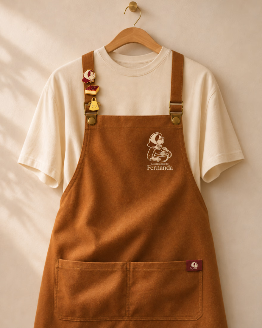
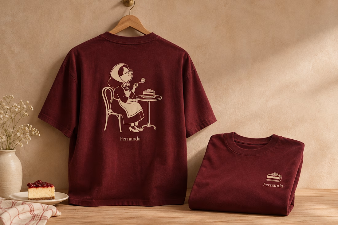

Nice logo design I like how logo is placed in clothes