The network for creativity
Join 1.25M professional creatives like you
Connect with clients, get discovered, and run your business 100% commission-free
Creatives on Contra have earned over $150M and we are just getting started
Back to feedPost
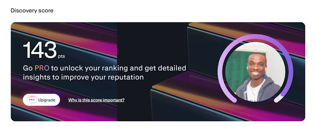
I am among the Top 5% on Contra. Working towards the 1% 👍

Congratulation chief

congrats mate!

Thank you!

Congratulations Mate!
Thank you
The network for creativity
Join 1.25M professional creatives like you
Connect with clients, get discovered, and run your business 100% commission-free
Creatives on Contra have earned over $150M and we are just getting started



Related posts

Let's grow together on Contra! 🚀
I believe we can grow faster when we share knowledge instead of figuring everything out alone.
Whether you're new to Contra or have been here for years, I'd love us to share ideas, strategies and experiences that can help everyone succeed.
I'll start with one tip: Pay attention to your Discovery Score. Keep improving your profile, portfolio and visibility.
What's one thing that has helped you grow on Contra?
I'd love to hear your thoughts. And if you're just starting out, feel free to send me a message. Let's connect, exchange ideas and grow together!
Your next breakthrough might come from a conversation. 🤝


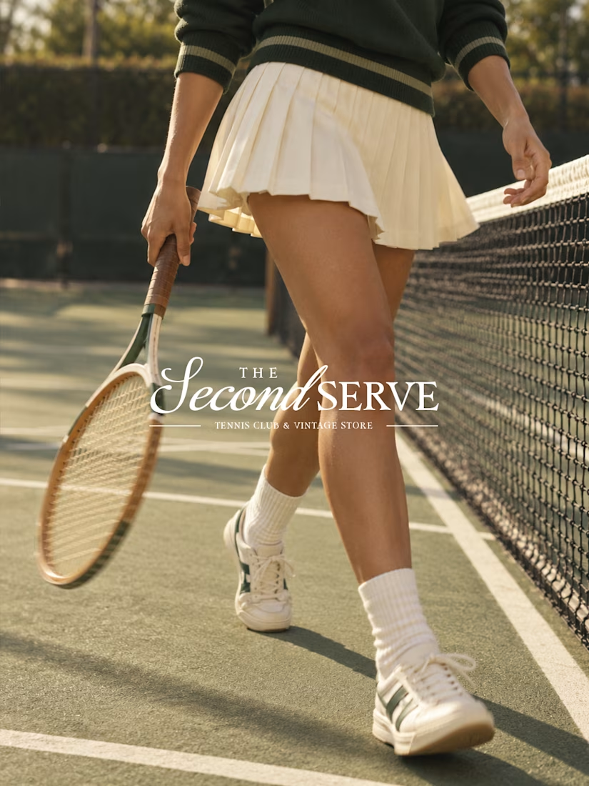
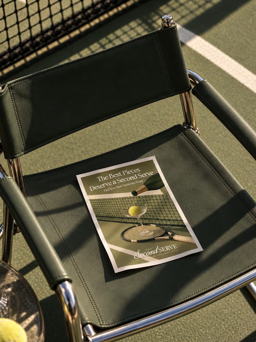
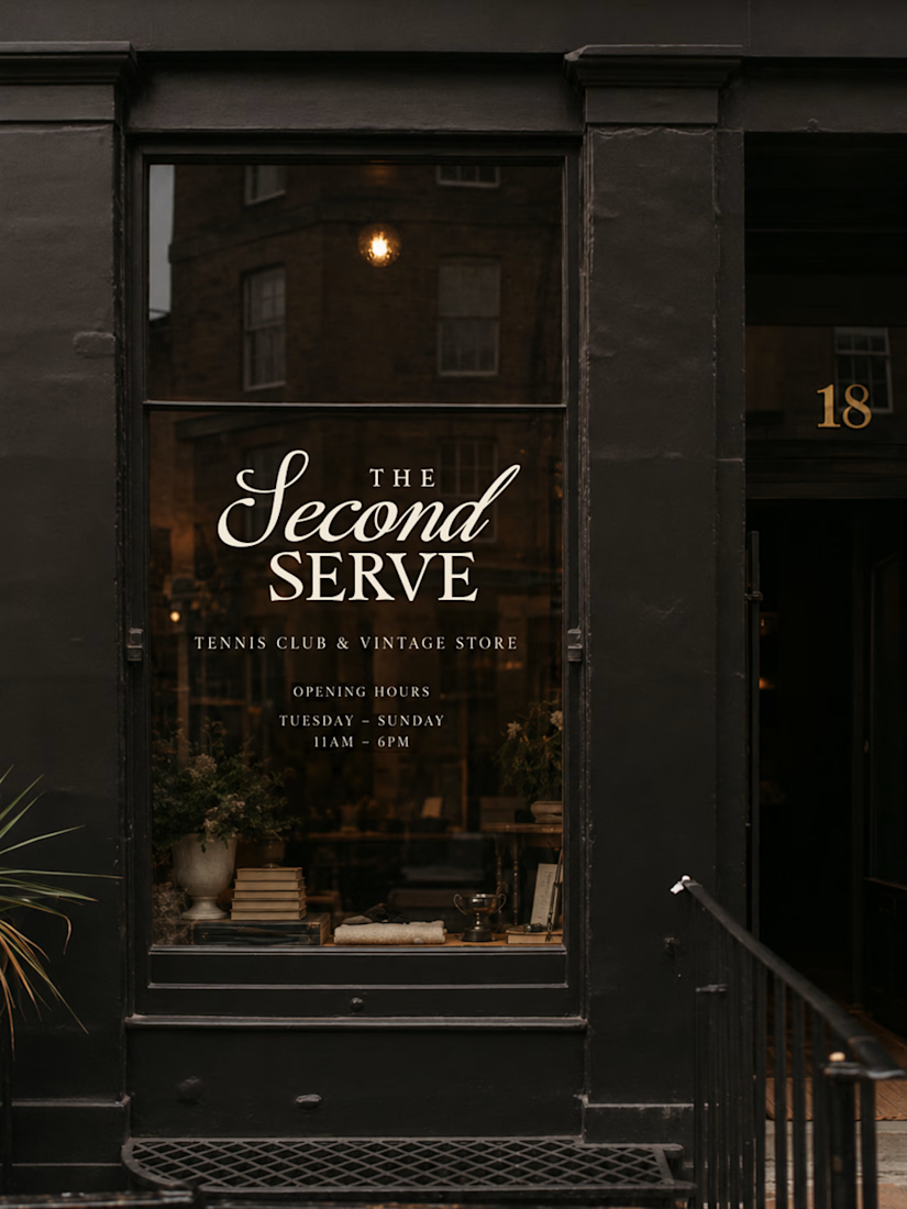
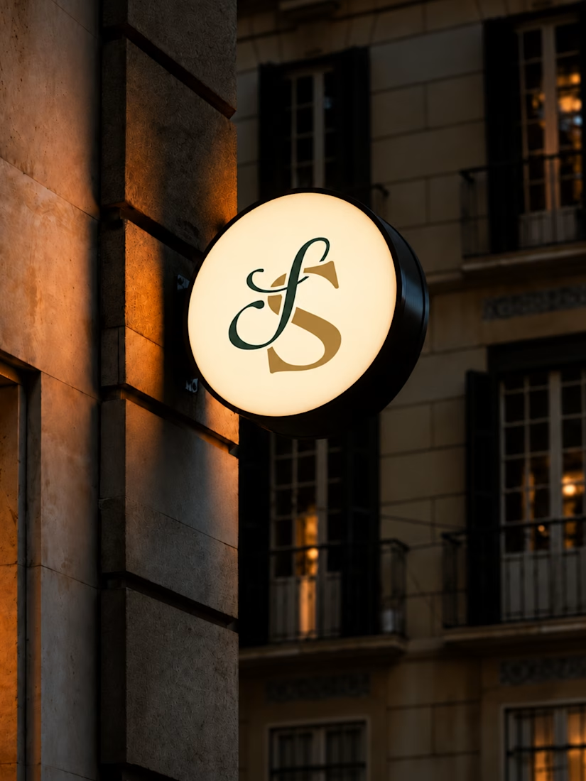
New to Contra, and warming up with some small brand work. Where vintage charm meets modern court culture.
For this project, I wanted to create something that felt classic without looking outdated. I played around with elegant typography, deep greens, warm neutrals, and subtle vintage details to give the brand that old-school tennis club feel.
The idea was to build an identity that could work just as well on a storefront as it does on clothing, packaging, and social media - I think it worked out well!