The network for creativity
Join 1.25M professional creatives like you
Connect with clients, get discovered, and run your business 100% commission-free
Creatives on Contra have earned over $150M and we are just getting started
Back to feedPost

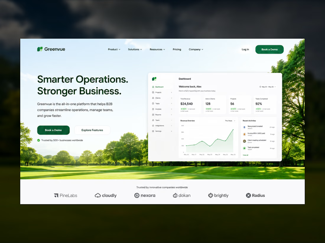
🌿 Experimenting with a Different SaaS Hero Direction
Most B2B SaaS websites lean heavily on abstract gradients and geometric shapes. I wanted to explore a cleaner, more refreshing approach by introducing natural elements into the hero section.
This concept combines:
• Green trees and a subtle landscape background
• Minimal, modern UI with plenty of whitespace
• Enterprise-focused dashboard preview
• A professional B2B aesthetic without sacrificing visual warmth
• A layout designed to stay consistent across the entire landing page
The goal wasn't to make it feel like a nature website—it was to create a trustworthy, calm, and premium first impression while keeping the focus on the product.
I'd love to hear your thoughts: Would you consider this style for a modern B2B SaaS brand, or do you prefer the more traditional gradient-based approach?


The network for creativity
Join 1.25M professional creatives like you
Connect with clients, get discovered, and run your business 100% commission-free
Creatives on Contra have earned over $150M and we are just getting started





Related posts

Bleu Cleaning Local Business Website Project done
A clean, trust-focused website design for a home and office cleaning service, made to help visitors find a cleaner and book in less than a minute.
The Problem was
Most cleaning websites lose customers before they book. Visitors don't trust strangers in their space, prices are hidden, and booking takes too many steps.
Solution I deliver
I designed Bleu's Website around one goal: get visitors to book faster.
Instant booking: A postcode search and Book Online button in the hero start the booking straight away.
Trust from the first scroll: A "40,000+ properties" statistic, a project gallery, and client testimonials prove reliability.
No pricing surprises: Every service shows a clear price, with "no hidden fees" stated upfront.
Doubts answered: Eco-friendly products, a satisfaction guarantee, easy rescheduling, and an FAQ remove the last reasons to hesitate.


This is lovely and beautiful 😍

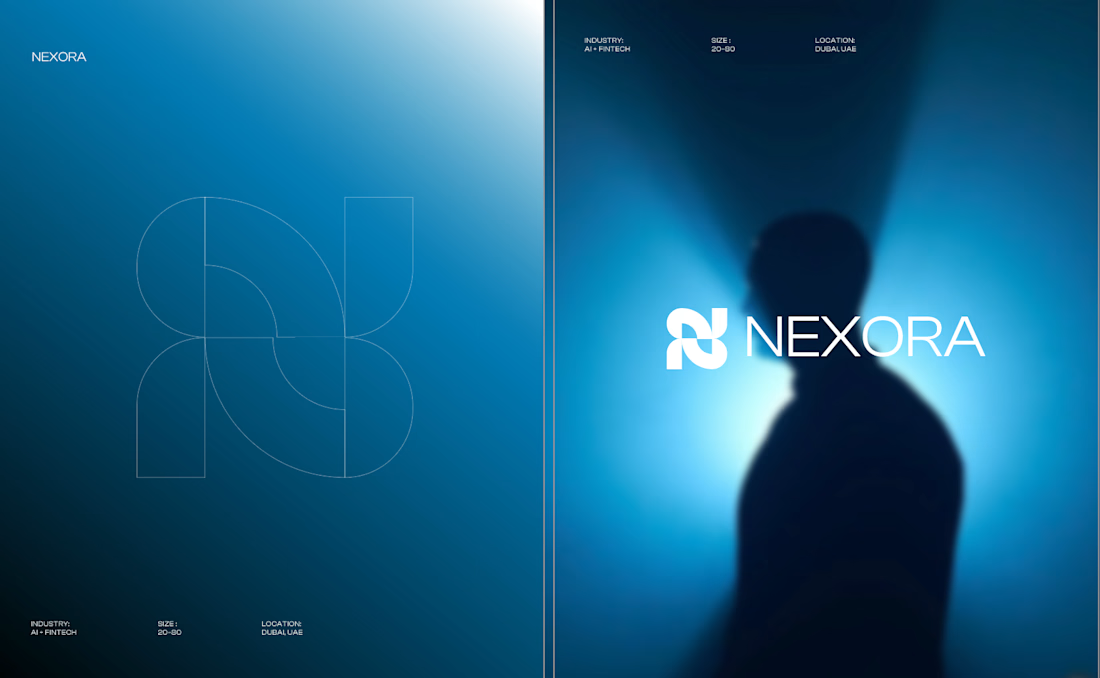
Currently building a new identity for an AI + fintech company in Dubai.
Still early, but this is one of the directions we’ve been exploring for the brand.
The idea was to avoid the usual “AI company” visual language and build something that feels more established, precise, and quietly futuristic.
We’ve been playing with geometry, light, and a much more restrained visual system around the mark.
Still developing this one, so I’m curious:
Would you push this direction further, or keep it this restrained?

Honestly the logo presentation is impressive


pure eye candy 😍