The network for creativity
Join 1.25M professional creatives like you
Connect with clients, get discovered, and run your business 100% commission-free
Creatives on Contra have earned over $150M and we are just getting started
Back to feedPost
Money shouldn't feel stuck.
It should move.
You spend it.
You save it.
You send it.
You grow it.
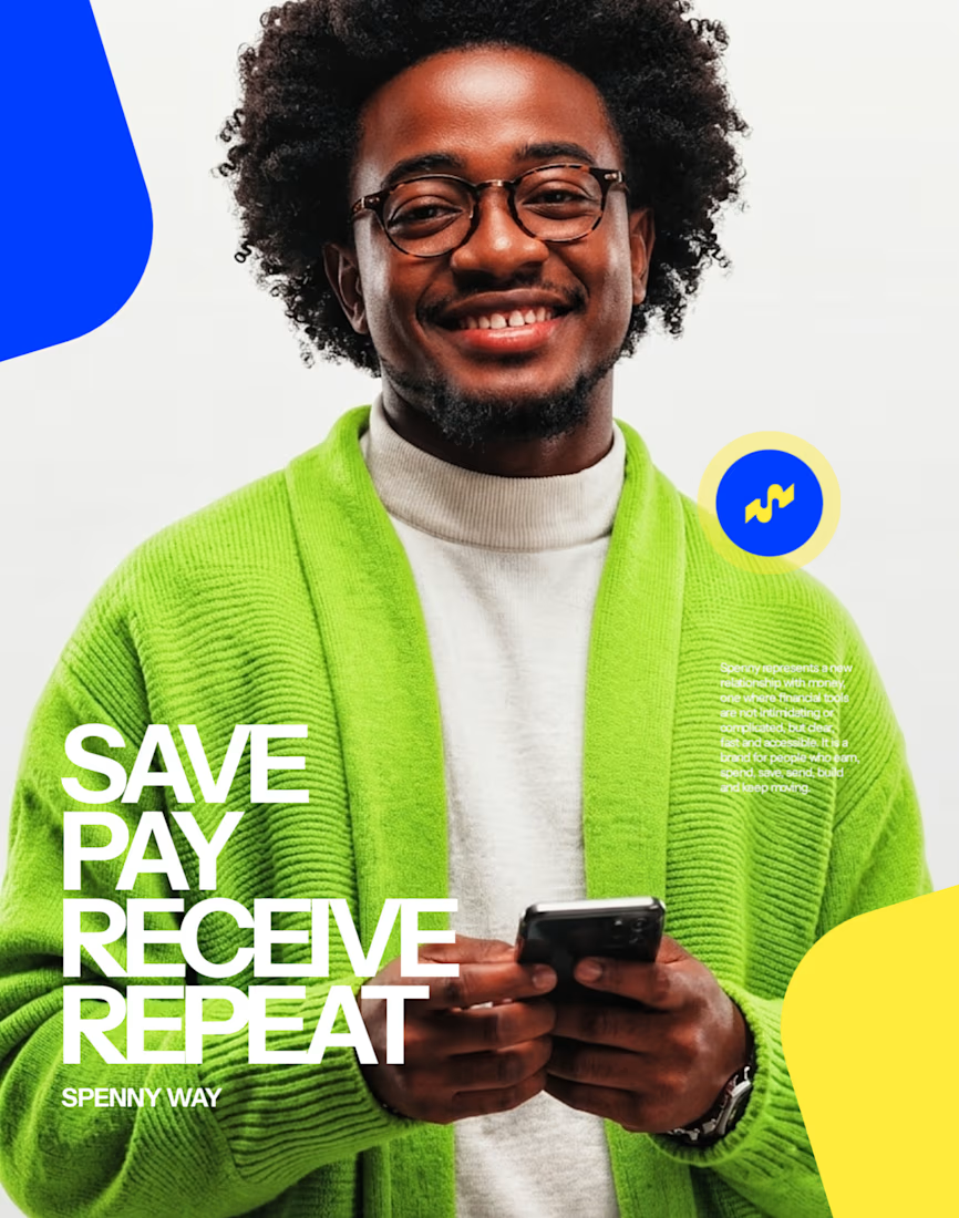
And that became the thinking behind SPENNY — a contemporary fintech brand built around a simple idea:
Money should move as freely as people do.
From everyday spending and payments to saving, transfers and financial growth, Spenny is designed to make managing money feel simpler, faster and more intuitive.
The identity
I wanted the visual identity to reflect that sense of movement.
Not a rigid financial institution.
Not another generic fintech brand.
Something that feels fluid, energetic and modern — while still carrying the clarity and trust people expect when money is involved.
The identity was developed around the idea of money in motion, translating movement into a visual language that feels distinctive without becoming complicated.
Because when you're dealing with money, the experience can be complex.
The brand shouldn't be.
More than making it look good
My approach to every project is simple: understand the idea first, then build the visuals around it.
Fresh energy.
A sharp eye.
And a genuine commitment to getting the details right.
The goal is always to create a brand that doesn't just look the part, but feels like it belongs exactly where it's placed.
Building something worth moving?
If you're serious about your next brand, product or visual identity, I'd love to be part of the process.
Let's turn the idea into something people can see, feel and remember.


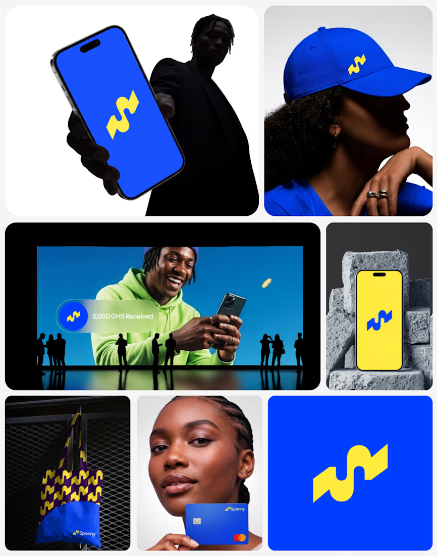


The part I'd be curious about is where the motion idea lives outside the stills — does it carry into the app's transitions, or does the mark have to do all of it? Fluid marks usually get tested hardest at app-icon size, where the movement flattens out.

That’s a really good question. The motion idea isn’t meant to live only in the mark, it can extend into the app through transitions and micro-interactions, while the mark itself is designed to still hold its own at app-icon size. The motion is more of a broader brand behaviour than something the logo has to carry alone.
The network for creativity
Join 1.25M professional creatives like you
Connect with clients, get discovered, and run your business 100% commission-free
Creatives on Contra have earned over $150M and we are just getting started
Trending
retrofuturism
Share your favorite designs from the past exploring the distant future. Or your own take on the aesthetic 🚀
halftone
Dots. Texture. Grain. Let's see your designs using the halftone technique.

Midjourney
Creatives are showing off what they're making with Midjourney.
colorgrade
Video editors sound off: How do you enhance the mood of your video in color grading?
Challenges
View all


Related posts

Took up this project a few weeks ago. The brief was simple, design an identity that doesn't need to scream luxury, but speaks for itself. A private collection of 17 residences.
The logomark draws inspiration from Spanish architectural heritage, specifically the Draped Arch, one of the most distinct and revered forms in Spanish design. Chosen not only for its visual elegance, but for what it symbolises: a sacred threshold. A portal marking the transition into something new. The creation of a home. A new standard of living.
The arch was then studied alongside the architecture of the residence itself, drawing from shared elements of form and proportion. Spanish architectural language meeting the building's own design, producing a mark that feels both rooted and original.
The result is an icon that does not need to announce itself. It simply speaks, quietly, confidently, and with purpose.
The full identity reveal is coming soon.


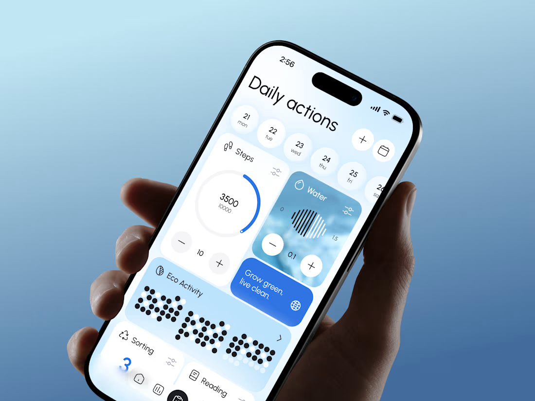
The eco-score sitting right next to steps and water is a smart move, it reframes sustainability as just another daily stat instead of a separate chore. Curious how you landed on gamifying it that way versus something more like a streak or badge system.


New badge, who dis? ✅💙
Lynksen is officially a @Webflow Certified Partner. That means our profile now carries the Webflow Expert badge for anyone hiring through Contra.
Lisbon-based, shipping worldwide. 🌍
WebflowwebflowcertifiedpartnerswebdesignLow-Code/No-Code DevelopmentWeb DesignWebflow DevelopmentContraFigma


Great news, congrats 💙💻