The network for creativity
Join 1.25M professional creatives like you
Connect with clients, get discovered, and run your business 100% commission-free
Creatives on Contra have earned over $150M and we are just getting started
Back to feedPost
Taste Test
Which bottle design makes the product look more appealing on the shelf?
1 voted
14%

6 voted
86%

7 votes
Closed

Amazing work

thanks Victor! ^^


I really like the idea and the product itself but just sharing my opinions;
This design itself looks industrial right now to be honest. To make it a bit appealing in the shelf, it has to be designed a little softer especially if its a self-care type of (it looks like it) product. Great work.
Thanks so much for sharing your thoughts! ^^

Frosted texture
The network for creativity
Join 1.25M professional creatives like you
Connect with clients, get discovered, and run your business 100% commission-free
Creatives on Contra have earned over $150M and we are just getting started



Related posts

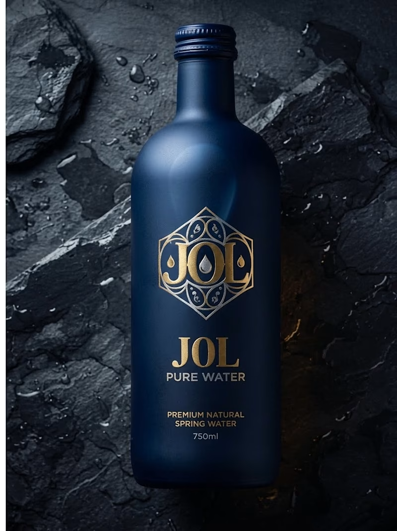
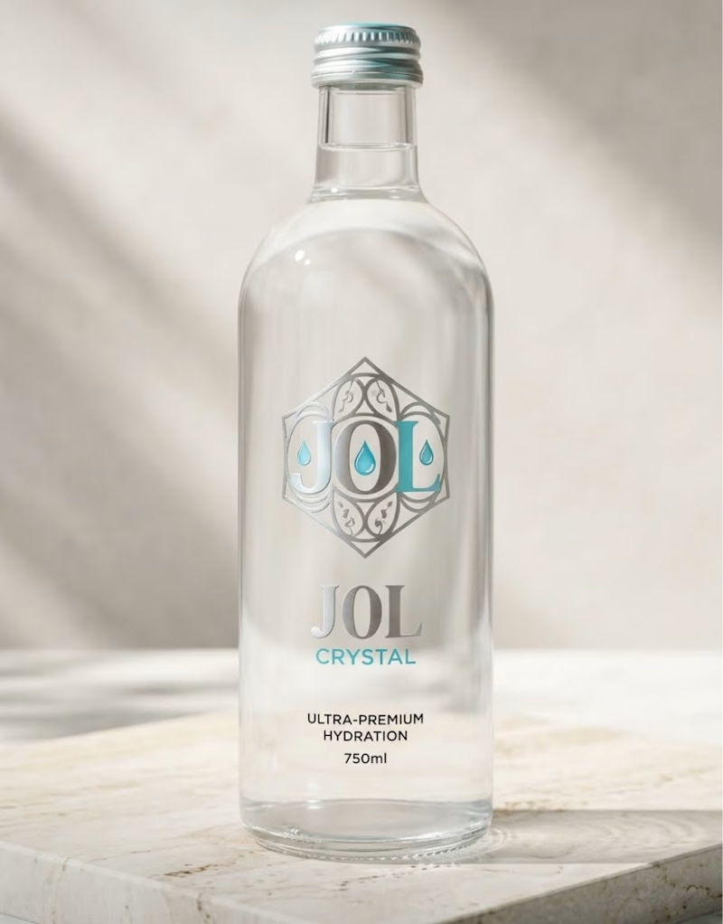
Which J0l bottle design stands out more to you?
I am testing two packaging directions for J0l, a luxury water concept I designed.
On one side, I created a bold, matte midnight blue bottle with gold accents. On the other, I designed a clean, crystal clear glass bottle with silver and teal details.
Which look grabs your attention first? Let me know in the poll below!
1 vote
Ends in 1d

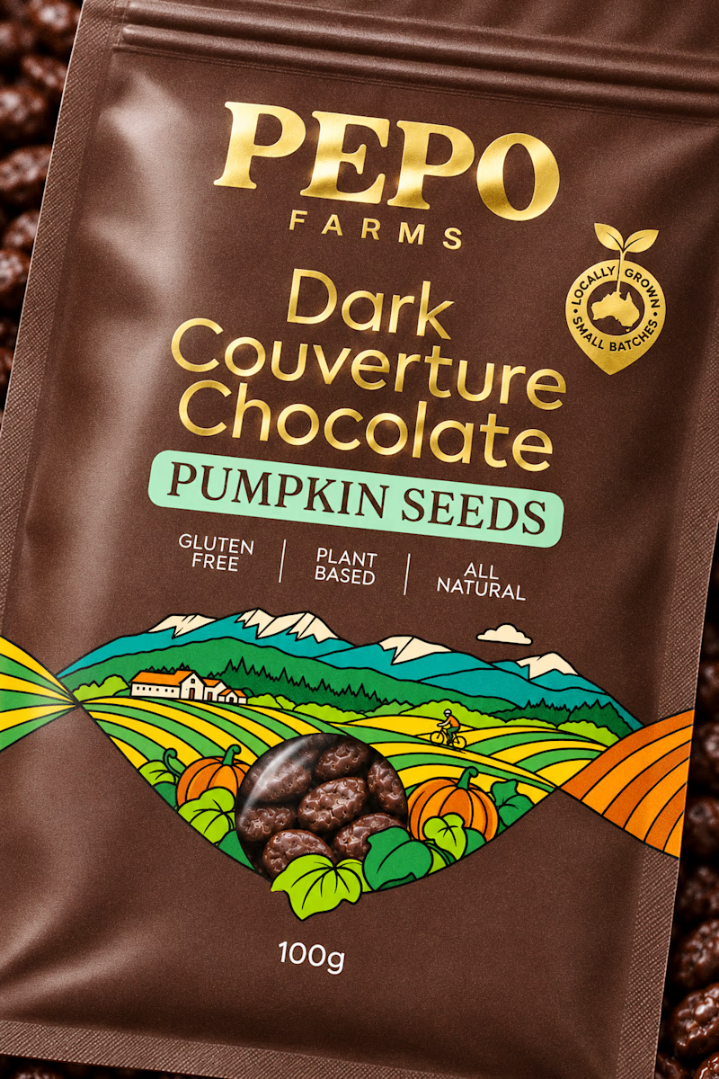
I need another set of eyes to check which version works better with this design. The main thought behind this design is the illustration created in the shape of a DNA strand to showcase the brand and how it originated.
Since this is a chocolate product, I personally felt that a more expressive and bold illustration with outlines would be better suited. I would love to hear what you think as a fellow creative.
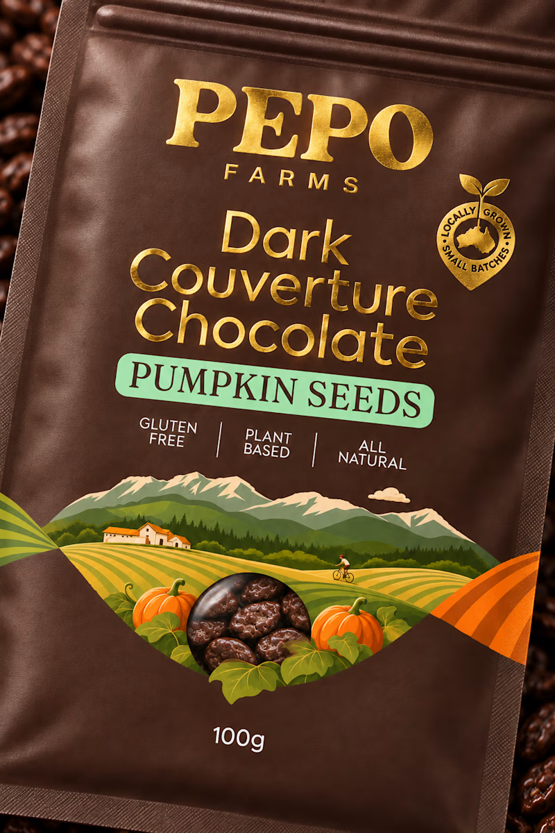
6 votes
Ends in 1d

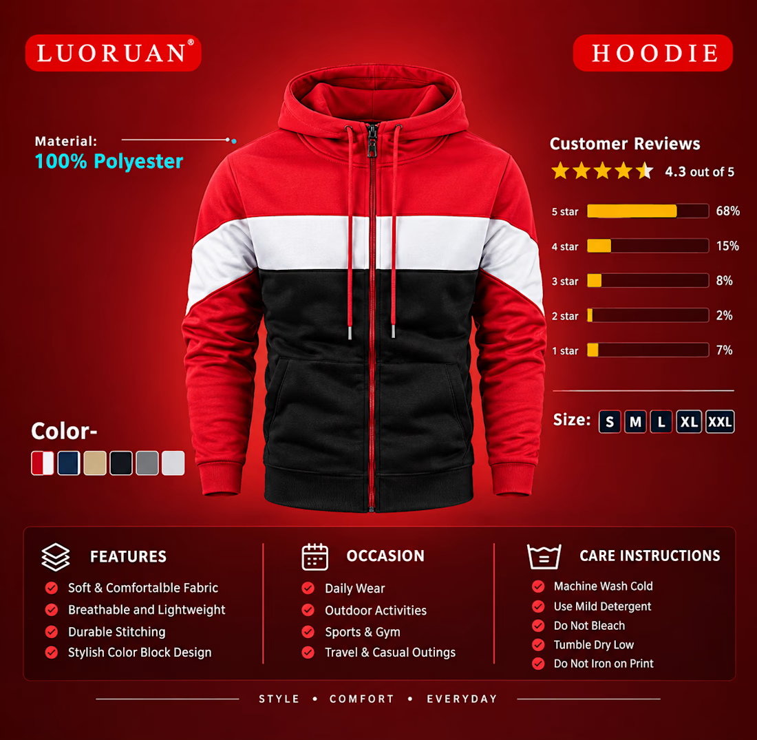
"Just wrapped up this vibrant product banner and advertising design for a modern apparel brand! Featuring clean layout composition, bold typography, and highlight details to boost e-commerce engagement. Let me know your thoughts! 👕✨"