The network for creativity
Join 1.25M professional creatives like you
Connect with clients, get discovered, and run your business 100% commission-free
Creatives on Contra have earned over $150M and we are just getting started
Back to feedPost
Designing a data platform that feels as structured as the product itself.
For this landing page concept, I explored a visual language built around clarity, structure, and controlled visual noise.
The grid system creates a strong foundation, while the blue modular shapes bring in a subtle connection to data, systems, and scalability. I also used the editorial-style product letter as a way to make the experience feel more tangible and human.
The goal was simple: make a technical product feel approachable without losing its technical character.


The editorial product letter next to the modular data-blocks grid is the smart move — it puts a human voice right beside the systems visuals instead of leaving the technical language to carry the whole page alone.

what do u think abt those blocks grid will distract the user from the actual content of vision?
The network for creativity
Join 1.25M professional creatives like you
Connect with clients, get discovered, and run your business 100% commission-free
Creatives on Contra have earned over $150M and we are just getting started








Related posts

A premium landing page concept for a luxury sauna brand, focused on warm visuals, refined typography, and a smooth interactive experience.


Great landing page 🎉🎉🔥🔥

Juice & Beverage Shopping App UI/UX Design
A fresh and modern juice and beverage shopping app designed to deliver a smooth and engaging shopping experience. Featuring vibrant product visuals, intuitive navigation, interactive animations, and a clickable prototype, this design makes it easy for users to explore beverages and enjoy a seamless ordering journey.
The project combines clean UI, thoughtful UX, and engaging micro-interactions to create a visually appealing and user-friendly mobile shopping experience.


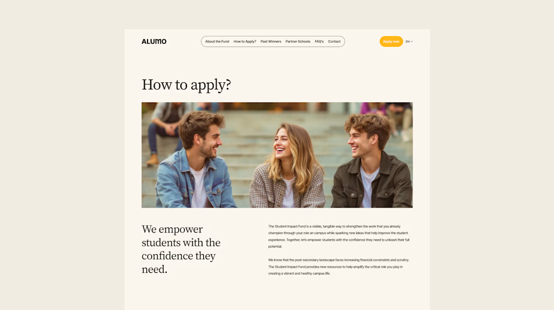
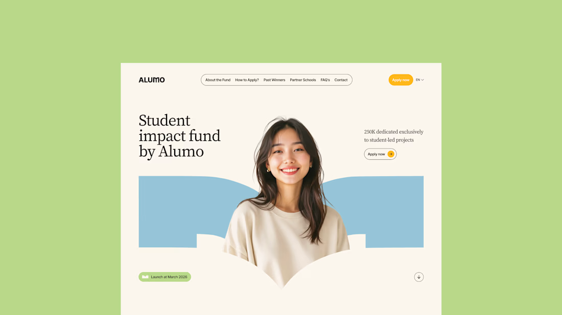
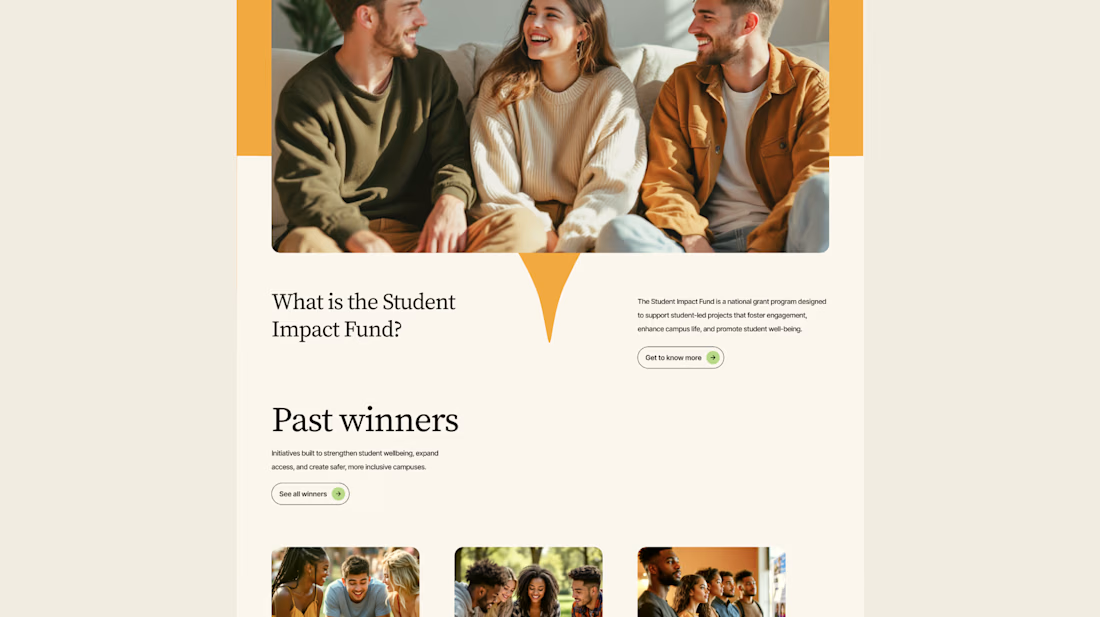
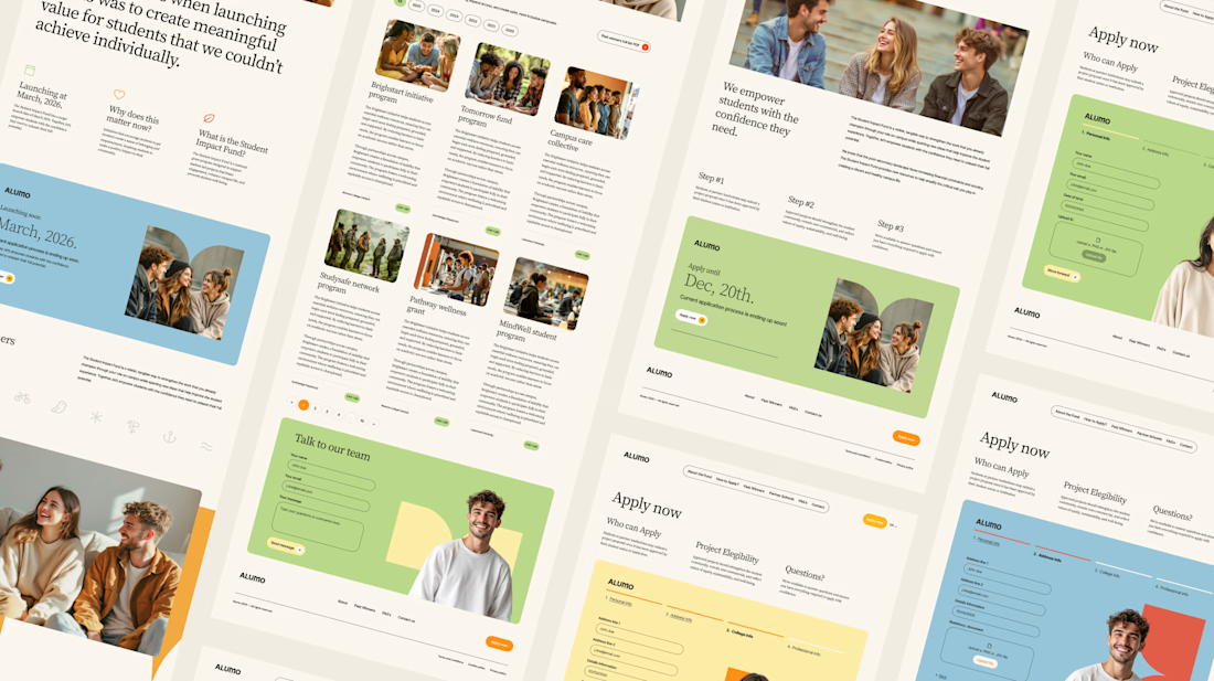
The Client: Alumo is a student impact fund that pools collective influence from influencers and partner schools to deliver a $250,000 annual grant program for student-led projects across Canada.
The Issue: The fund needed a website that could communicate trust and purpose to two very different audiences — students applying for grants and partner schools or influencers considering joining — while also showcasing past winners and guiding applicants through the process clearly.
The Solution: A multi-page website was designed with a warm, approachable visual identity using earthy tones, generous imagery, and clear information hierarchy. Each section — About, Past Winners, and How to Apply — was structured to reduce friction and build confidence, making it easy for students to understand eligibility and take action before the deadline.


Love how you're tackling trust + purpose for a $250K fund - that's a tough balance with two audiences. Communicating credibility for a student-led initiative across Canada is huge. Would love to see how you solved it!