The network for creativity
Join 1.25M professional creatives like you
Connect with clients, get discovered, and run your business 100% commission-free
Creatives on Contra have earned over $150M and we are just getting started
Back to feedPost

cool stuff

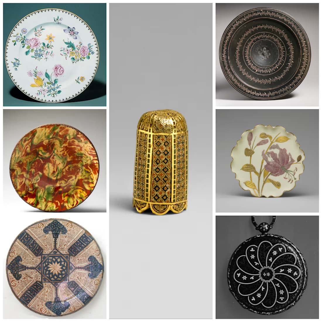
This is my 3rd and last submission, I have many Ideas so I combined them into one,
Inspired by:
1. Tip of a Pointer, Bayzantine 1080–1150 As cylindrical bullet seats
Link to Art: https://www.metmuseum.org/art/collection/search/466296
2. Watch pobably swiss, ca. 1815-20 As...
The network for creativity
Join 1.25M professional creatives like you
Connect with clients, get discovered, and run your business 100% commission-free
Creatives on Contra have earned over $150M and we are just getting started


Related posts

Just got featured on the Contra homepage 🔥 🚀
This is an ongoing work in progress. Version 1.1 of a spec work demo reel for HyperFilms, an AI video studio I've been working on launching this year.
Accelerated Storytelling: human taste and craft combined with AI-powered workflows.


Human taste plus AI workflow — reel moves beautifully.

There’s something so refreshing about curating a playlist for someone, or even just for yourself. In a world ruled by algorithms, it feels like a breath of fresh air. 🥹
Such a cool concept here, and the design is just as good!

Remember making a mixtape for someone? I do.
So I made Mixtape, for everyone who misses it.
Pick. Record. Share.

So good. Being able to draw right on the tape brings back the whole point of making a mixtape in the first place

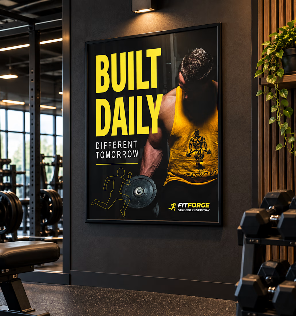
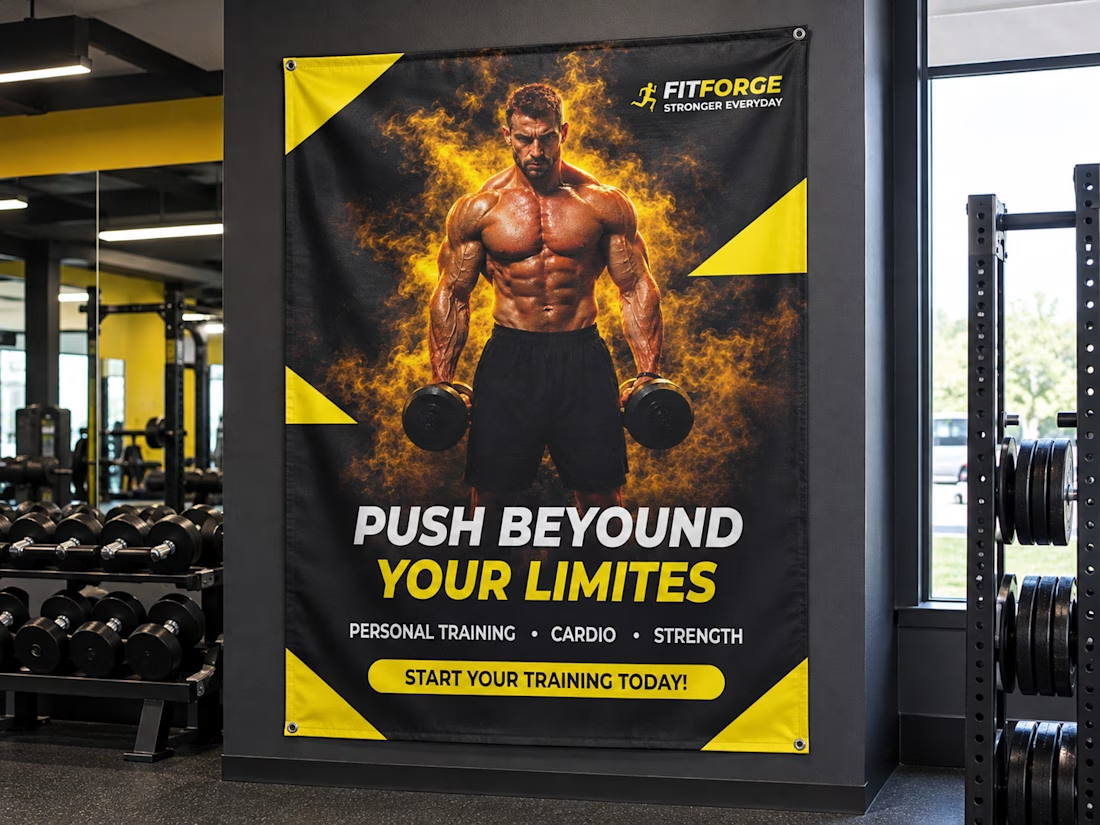
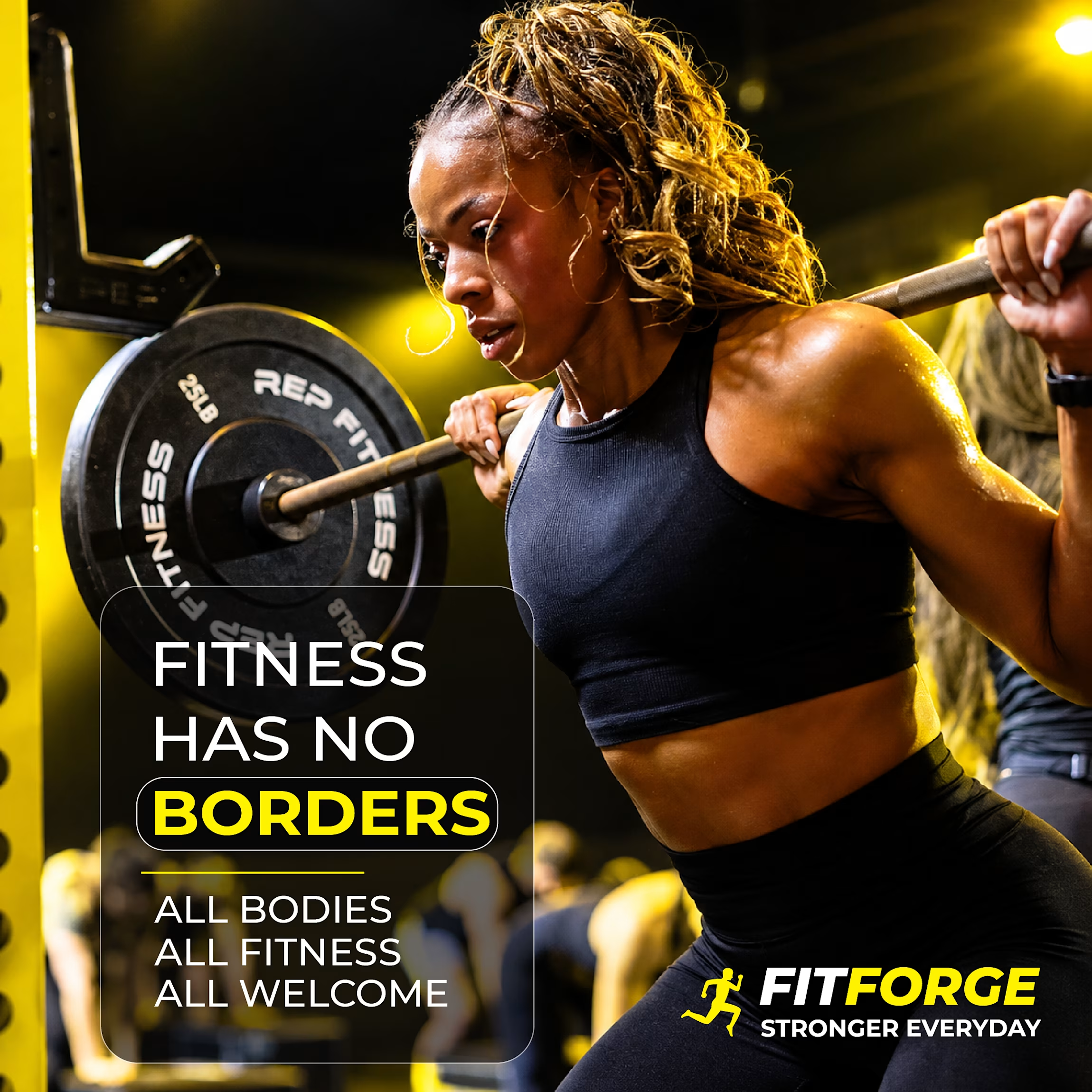
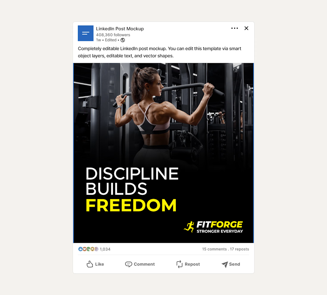
Brief: FitForge gym wanted posters and social media posts to promote their fitness services and create a bold, energetic look.
I designed two posters, three social media posts, and one postcard for FitForge, using strong typography, clear visual hierarchy, and a consistent black-and-white plus brand color palette.
Process: Started with logo direction, then carried the same look into the posters to keep the brand consistent. Used typography to create clear hierarchy so the main message reads first, with details following naturally.
Deliverables: Two posters, Three social media posts, One postcard, plus mockups showing how the design would look in a real gym space.
Outcome: a bold, clean, and cohesive set of materials that reflect the gym's energetic feel