The network for creativity
Join 1.25M professional creatives like you
Connect with clients, get discovered, and run your business 100% commission-free
Creatives on Contra have earned over $150M and we are just getting started
Back to feedPost

What if you could access your tasks and calendar from Apple's menu bar?
Less app switching, less distractions, more focused work sessions!
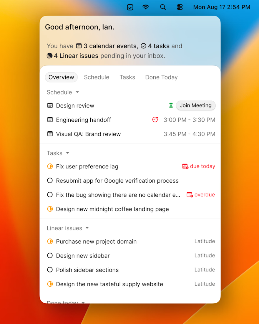
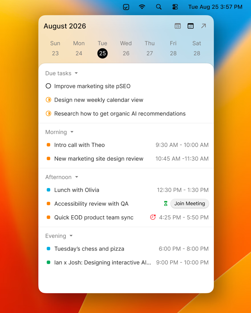

This is a strong take on reducing context switching—the paired task and calendar views make the utility immediately clear. The warm orange framing also gives the otherwise functional UI a welcoming, focused feel.
Thanks Rohan! Yeah, the idea was to make it simple to see what needs you attention, wherever you are.
The network for creativity
Join 1.25M professional creatives like you
Connect with clients, get discovered, and run your business 100% commission-free
Creatives on Contra have earned over $150M and we are just getting started

Challenges
View all


Related posts

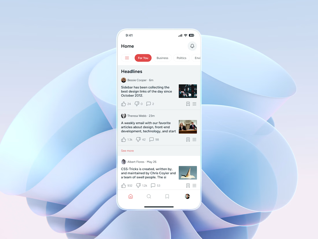
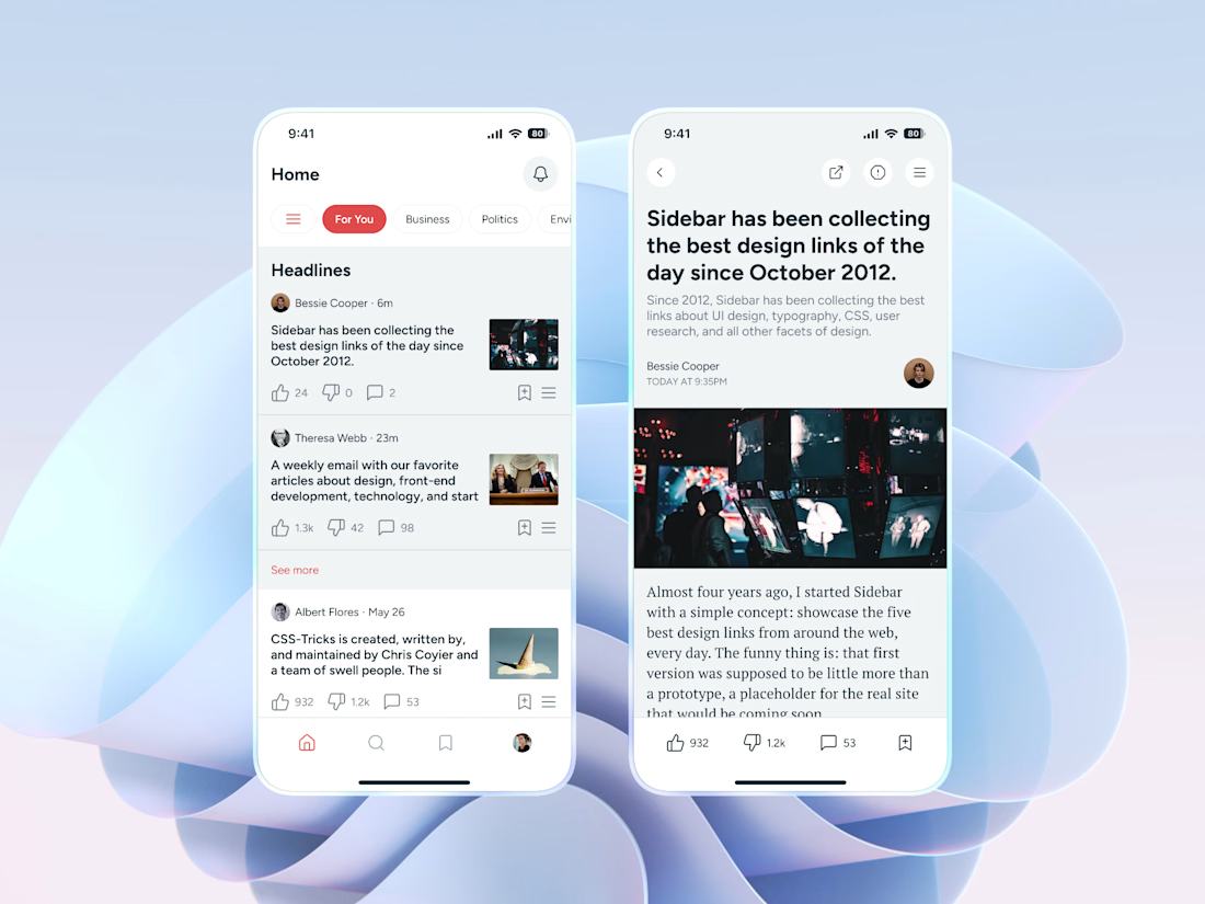
Daily Reads: Clean News Reader App 📰❤️
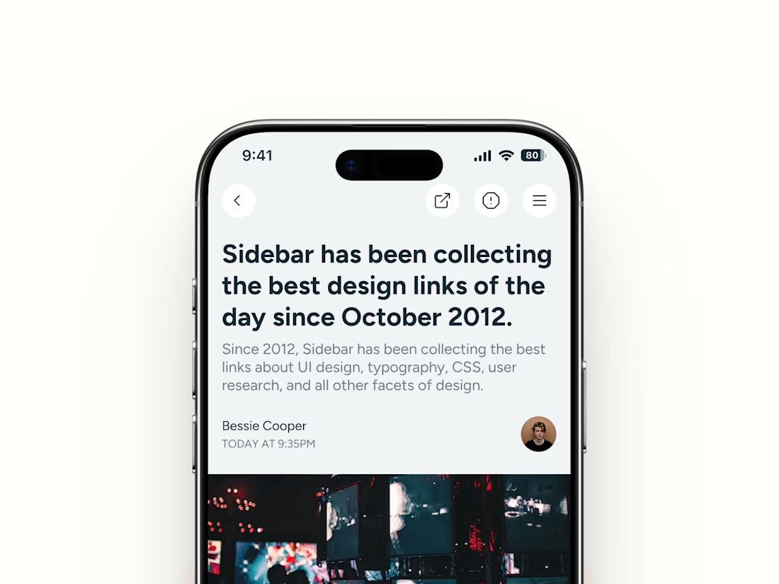
A minimal mobile app concept for people who want their daily news and design reads without the noise
The design uses a light, airy interface with soft grey surfaces, a confident red accent, and a mix of sans-serif and serif type to make long reading feel calm and easy
Special attention was given to:
- Clear headline feed with author, time, and thumbnail
- Category chips like For You, Business, and Politics
- Search with topic suggestions and voice input
- Comfortable article view with serif body text
- Like, dislike, comment, and save actions on every story
- Simple bottom navigation for one-hand use
- Strong visual hierarchy across all three screens
The result is a focused reading app that helps people find what matters, read it comfortably, and save it for later ✨



Framer tip for mobile navigation.
When someone clicks a link in the mobile navbar, the menu should close as the page scrolls to that section.
For example, clicking “Features” scrolls to the Features section and closes the menu at the same time.
Small detail that makes navigating a website on mobile easier.
Video tutorial below👇


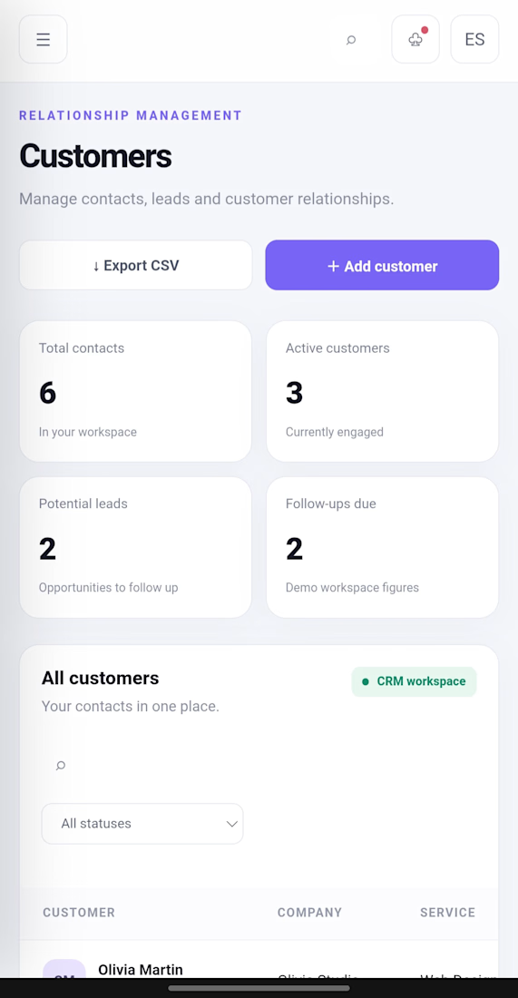
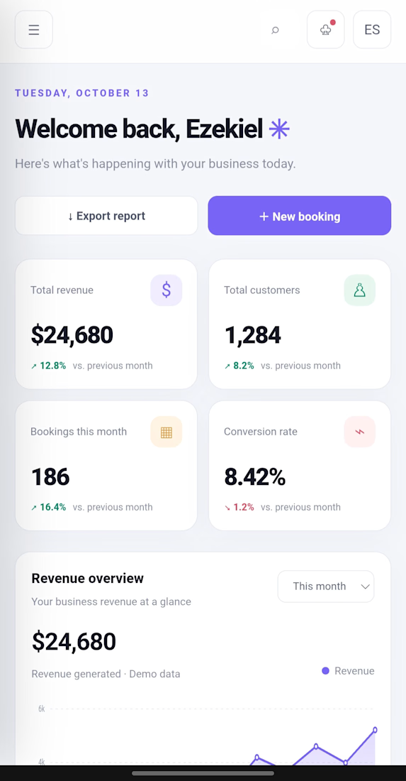
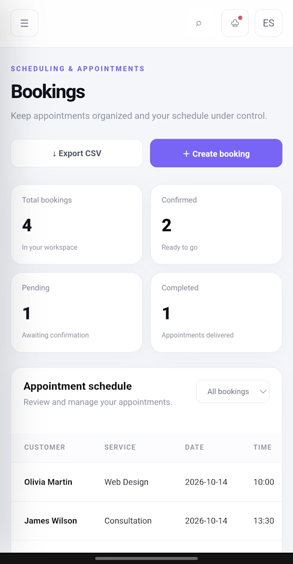
Ezekiel OS, One Workspace. Better Business Operations.
What if you could manage customers, bookings, services and business workflows from one dashboard?
That's the idea behind Ezekiel OS, an interactive business management prototype I designed and built.
Explore the demo: https://symphonious-douhua-f07d0a.netlify.app�
I build custom websites, dashboards, AI tools and business systems around real business needs.