The network for creativity
Join 1.25M professional creatives like you
Connect with clients, get discovered, and run your business 100% commission-free
Creatives on Contra have earned over $150M and we are just getting started
Back to feedPost

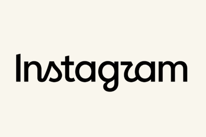
Saw many people criticising the new logo instagram rolled out. Honestly , I don't understand the hate. Obviously the old logo was great and was working very well for instagram but nothings wrong with the new one either.
The typography and everything is on point and its still retaining its old identity instead of being completely different.
What do you think?
The network for creativity
Join 1.25M professional creatives like you
Connect with clients, get discovered, and run your business 100% commission-free
Creatives on Contra have earned over $150M and we are just getting started
Related posts




So pretty



A logo can’t spend its whole life on a white background.
Eventually, it has to get dressed, carry a coffee and leave the shop.
A few Tindara applications on cups, bags and uniforms. I like this part of branding: seeing how the identity adapts to different shapes, sizes and materials, while still feeling like itself.