The network for creativity
Join 1.25M professional creatives like you
Connect with clients, get discovered, and run your business 100% commission-free
Creatives on Contra have earned over $150M and we are just getting started
Back to feedPost

Hearing Our Craft 🛠️🎧
Every craft has a sound: the saw, the hammer, the wrench. But what does design sound like? As AI prompts replace handiwork, we are losing our "rhythm".
I built Figma Sonic for the #FigmaMakeathon to restore our audible soul. Using Figma Make, I turned the canvas into an instrument where every gesture is a reward.
Tactile Feedback: Nodes "ding" and layers click like a mechanical Leica camera.
Human Composer: You aren't just drawing; you are composing a score with your lines.
AI as Mentor: You lead the composition; AI simply harmonizes your strokes into a song.
Figma Make: I used it to bridge vector math and audio into a live performance.
Design is a performance. It’s time to hear our craft.

The network for creativity
Join 1.25M professional creatives like you
Connect with clients, get discovered, and run your business 100% commission-free
Creatives on Contra have earned over $150M and we are just getting started











Related posts


10 years of building ad creatives. The tools changed completely.
Started with Google Web Designer and Photoshop. Now it’s Figma Motion, Jitter and AI.
Across national and international brands, from automotive and retail to finance sector, one thing stayed the same: one message, a hook in the first second, a clear CTA. Everyone can generate 50 variations now. Knowing which one to ship is the skill.


A decade of ad creatives across automotive, retail and finance is a serious run, Tom. Your line about everyone being able to generate 50 variations now, but knowing which one to ship, nails the shift perfectly.

ZENO: 3D Landing Page for a Camera Drone
I designed the layout and visual system in Figma, then built the interactive 3D hero in Spline together with Claude. I set the art direction, composition and mood. Claude worked directly inside Spline and helped assemble the drone scene, the materials and the interaction. I directed and refined every iteration.


Ohhhhh this is really nice

BloomyMind is a next–generation AI mental wellness assistant designed to help people feel seen, supported, and more emotionally balanced in their everyday lives. Our studio was invited to create a visual identity and product experience that seamlessly blends the precision of artificial intelligence with warmth, empathy, and human-centered design. Project Goal To build a brand and interface system that communicates BloomyMind’s core purpose: making emotional care accessible, gentle, and meaningful. We aimed to craft a personality that feels uplifting, calm, and trustworthy a digital companion users can rely on during moments of stress, reflection, or self-growth.


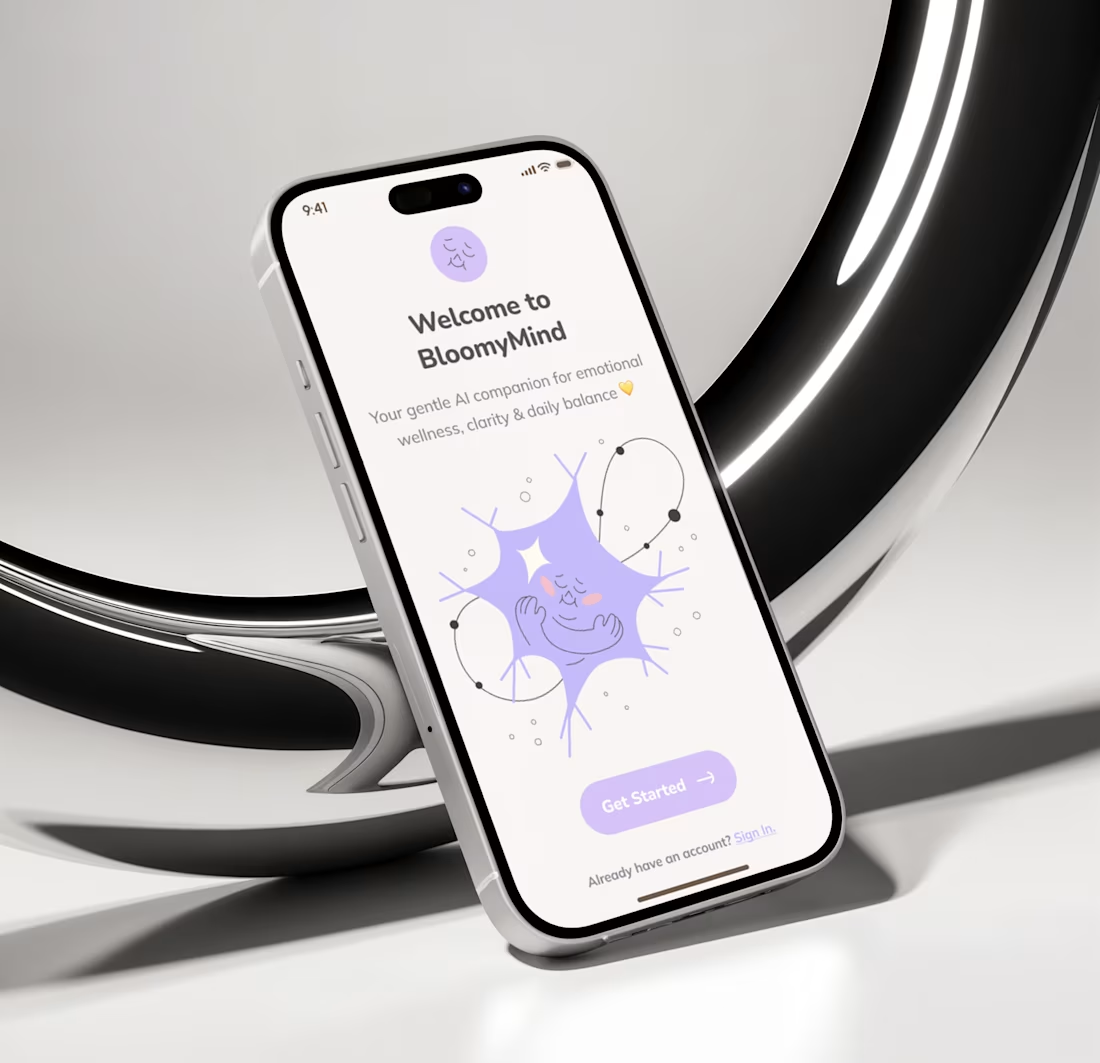
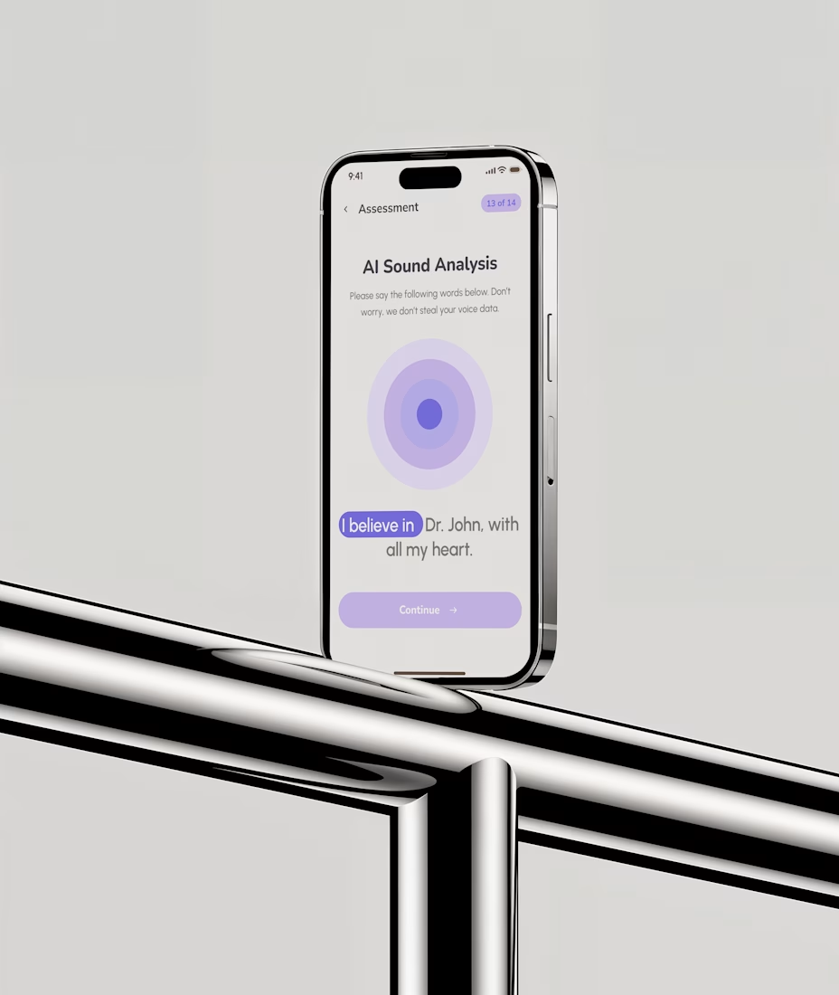
Blending the precision of AI with warmth and empathy is exactly the right brief for a mental wellness product, Huzaifa. That soft lavender bloom personality makes BloomyMind feel like a companion you would trust during moments of stress or reflection.