The network for creativity
Join 1.25M professional creatives like you
Connect with clients, get discovered, and run your business 100% commission-free
Creatives on Contra have earned over $150M and we are just getting started
Back to feedPost

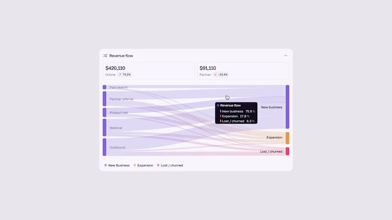
Bento exploration #0456
Project is calling for a digital/analog hybrid approach.
You can't go more analog than a loosely sketched drawing right?

The network for creativity
Join 1.25M professional creatives like you
Connect with clients, get discovered, and run your business 100% commission-free
Creatives on Contra have earned over $150M and we are just getting started
Related posts

The contact page is usually the last page anyone designs.
We made it one of the best
Recent client work: a contact section UI design for a company with offices across cities. Globe in the back, every location up front, and small interactions that make the whole web design feel alive.

Impressive work

Such a neat experiment in AI-assisted spatial design! Using 10 photos of a real setup to train a local model like FLUX 3 Klein is next-level prototyping.
Both options look great, but Option A totally wins on the cozy lighting front for me. Check out the post and drop your vote


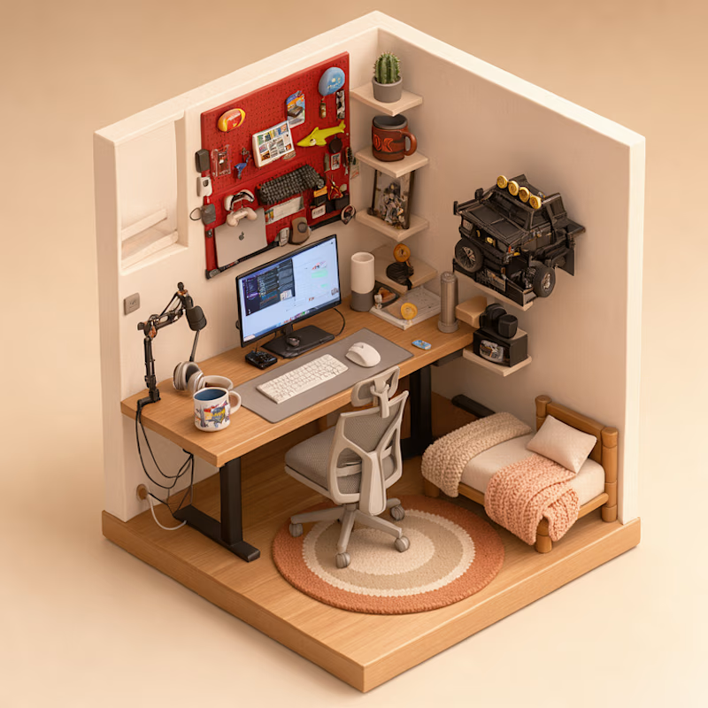
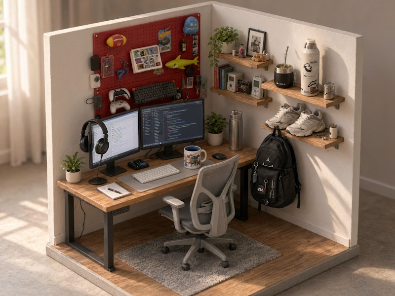
Turned my real desk into a tiny clay diorama ☕️
Made with FLUX 3 Klein running locally, using 10 photos of my actual setup as references: the pegboard wall, headphones, mug, shelves...
Which one do you like more, A or B?
21 voted
58%
15 voted
42%
36 votes
Closed

A hits to me it's so mangable❤️